2 Section 1 Overview
Section 1 introduces you to Data Visualization and Distributions.
After completing Section 1, you will:
- understand the importance of data visualization for communicating data-driven findings.
- be able to use distributions to summarize data.
- be able to use the average and the standard deviation to understand the normal distribution.
- be able to assess how well a normal distribution fits the data using a quantile-quantile plot.
- be able to interpret data from a boxplot.
2.1 Introduction to Data Visualization
The textbook for this section is available here.
Key points
- Plots of data easily communicate information that is difficult to extract from tables of raw values.
- Data visualization is a key component of exploratory data analysis (EDA), in which the properties of data are explored through visualization and summarization techniques.
- Data visualization can help discover biases, systematic errors, mistakes and other unexpected problems in data before those data are incorporated into potentially flawed analysis.
- This course covers the basics of data visualization and EDA in R using the ggplot2 package and motivating examples from world health, economics and infectious disease.
Code
if(!require(dslabs)) install.packages("dslabs")## Loading required package: dslabslibrary(dslabs)
data(murders)
head(murders)## state abb region population total
## 1 Alabama AL South 4779736 135
## 2 Alaska AK West 710231 19
## 3 Arizona AZ West 6392017 232
## 4 Arkansas AR South 2915918 93
## 5 California CA West 37253956 1257
## 6 Colorado CO West 5029196 652.2 Introduction to Distributions
The textbook for this section is available here.
Key points
- The most basic statistical summary of a list of objects is its distribution.
- We will learn ways to visualize and analyze distributions in the upcoming videos.
- In some cases, data can be summarized by a two-number summary: the average and standard deviation. We will learn to use data visualization to determine when that is appropriate.
2.3 Data Types
The textbook for this section is available here.
Key points
- Categorical data are variables that are defined by a small number of groups.
- Ordinal categorical data have an inherent order to the categories (mild/medium/hot, for example).
- Non-ordinal categorical data have no order to the categories.
- Numerical data take a variety of numeric values.
- Continuous variables can take any value.
- Discrete variables are limited to sets of specific values.
2.4 Assessment - Data Types
- The type of data we are working with will often influence the data visualization technique we use.
We will be working with two types of variables: categorical and numeric. Each can be divided into two other groups: categorical can be ordinal or not, whereas numerical variables can be discrete or continuous.
We will review data types using some of the examples provided in the dslabs package. For example, the heights dataset.
library(dslabs)
data(heights)data(heights)
names(heights)## [1] "sex" "height"- We saw that
sexis the first variable. We know what values are represented by this variable and can confirm this by looking at the first few entires:
head(heights)## sex height
## 1 Male 75
## 2 Male 70
## 3 Male 68
## 4 Male 74
## 5 Male 61
## 6 Female 65What data type is the sex variable?
- A. Continuous
- B. Categorical
- C. Ordinal
- D. None of the above
- Keep in mind that discrete numeric data can be considered ordinal.
Although this is technically true, we usually reserve the term ordinal data for variables belonging to a small number of different groups, with each group having many members.
The height variable could be ordinal if, for example, we report a small number of values such as short, medium, and tall. Let’s explore how many unique values are used by the heights variable. For this we can use the unique function:
x <- c(3, 3, 3, 3, 4, 4, 2)
unique(x)
x <- heights$height
length(unique(x))## [1] 139- One of the useful outputs of data visualization is that we can learn about the distribution of variables.
For categorical data we can construct this distribution by simply computing the frequency of each unique value. This can be done with the function table. Here is an example:
x <- c(3, 3, 3, 3, 4, 4, 2)
table(x)
x <- heights$height
tab <- table(x)- To see why treating the reported heights as an ordinal value is not useful in practice we note how many values are reported only once.
In the previous exercise we computed the variable tab which reports the number of times each unique value appears. For values reported only once tab will be 1. Use logicals and the function sum to count the number of times this happens.
tab <- table(heights$height)
sum(tab==1)
## [1] 63- Since there are a finite number of reported heights and technically the height can be considered ordinal, which of the following is true:
- A. It is more effective to consider heights to be numerical given the number of unique values we observe and the fact that if we keep collecting data even more will be observed.
- B. It is actually preferable to consider heights ordinal since on a computer there are only a finite number of possibilities.
- C. This is actually a categorical variable: tall, medium or short.
- D. This is a numerical variable because numbers are used to represent it.
2.5 Describe Heights to ET
The textbook for this section is available:
Key points
- A distribution is a function or description that shows the possible values of a variable and how often those values occur.
- For categorical variables, the distribution describes the proportions of each category.
- A frequency table is the simplest way to show a categorical distribution. Use
prop.tableto convert a table of counts to a frequency table. Barplots display the distribution of categorical variables and are a way to visualize the information in frequency tables. - For continuous numerical data, reporting the frequency of each unique entry is not an effective summary as many or most values are unique. Instead, a distribution function is required.
- The cumulative distribution function (CDF) is a function that reports the proportion of data below a value a for all values of a: \(F(a) = Pr(x \le a)\).
- The proportion of observations between any two values a and b can be computed from the CDF as \(F(b) - F(a)\).
- A histogram divides data into non-overlapping bins of the same size and plots the counts of number of values that fall in that interval.
Code
# load the dataset
library(dslabs)
data(heights)
# make a table of category proportions
prop.table(table(heights$sex))##
## Female Male
## 0.2266667 0.77333332.6 Smooth Density Plots
The textbook for this section is available here.
Key points
- Smooth density plots can be thought of as histograms where the bin width is extremely or infinitely small. The smoothing function makes estimates of the true continuous trend of the data given the available sample of data points.
- The degree of smoothness can be controlled by an argument in the plotting function. (We will learn functions for plotting later.)
- While the histogram is an assumption-free summary, the smooth density plot is shaped by assumptions and choices you make as a data analyst.
- The y-axis is scaled so that the area under the density curve sums to 1. This means that interpreting values on the y-axis is not straightforward. To determine the proportion of data in between two values, compute the area under the smooth density curve in the region between those values.
- An advantage of smooth densities over histograms is that densities are easier to compare visually.
A further note on histograms: note that the choice of binwidth has a determinative effect on shape. There is no “true” choice for binwidth, and you can sometimes gain insights into the data by experimenting with binwidths.
2.7 Assessment - Distributions
- You may have noticed that numerical data is often summarized with the average value.
For example, the quality of a high school is sometimes summarized with one number: the average score on a standardized test. Occasionally, a second number is reported: the standard deviation. So, for example, you might read a report stating that scores were 680 plus or minus 50 (the standard deviation). The report has summarized an entire vector of scores with with just two numbers. Is this appropriate? Is there any important piece of information that we are missing by only looking at this summary rather than the entire list? We are going to learn when these 2 numbers are enough and when we need more elaborate summaries and plots to describe the data.
Our first data visualization building block is learning to summarize lists of factors or numeric vectors. The most basic statistical summary of a list of objects or numbers is its distribution. Once a vector has been summarized as distribution, there are several data visualization techniques to effectively relay this information. In later assessments we will practice to write code for data visualization. Here we start with some multiple choice questions to test your understanding of distributions and related basic plots.
In the murders dataset, the region is a categorical variable and on the right you can see its distribution. To the closest 5%, what proportion of the states are in the North Central region?
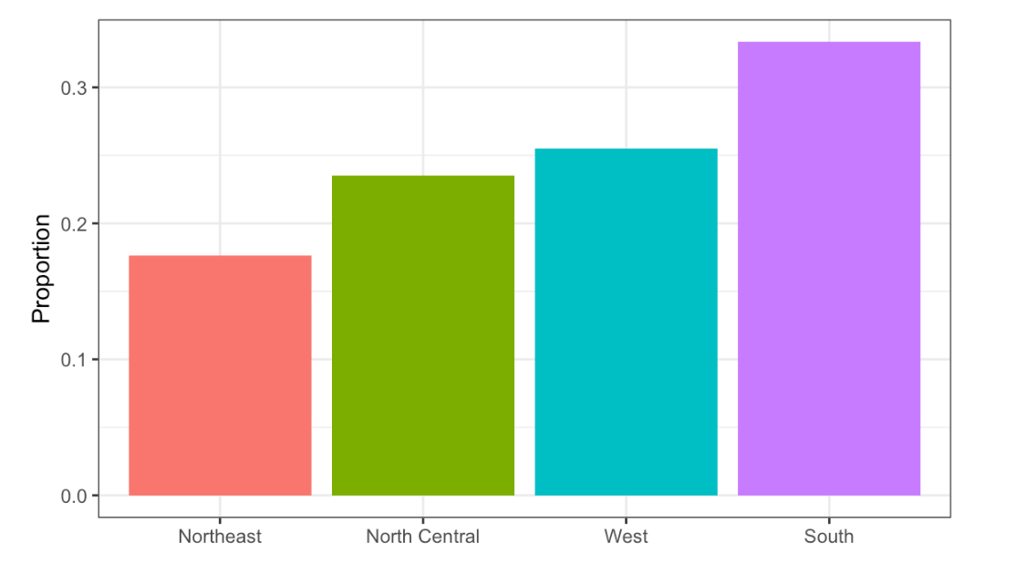
Region vs. Proportion
- A. 75%
- B. 50%
- C. 20%
- D. 5%
- In the murders dataset, the region is a categorical variable and to the right is its distribution.
Which of the following is true:
- A. The graph above is a histogram.
- B. The graph above shows only four numbers with a bar plot.
- C. Categories are not numbers, so it does not make sense to graph the distribution.
- D. The colors, not the height of the bars, describe the distribution.
- The plot shows the eCDF for male heights.
Based on the plot, what percentage of males are shorter than 75 inches?
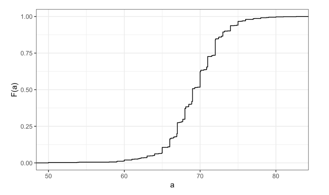
eCDF for male heights
- A. 100%
- B. 95%
- C. 80%
- D. 72 inches
- To the closest inch, what height
mhas the property that 1/2 of the male students are taller thanmand 1/2 are shorter?
- A. 61 inches
- B. 64 inches
- C. 69 inches
- D. 74 inches
- Here is an eCDF of the murder rates across states.
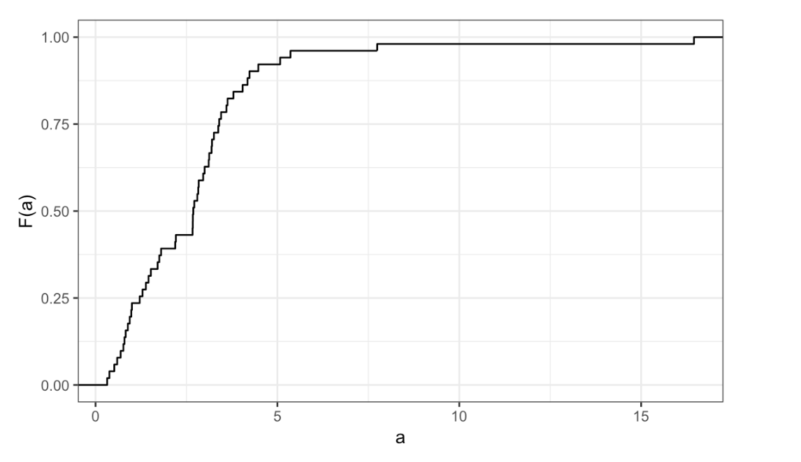
eCDF of the murder rates across states
Knowing that there are 51 states (counting DC) and based on this plot, how many states have murder rates larger than 10 per 100,000 people?
- A. 1
- B. 5
- C. 10
- D. 50
- Based on the eCDF above, which of the following statements are true.
- A. About half the states have murder rates above 7 per 100,000 and the other half below.
- B. Most states have murder rates below 2 per 100,000.
- C. All the states have murder rates above 2 per 100,000.
- D. With the exception of 4 states, the murder rates are below 5 per 100,000.
- Here is a histogram of male heights in our
heightsdataset.
Based on this plot, how many males are between 62.5 and 65.5?
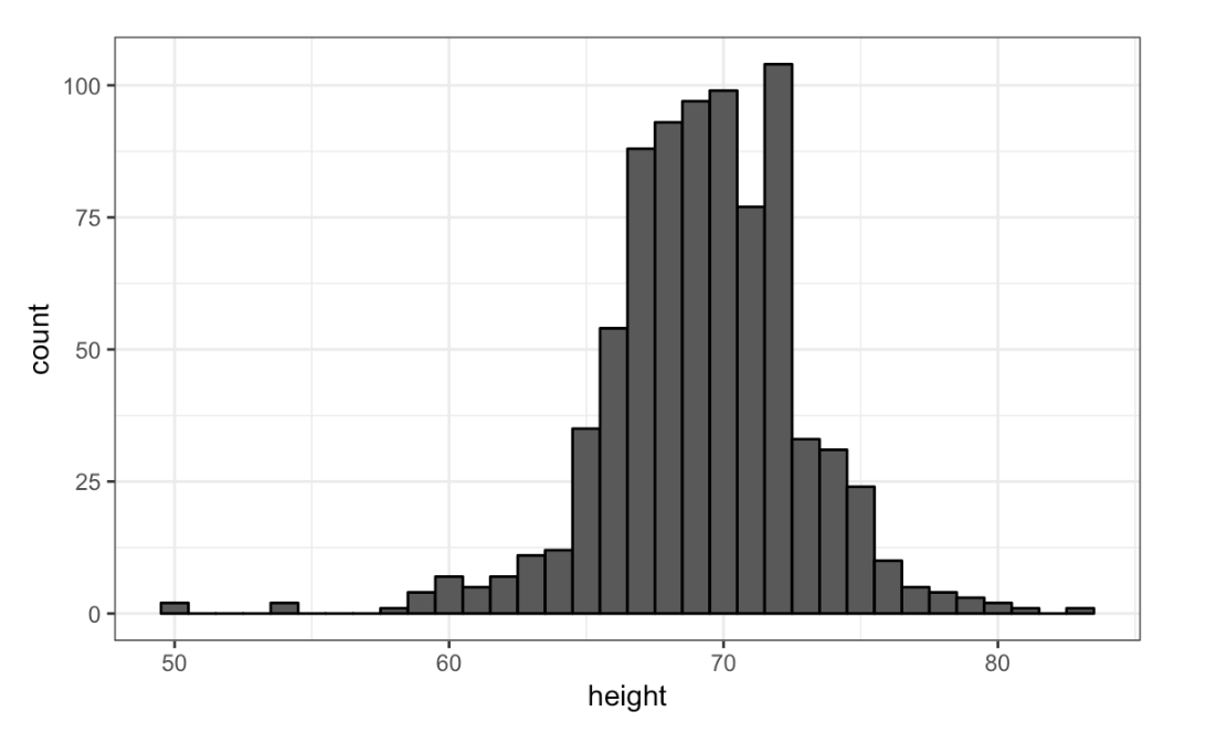
Histogram of male heights
- A. 11
- B. 29
- C. 58
- D. 99
- About what percentage are shorter than 60 inches?
- A. 1%
- B. 10%
- C. 25%
- D. 50%
- Based on this density plot, about what proportion of US states have populations larger than 10 million?
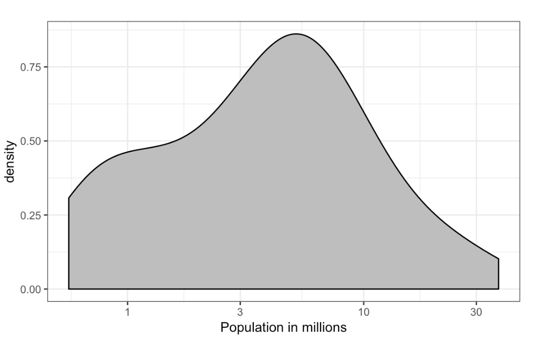
Density plot population
- A. 0.02
- B. 0.15
- C. 0.50
- D. 0.55
- Below are three density plots. Is it possible that they are from the same dataset?
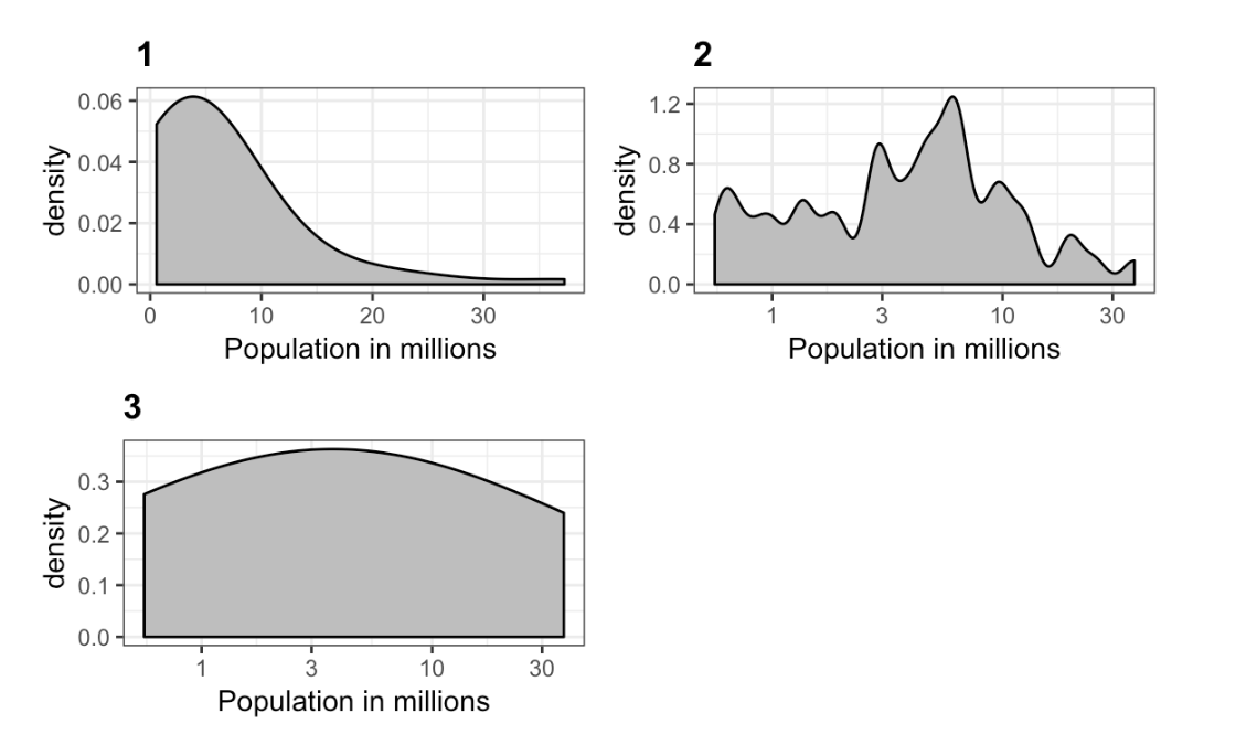
Three density plots
Which of the following statements is true?
- A. It is impossible that they are from the same dataset.
- B. They are from the same dataset, but the plots are different due to code errors.
- C. They are the same dataset, but the first and second plot undersmooth and the third oversmooths.
- D. They are the same dataset, but the first is not in the log scale, the second undersmooths and the third oversmooths.
2.8 Normal Distribution
The textbook for this section is available here.
Key points
The normal distribution:
- Is centered around one value, the mean
- Is symmetric around the mean
- Is defined completely by its mean (\(\mu\)) and standard deviation (\(\sigma\))
- Always has the same proportion of observations within a given distance of the mean (for example, 95% within 2 \(\sigma\))
The standard deviation is the average distance between a value and the mean value.
Calculate the mean using the
meanfunction.Calculate the standard deviation using the
sdfunction or manually.Standard units describe how many standard deviations a value is away from the mean. The z-score, or number of standard deviations an observation x is away from the mean (\(\mu\)):
\(Z = \frac{x - \mu}{\sigma}\)
Compute standard units with the
scalefunction.Important: to calculate the proportion of values that meet a certain condition, use the
meanfunction on a logical vector. Because TRUE is converted to 1 and FALSE is converted to 0, taking the mean of this vector yields the proportion of TRUE.
Equation for the normal distribution
The normal distribution is mathematically defined by the following formula for any mean \(\mu\) and standard deviation \(\sigma\):
\(Pr(a < x < b) = \int_{a}^{b} \frac{1}{\sqrt2\pi\sigma} e^-\frac{1}{2}(\frac{x - \mu}{\sigma})^2 dx\)
Code
if(!require(tidyverse)) install.packages("tidyverse")## Loading required package: tidyverse## ── Attaching packages ───────────────────────────────────────────────────────────────────────────────────────────────────────────────────────────────────────────── tidyverse 1.3.0 ──## ✓ ggplot2 3.3.2 ✓ purrr 0.3.4
## ✓ tibble 3.0.3 ✓ dplyr 1.0.2
## ✓ tidyr 1.1.2 ✓ stringr 1.4.0
## ✓ readr 1.3.1 ✓ forcats 0.5.0## ── Conflicts ──────────────────────────────────────────────────────────────────────────────────────────────────────────────────────────────────────────────── tidyverse_conflicts() ──
## x dplyr::filter() masks stats::filter()
## x dplyr::lag() masks stats::lag()# define x as vector of male heights
library(tidyverse)
index <- heights$sex=="Male"
x <- heights$height[index]
# calculate the mean and standard deviation manually
average <- sum(x)/length(x)
SD <- sqrt(sum((x - average)^2)/length(x))
# built-in mean and sd functions - note that the audio and printed values disagree
average <- mean(x)
SD <- sd(x)
c(average = average, SD = SD)## average SD
## 69.314755 3.611024# calculate standard units
z <- scale(x)
# calculate proportion of values within 2 SD of mean
mean(abs(z) < 2)## [1] 0.9495074Note about the sd function: The built-in R function sd calculates the standard deviation, but it divides by length(x)-1 instead of length(x). When the length of the list is large, this difference is negligible and you can use the built-in sd function. Otherwise, you should compute \(\sigma\) by hand. For this course series, assume that you should use the sd function unless you are told not to do so.
2.9 Assessment - Normal Distribution
- Histograms and density plots provide excellent summaries of a distribution.
But can we summarize even further? We often see the average and standard deviation used as summary statistics: a two number summary! To understand what these summaries are and why they are so widely used, we need to understand the normal distribution.
The normal distribution, also known as the bell curve and as the Gaussian distribution, is one of the most famous mathematical concepts in history. A reason for this is that approximately normal distributions occur in many situations. Examples include gambling winnings, heights, weights, blood pressure, standardized test scores, and experimental measurement errors. Often data visualization is needed to confirm that our data follows a normal distribution.
Here we focus on how the normal distribution helps us summarize data and can be useful in practice.
One way the normal distribution is useful is that it can be used to approximate the distribution of a list of numbers without having access to the entire list. We will demonstrate this with the heights dataset.
Load the height data set and create a vector x with just the male heights:
library(dslabs)
data(heights)
x <- heights$height[heights$sex == "Male"]
What proportion of the data is between 69 and 72 inches (taller than 69 but shorter or equal to 72)? A proportion is between 0 and 1.
x <- heights$height[heights$sex == "Male"]
mean(x > 69 & x <= 72)
## [1] 0.3337438- Suppose all you know about the height data from the previous exercise is the average and the standard deviation and that its distribution is approximated by the normal distribution.
We can compute the average and standard deviation like this:
library(dslabs)
data(heights)
x <- heights$height[heights$sex=="Male"]
avg <- mean(x)
stdev <- sd(x)
Suppose you only have avg and stdev below, but no access to x, can you approximate the proportion of the data that is between 69 and 72 inches?
Given a normal distribution with a mean mu and standard deviation sigma, you can calculate the proportion of observations less than or equal to a certain value with pnorm(value, mu, sigma). Notice that this is the CDF for the normal distribution. We will learn much more about pnorm later in the course series, but you can also learn more now with ?pnorm.
x <- heights$height[heights$sex=="Male"]
avg <- mean(x)
stdev <- sd(x)
pnorm(72, avg, stdev) - pnorm(69, avg, stdev)
## [1] 0.3061779- Notice that the approximation calculated in the second question is very close to the exact calculation in the first question.
The normal distribution was a useful approximation for this case. However, the approximation is not always useful. An example is for the more extreme values, often called the “tails” of the distribution. Let’s look at an example. We can compute the proportion of heights between 79 and 81.
library(dslabs)
data(heights)
x <- heights$height[heights$sex == "Male"]
mean(x > 79 & x <= 81)
x <- heights$height[heights$sex == "Male"]
avg <- mean(x)
stdev <- sd(x)
exact <- mean(x > 79 & x <= 81)
approx <- pnorm(81, avg, stdev) - pnorm(79, avg, stdev)
exact## [1] 0.004926108approx## [1] 0.003051617exact/approx## [1] 1.614261- Someone asks you what percent of seven footers are in the National Basketball Association (NBA). Can you provide an estimate? Let’s try using the normal approximation to answer this question.
First, we will estimate the proportion of adult men that are 7 feet tall or taller.
Assume that the distribution of adult men in the world as normally distributed with an average of 69 inches and a standard deviation of 3 inches.
# use pnorm to calculate the proportion over 7 feet (7*12 inches)
1 - pnorm(7*12, 69, 3)
## [1] 2.866516e-07- Now we have an approximation for the proportion, call it
p, of men that are 7 feet tall or taller.
We know that there are about 1 billion men between the ages of 18 and 40 in the world, the age range for the NBA.
Can we use the normal distribution to estimate how many of these 1 billion men are at least seven feet tall?
p <- 1 - pnorm(7*12, 69, 3)
round(p*10^9)
## [1] 287- There are about 10 National Basketball Association (NBA) players that are 7 feet tall or higher.
p <- 1 - pnorm(7*12, 69, 3)
N <- round(p*10^9)
10/N
## [1] 0.03484321- In the previous exerceise we estimated the proportion of seven footers in the NBA using this simple code:
p <- 1 - pnorm(7*12, 69, 3)
N <- round(p * 10^9)
10/N
Repeat the calculations performed in the previous question for Lebron James’ height: 6 feet 8 inches. There are about 150 players, instead of 10, that are at least that tall in the NBA.
## Change the solution to previous answer
p <- 1 - pnorm(7*12, 69, 3)
N <- round(p * 10^9)
10/N
## [1] 0.03484321p <- 1 - pnorm(6*12+8, 69, 3)
N <- round(p * 10^9)
150/N## [1] 0.001220842- In answering the previous questions, we found that it is not at all rare for a seven footer to become an NBA player.
What would be a fair critique of our calculations?
- A. Practice and talent are what make a great basketball player, not height.
- B. The normal approximation is not appropriate for heights.
- C. As seen in exercise 3, the normal approximation tends to underestimate the extreme values. It’s possible that there are more seven footers than we predicted.
- D. As seen in exercise 3, the normal approximation tends to overestimate the extreme values. It’s possible that there are less seven footers than we predicted.
2.10 Quantile-Quantile Plots
The textbook for this section is available here.
Key points
- Quantile-quantile plots, or QQ-plots, are used to check whether distributions are well-approximated by a normal distribution.
- Given a proportion p, the quantile q is the value such that the proportion of values in the data below q is p.
- In a QQ-plot, the sample quantiles in the observed data are compared to the theoretical quantiles expected from the normal distribution. If the data are well-approximated by the normal distribution, then the points on the QQ-plot will fall near the identity line (sample = theoretical).
- Calculate sample quantiles (observed quantiles) using the
quantilefunction. - Calculate theoretical quantiles with the
qnormfunction.qnormwill calculate quantiles for the standard normal distribution (\(\mu = 0\), \(\sigma = 1\)) by default, but it can calculate quantiles for any normal distribution given mean andsdarguments. We will learn more aboutqnormin the probability course. - Note that we will learn alternate ways to make QQ-plots with less code later in the series.
Code
# define x and z
index <- heights$sex=="Male"
x <- heights$height[index]
z <- scale(x)

# proportion of data below 69.5
mean(x <= 69.5)
## [1] 0.5147783# calculate observed and theoretical quantiles
p <- seq(0.05, 0.95, 0.05)
observed_quantiles <- quantile(x, p)
theoretical_quantiles <- qnorm(p, mean = mean(x), sd = sd(x))
# make QQ-plot
plot(theoretical_quantiles, observed_quantiles)
abline(0,1)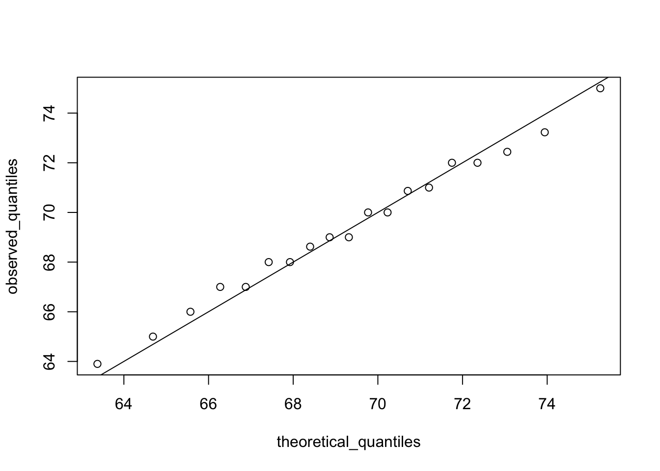
# make QQ-plot with scaled values
observed_quantiles <- quantile(z, p)
theoretical_quantiles <- qnorm(p)
plot(theoretical_quantiles, observed_quantiles)
abline(0,1)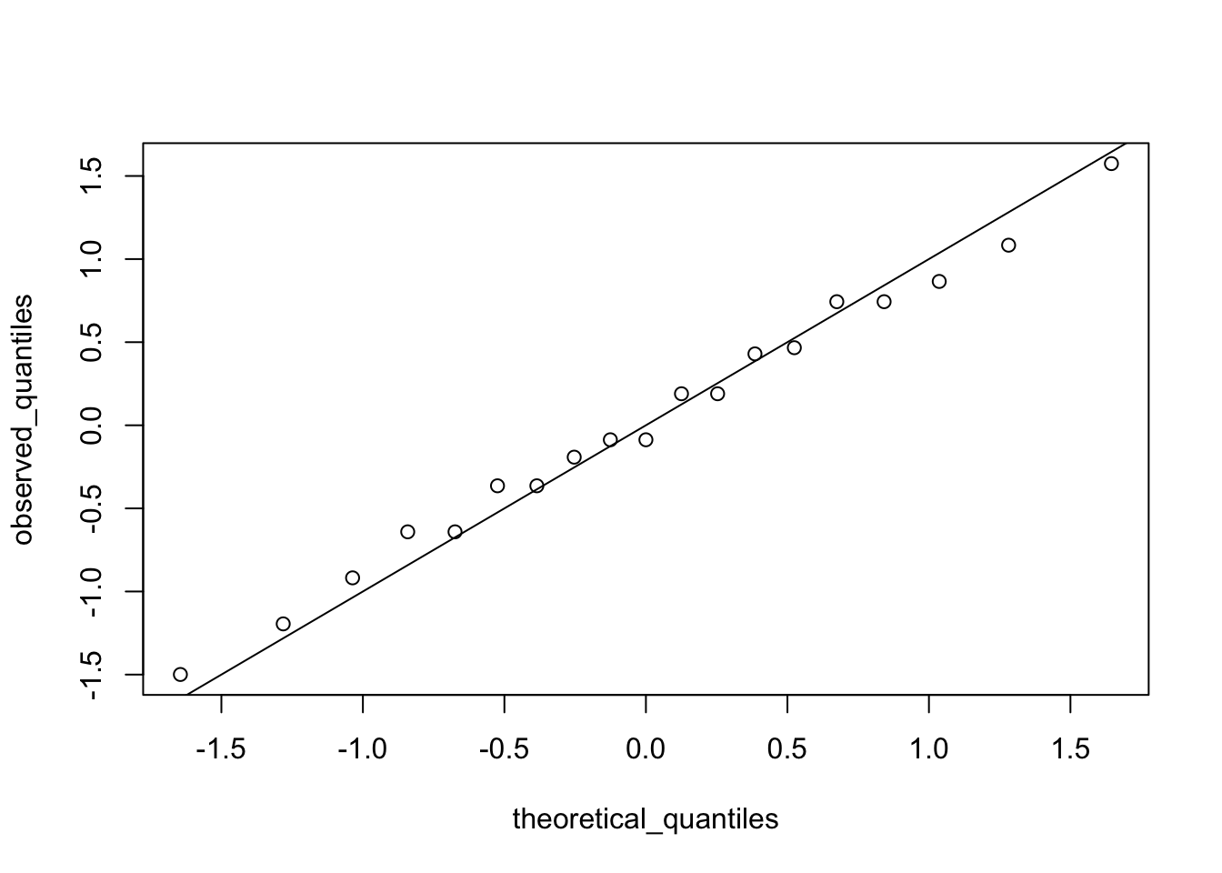
2.11 Percentiles
The textbook for this section is available here.
Key points
- Percentiles are the quantiles obtained when defining p as
0.01,0.02,...,0.99. They summarize the values at which a certain percent of the observations are equal to or less than that value. - The 50th percentile is also known as the median.
- The quartiles are the 25th, 50th and 75th percentiles.
2.12 Boxplots
The textbook for this section is available here.
Key points
- When data do not follow a normal distribution and cannot be succinctly summarized by only the mean and standard deviation, an alternative is to report a five-number summary: range (ignoring outliers) and the quartiles (25th, 50th, 75th percentile).
- In a boxplot, the box is defined by the 25th and 75th percentiles and the median is a horizontal line through the box. The whiskers show the range excluding outliers, and outliers are plotted separately as individual points.
- The interquartile range is the distance between the 25th and 75th percentiles.
- Boxplots are particularly useful when comparing multiple distributions.
- We discuss outliers later.
2.13 Assessment - Quantiles, percentiles, and boxplots
- When analyzing data it’s often important to know the number of measurements you have for each category.
male <- heights$height[heights$sex=="Male"]
female <- heights$height[heights$sex=="Female"]
length(male)
## [1] 812length(female)## [1] 238- Suppose we can’t make a plot and want to compare the distributions side by side. If the number of data points is large, listing all the numbers is inpractical. A more practical approach is to look at the percentiles. We can obtain percentiles using the
quantilefunction like this
library(dslabs)
data(heights)
quantile(heights$height, seq(.01, 0.99, 0.01))
male <- heights$height[heights$sex=="Male"]
female <- heights$height[heights$sex=="Female"]
female_percentiles <- quantile(female, seq(0.1, 0.9, 0.2))
male_percentiles <- quantile(male, seq(0.1, 0.9, 0.2))
df <- data.frame(female = (female_percentiles), male = (male_percentiles))
df## female male
## 10% 61.00000 65.00000
## 30% 63.00000 68.00000
## 50% 64.98031 69.00000
## 70% 66.46417 71.00000
## 90% 69.00000 73.22751- Study the boxplots summarizing the distributions of populations sizes by country.
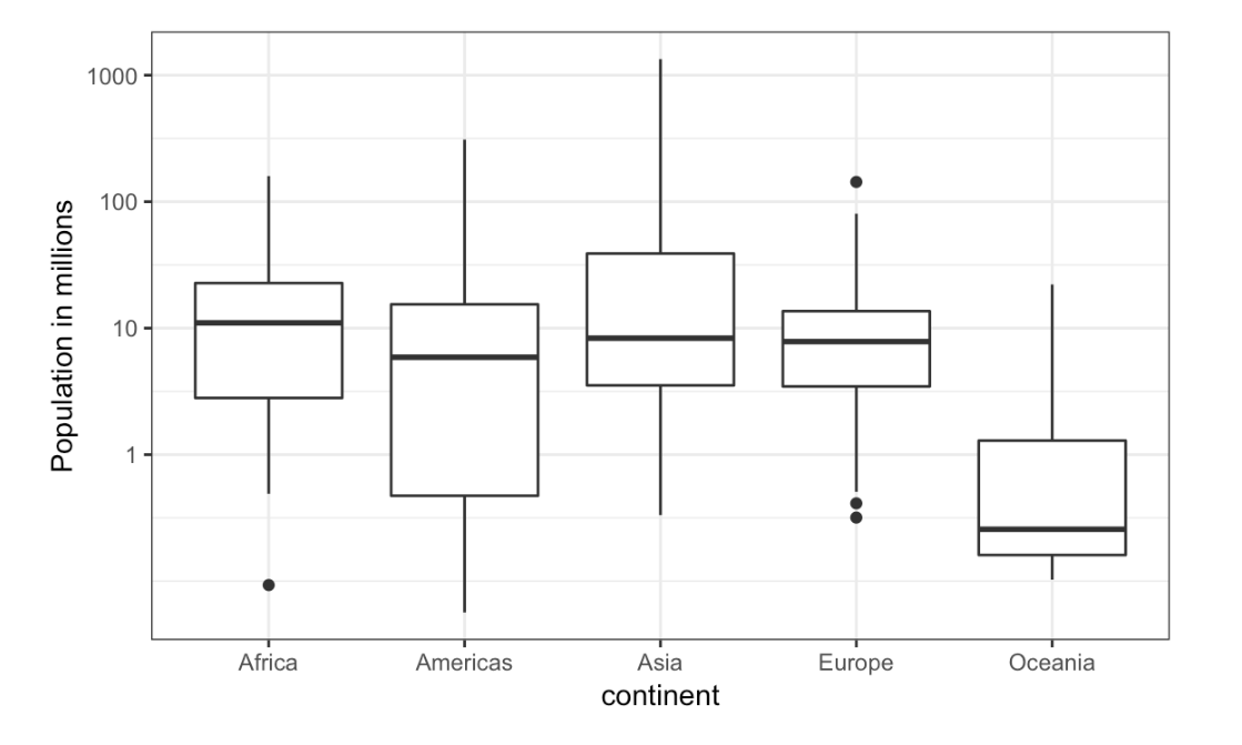
Continent vs Population
Which continent has the country with the largest population size?
- A. Africa
- B. Americas
- C. Asia
- D. Europe
- E. Oceania
- Study the boxplots summarizing the distributions of populations sizes by country.
Which continent has median country with the largest population?
- A. Africa
- B. Americas
- C. Asia
- D. Europe
- E. Oceania
- Again, look at the boxplots summarizing the distributions of populations sizes by country.
To the nearest million, what is the median population size for Africa?
- A. 100 million
- B. 25 million
- C. 10 million
- D. 5 million
- E. 1 million
- Examine the following boxplots and report approximately what proportion of countries in Europe have populations below 14 million?
- A. 0.75
- B. 0.50
- C. 0.25
- D. 0.01
- Based on the boxplot, if we use a log transformation, which continent shown below has the largest interquartile range?
- A. Africa
- B. Americas
- C. Asia
- D. Europe
- E. Oceania
2.14 Distribution of Female Heights
The textbook for this section is available here.
Key points
- If a distribution is not normal, it cannot be summarized with only the mean and standard deviation. Provide a histogram, smooth density or boxplot instead.
- A plot can force us to see unexpected results that make us question the quality or implications of our data.
2.15 Assessment - Robust Summaries With Outliers
- For this chapter, we will use height data collected by Francis Galton for his genetics studies. Here we just use height of the children in the dataset:
library(HistData)
data(Galton)
x <- Galton$childif(!require(HistData)) install.packages("HistData")## Loading required package: HistDatalibrary(HistData)
data(Galton)
x <- Galton$child
mean(x)## [1] 68.08847median(x)## [1] 68.2- Now for the same data compute the standard deviation and the median absolute deviation (MAD).
x <- Galton$child
sd(x)
## [1] 2.517941mad(x)## [1] 2.9652- In the previous exercises we saw that the mean and median are very similar and so are the standard deviation and MAD. This is expected since the data is approximated by a normal distribution which has this property.
Now suppose that suppose Galton made a mistake when entering the first value, forgetting to use the decimal point. You can imitate this error by typing:
library(HistData)
data(Galton)
x <- Galton$child
x_with_error <- x
x_with_error[1] <- x_with_error[1]*10
The data now has an outlier that the normal approximation does not account for. Let’s see how this affects the average.
x <- Galton$child
x_with_error <- x
x_with_error[1] <- x_with_error[1]*10
gem <- mean(x)
gem_error <- mean(x_with_error)
gem_error - gem
## [1] 0.5983836- In the previous exercise we saw how a simple mistake in 1 out of over 900 observations can result in the average of our data increasing more than half an inch, which is a large difference in practical terms.
Now let’s explore the effect this outlier has on the standard deviation.
x_with_error <- x
x_with_error[1] <- x_with_error[1]*10
sd(x_with_error)- sd(x)
## [1] 15.6746- In the previous exercises we saw how one mistake can have a substantial effect on the average and the standard deviation.
Now we are going to see how the median and MAD are much more resistant to outliers. For this reason we say that they are robust summaries.
x_with_error <- x
x_with_error[1] <- x_with_error[1]*10
mediaan <- median(x)
mediaan_error <- median(x_with_error)
mediaan_error - mediaan
## [1] 0- We saw that the median barely changes. Now let’s see how the MAD is affected.
We saw that the median barely changes. Now let’s see how the MAD is affected.
x_with_error <- x
x_with_error[1] <- x_with_error[1]*10
mad_normal <- mad(x)
mad_error <- mad(x_with_error)
mad_error - mad_normal
## [1] 0- How could you use exploratory data analysis to detect that an error was made?
- A. Since it is only one value out of many, we will not be able to detect this.
- B. We would see an obvious shift in the distribution.
- C. A boxplot, histogram, or qq-plot would reveal a clear outlier.
- D. A scatter plot would show high levels of measurement error.
- We have seen how the average can be affected by outliers.
But how large can this effect get? This of course depends on the size of the outlier and the size of the dataset.
To see how outliers can affect the average of a dataset, let’s write a simple function that takes the size of the outlier as input and returns the average.
x <- Galton$child
error_avg <- function(k){
x[1] = k
mean(x)
}
error_avg(10000)
## [1] 78.79784error_avg(-10000)## [1] 57.24612