3 Section 2 Overview
In Section 2, you will learn how to create data visualizations in R using ggplot2.
After completing Section 2, you will:
- be able to use ggplot2 to create data visualizations in R.
- be able to explain what the data component of a graph is.
- be able to identify the geometry component of a graph and know when to use which type of geometry.
- be able to explain what the aesthetic mapping component of a graph is.
- be able to understand the scale component of a graph and select an appropriate scale component to use.
Note that it can be hard to memorize all of the functions and arguments used by ggplot2, so we recommend that you have a cheat sheet handy to help you remember the necessary commands.
3.1 ggplot
The textbook for this section is available here.
Key points
- Throughout the series, we will create plots with the ggplot2 package. ggplot2 is part of the tidyverse, which you can load with
library(tidyverse). - Note that you can also load ggplot2 alone using the command
library(ggplot2), instead of loading the entire tidyverse. - ggplot2 uses a grammar of graphics to break plots into building blocks that have intuitive syntax, making it easy to create relatively complex and aesthetically pleasing plots with relatively simple and readable code.
- ggplot2 is designed to work exclusively with tidy data (rows are observations and columns are variables).
3.2 Graph Components
The textbook for this section is available here.
Key points
- Plots in ggplot2 consist of 3 main components:
- Data: The dataset being summarized
- Geometry: The type of plot (scatterplot, boxplot, barplot, histogram, qqplot, smooth density, etc.)
- Aesthetic mapping: Variables mapped to visual cues, such as x-axis and y-axis values and color
- There are additional components:
- Scale
- Labels, Title, Legend
- Theme/Style
3.3 Creating a New Plot
The textbook for this section is available here.
Key points
- You can associate a dataset x with a ggplot object with any of the 3 commands:
ggplot(data = x)ggplot(x)x %>% ggplot()
- You can assign a ggplot object to a variable. If the object is not assigned to a variable, it will automatically be displayed.
- You can display a ggplot object assigned to a variable by printing that variable.
Code
ggplot(data = murders)

murders %>% ggplot()
p <- ggplot(data = murders)
class(p)## [1] "gg" "ggplot"print(p) # this is equivalent to simply typing pThe functions above render a plot, in this case a blank slate since no geometry has been defined. The only style choice we see is a grey background.
3.4 Layers
The textbook for this section is available:
Key points
- In ggplot2, graphs are created by adding layers to the ggplot object:
DATA %>% ggplot() + LAYER_1 + LAYER_2 + ... + LAYER_N - The geometry layer defines the plot type and takes the format
geom_Xwhere X is the plot type. - Aesthetic mappings describe how properties of the data connect with features of the graph (axis position, color, size, etc.) Define aesthetic mappings with the
aesfunction. - aes uses variable names from the object component (for example,
totalrather thanmurders$total). geom_pointcreates a scatterplot and requires x and y aesthetic mappings.geom_textandgeom_labeladd text to a scatterplot and require x, y, and label aesthetic mappings.- To determine which aesthetic mappings are required for a geometry, read the help file for that geometry.
- You can add layers with different aesthetic mappings to the same graph.
Code: Adding layers to a plot
murders %>% ggplot() +
    geom_point(aes(x = population/10^6, y = total))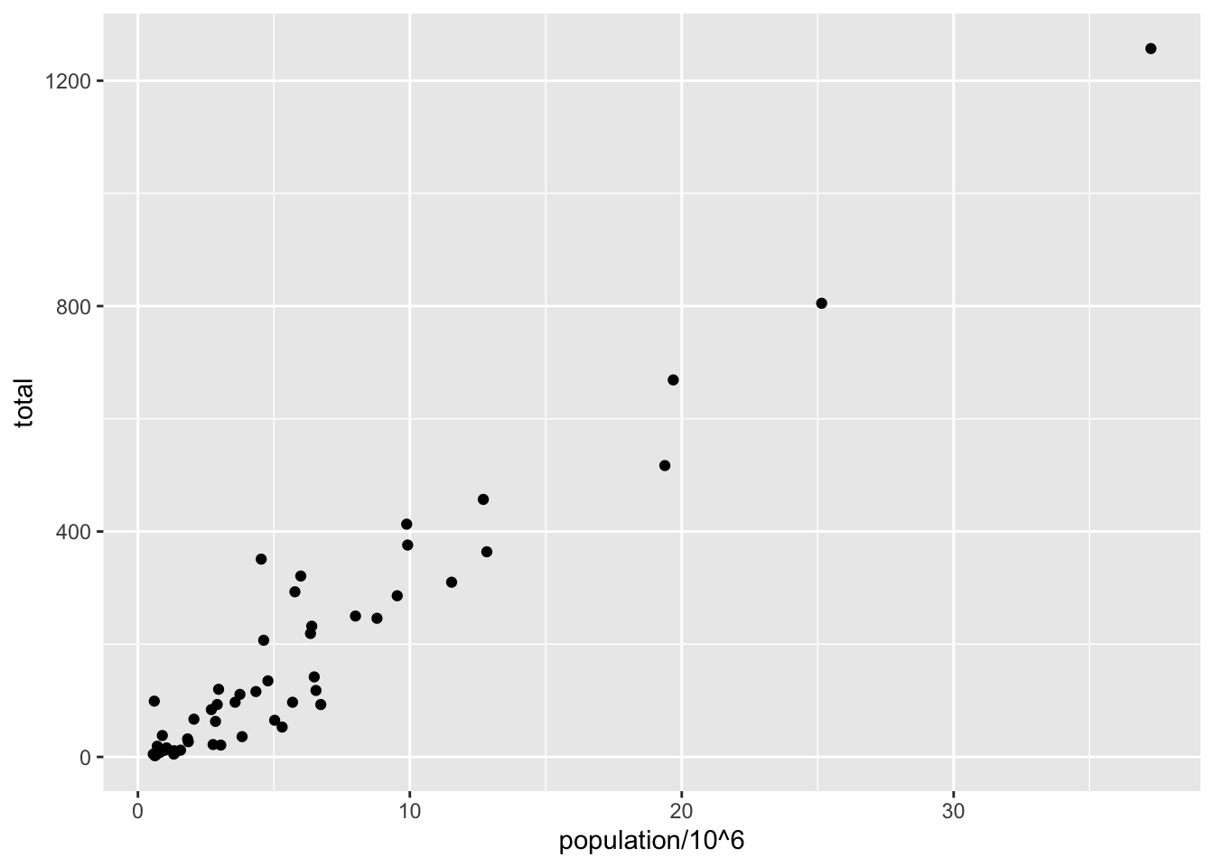
# add points layer to predefined ggplot object
p <- ggplot(data = murders)
p + geom_point(aes(population/10^6, total))
# add text layer to scatterplot
p + geom_point(aes(population/10^6, total)) +
    geom_text(aes(population/10^6, total, label = abb))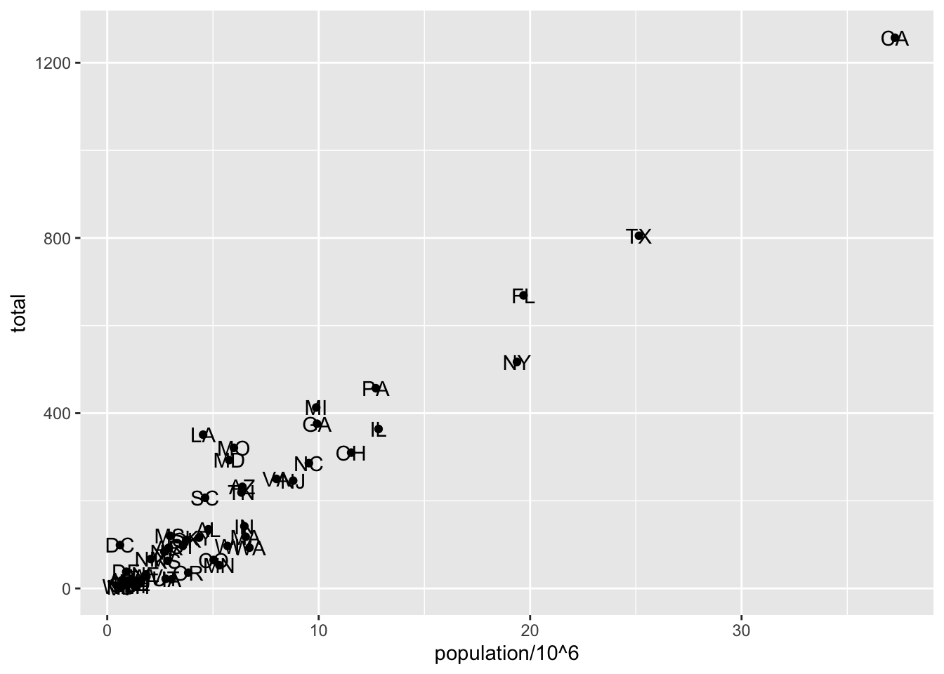
Code: Example of aes behavior
# no error from this call
p_test <- p + geom_text(aes(population/10^6, total, label = abb))
# error - "abb" is not a globally defined variable and cannot be found outside of aes
p_test <- p + geom_text(aes(population/10^6, total), label = abb)3.5 Tinkering
The textbook for this section is available here and here.
Key points
- You can modify arguments to geometry functions other than aes and the data. Additional arguments can be found in the documentation for each geometry.
- These arguments are not aesthetic mappings: they affect all data points the same way.
- Global aesthetic mappings apply to all geometries and can be defined when you initially call
ggplot. All the geometries added as layers will default to this mapping. Local aesthetic mappings add additional information or override the default mappings.
Code
# change the size of the points
p + geom_point(aes(population/10^6, total), size = 3) +
    geom_text(aes(population/10^6, total, label = abb))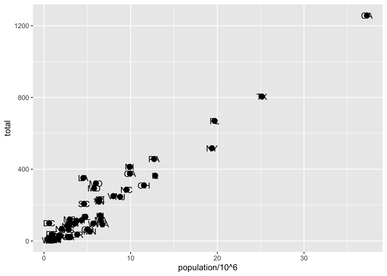
# move text labels slightly to the right
p + geom_point(aes(population/10^6, total), size = 3) +
    geom_text(aes(population/10^6, total, label = abb), nudge_x = 1)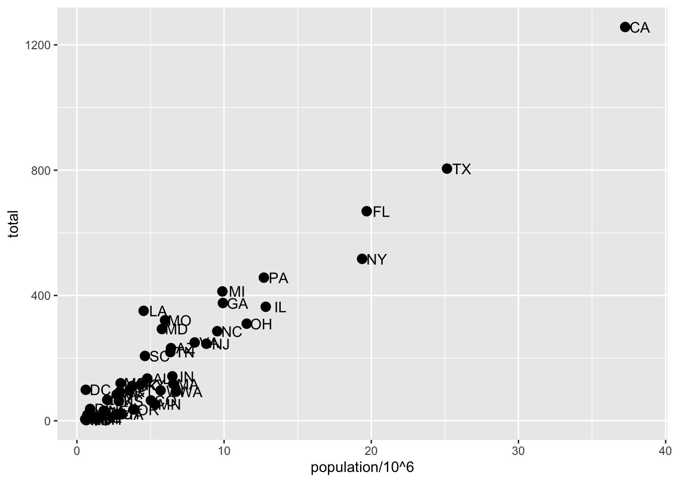
# simplify code by adding global aesthetic
p <- murders %>% ggplot(aes(population/10^6, total, label = abb))
p + geom_point(size = 3) +
    geom_text(nudge_x = 1.5)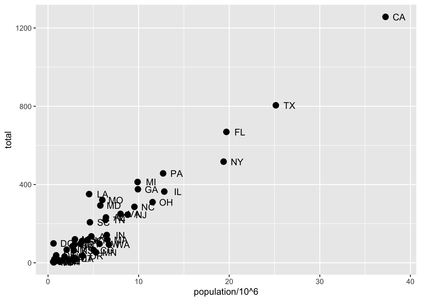
# local aesthetics override global aesthetics
p + geom_point(size = 3) +
    geom_text(aes(x = 10, y = 800, label = "Hello there!"))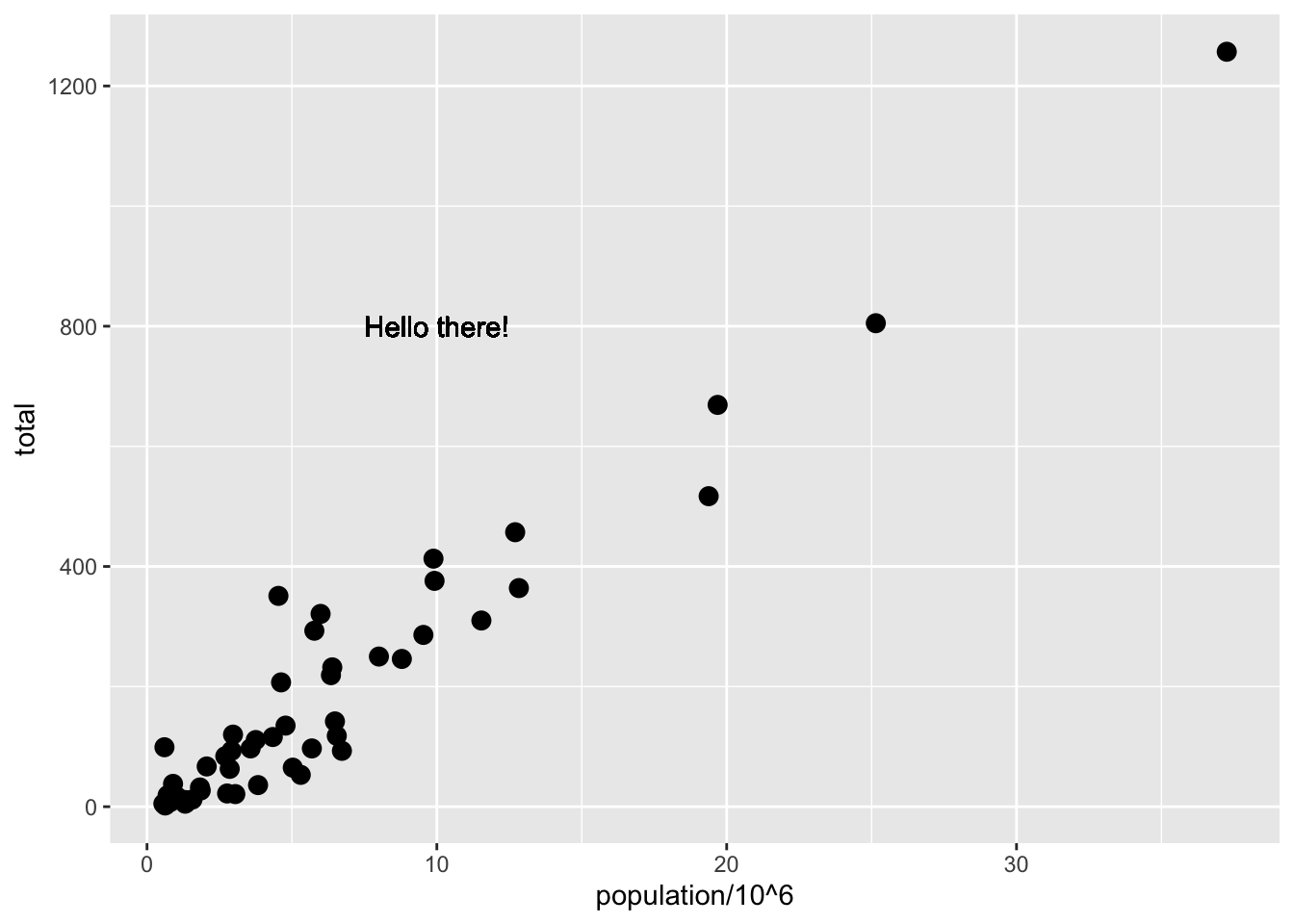
3.6 Scales, Labels, and Colors
The textbook for this section is available:
Key points
- Convert the x-axis to log scale with
scale_x_continuous(trans = "log10")orscale_x_log10. Similar functions exist for the y-axis. - Add axis titles with
xlabandylabfunctions. Add a plot title with theggtitlefunction. - Add a color mapping that colors points by a variable by defining the
colargument withinaes. To color all points the same way, definecoloutside ofaes. - Add a line with the
geom_ablinegeometry.geom_ablinetakes argumentsslope(default = 1) andintercept(default = 0). Change the color withcolorcolorand line type withlty. - Placing the line layer after the point layer will overlay the line on top of the points. To overlay points on the line, place the line layer before the point layer.
- There are many additional ways to tweak your graph that can be found in the ggplot2 documentation, cheat sheet, or on the internet. For example, you can change the legend title with
scale_color_discrete.
Code: Log-scale the x- and y-axis
# define p
p <- murders %>% ggplot(aes(population/10^6, total, label = abb))

# log base 10 scale the x-axis and y-axis
p + geom_point(size = 3) +
    geom_text(nudge_x = 0.05) +
    scale_x_continuous(trans = "log10") +
    scale_y_continuous(trans = "log10")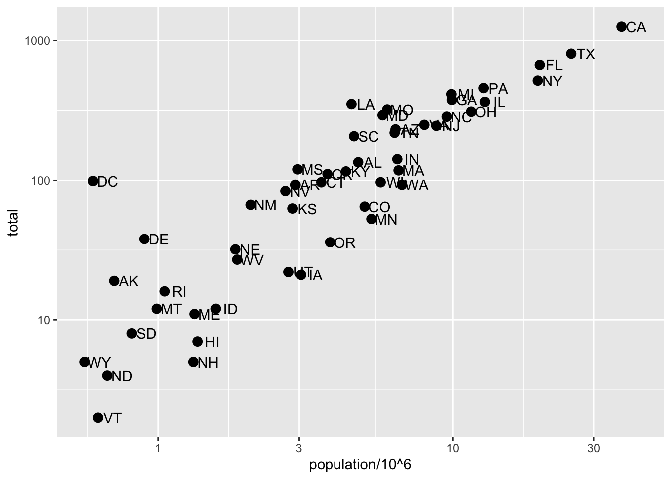
# efficient log scaling of the axes
p + geom_point(size = 3) +
    geom_text(nudge_x = 0.075) +
    scale_x_log10() +
    scale_y_log10()
Code: Add labels and title
p + geom_point(size = 3) +
    geom_text(nudge_x = 0.075) +
    scale_x_log10() +
    scale_y_log10() +
    xlab("Population in millions (log scale)") +
    ylab("Total number of murders (log scale)") +
    ggtitle("US Gun Murders in 2010")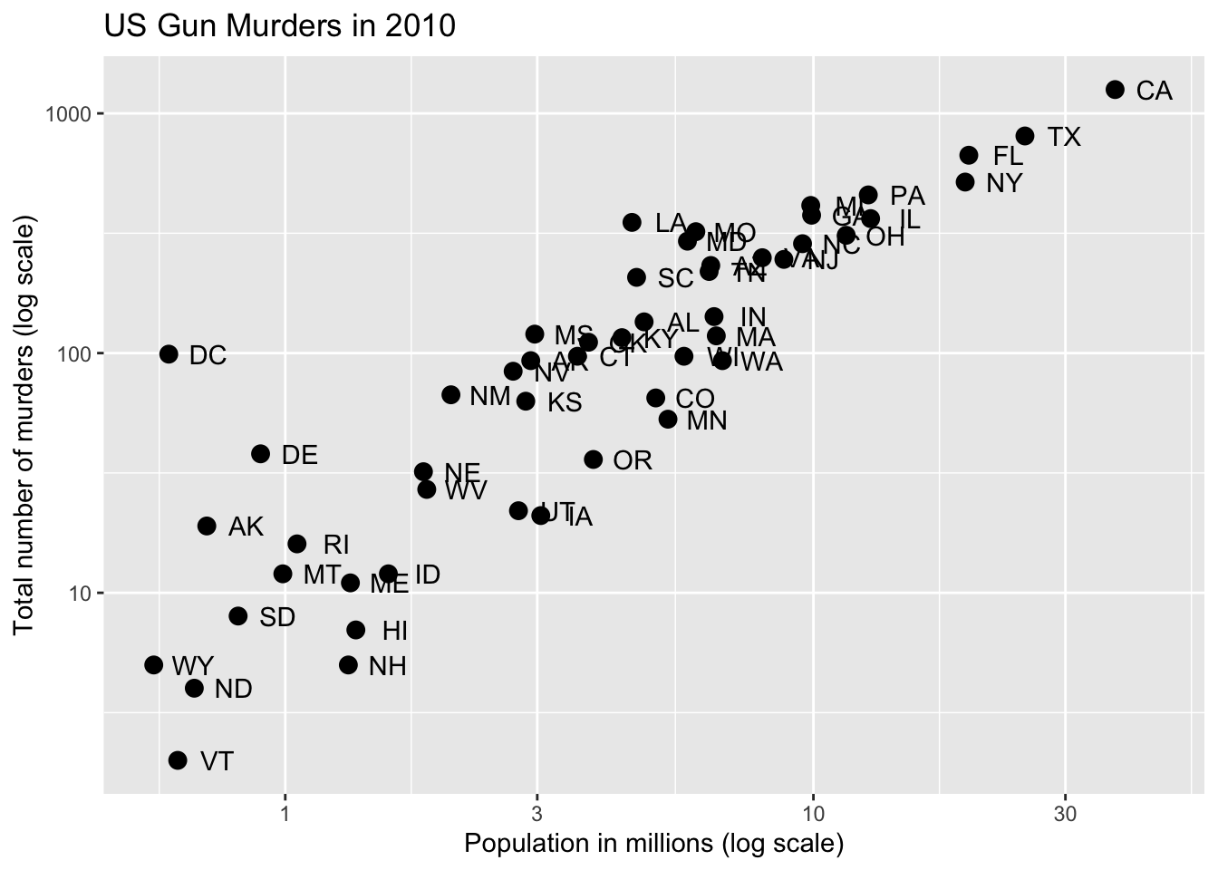
Code: Change color of the points
# redefine p to be everything except the points layer
p <- murders %>%
    ggplot(aes(population/10^6, total, label = abb)) +
    geom_text(nudge_x = 0.075) +
    scale_x_log10() +
    scale_y_log10() +
    xlab("Population in millions (log scale)") +
    ylab("Total number of murders (log scale)") +
    ggtitle("US Gun Murders in 2010")

# make all points blue
p + geom_point(size = 3, color = "blue")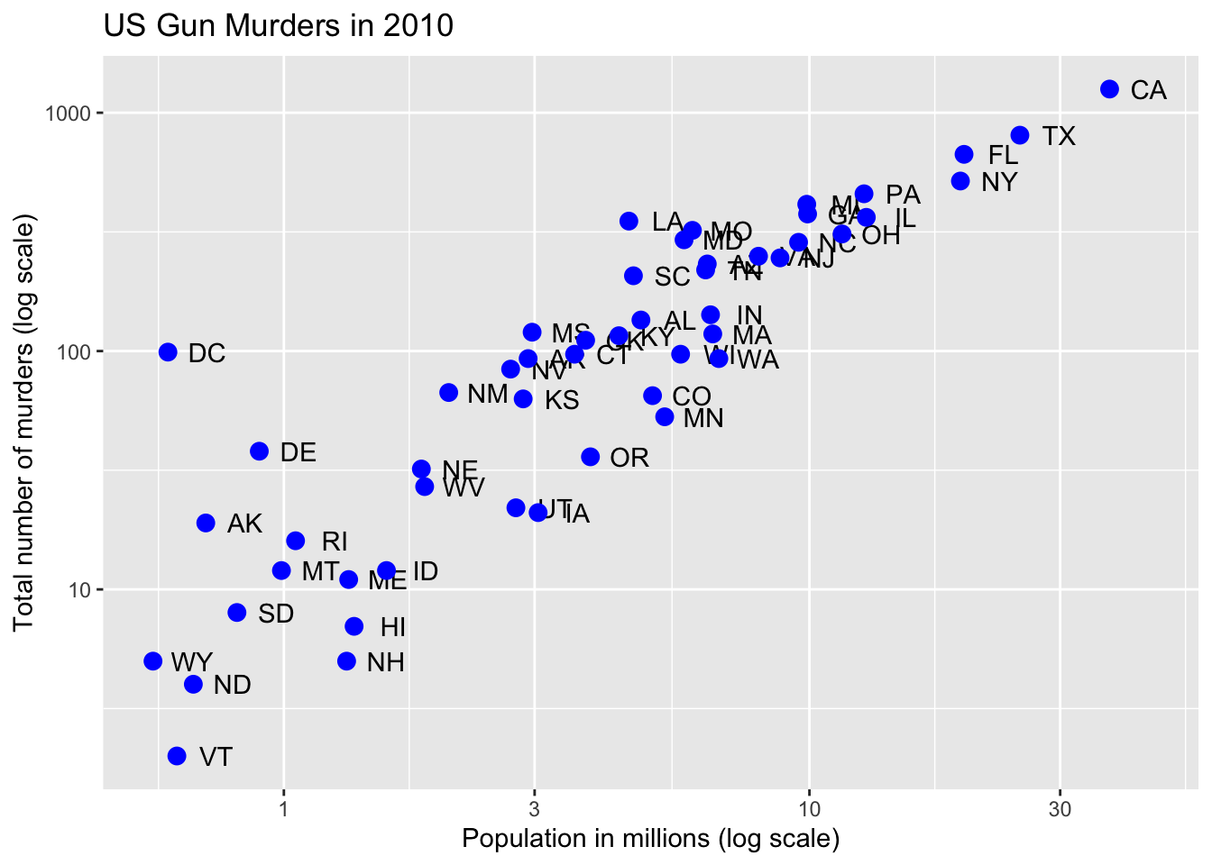
# color points by region
p + geom_point(aes(col = region), size = 3)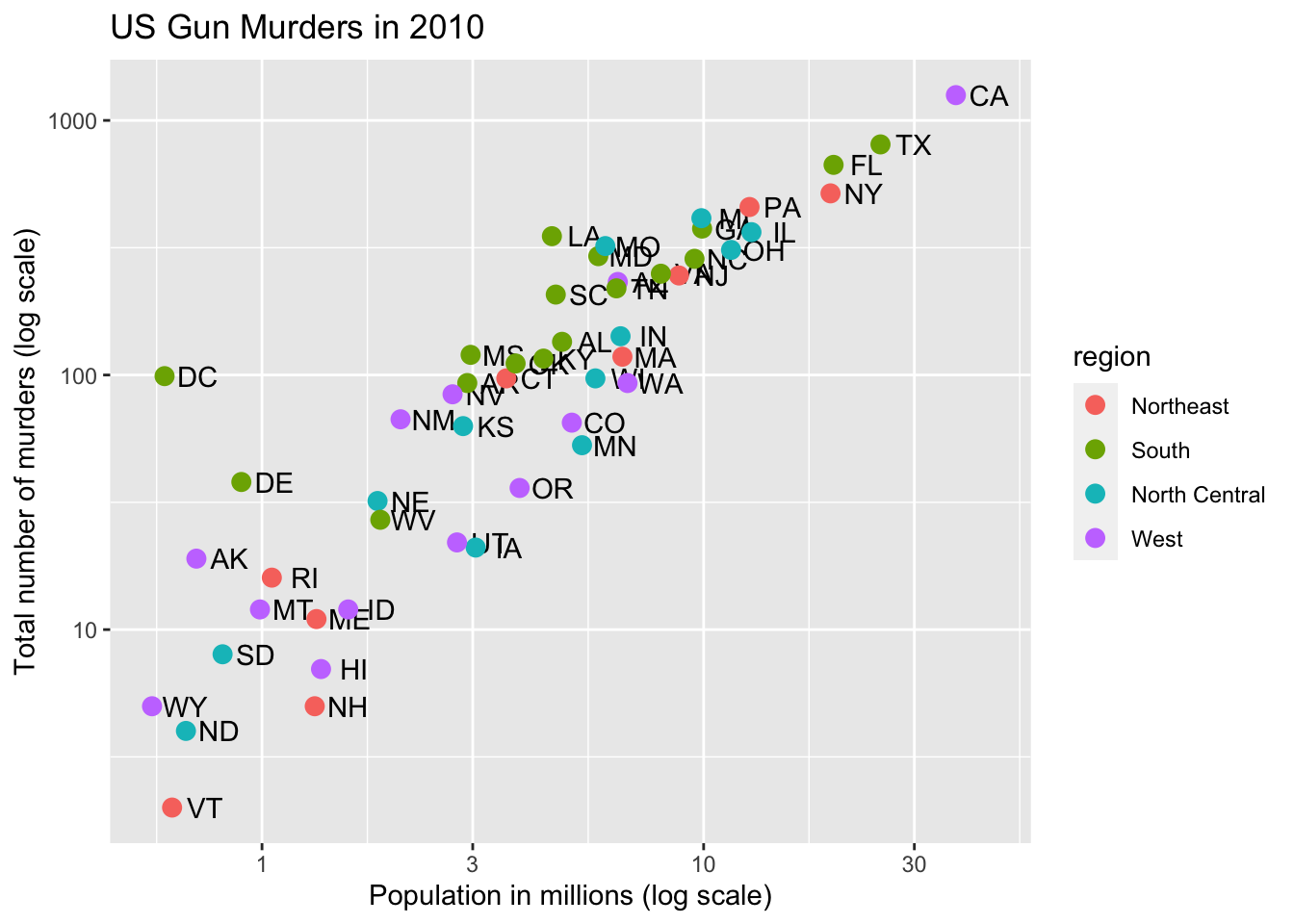
Code: Add a line with average murder rate
# define average murder rate
r <- murders %>%
    summarize(rate = sum(total) / sum(population) * 10^6) %>%
    pull(rate)

# basic line with average murder rate for the country
p + geom_point(aes(col = region), size = 3) +
    geom_abline(intercept = log10(r))    # slope is default of 1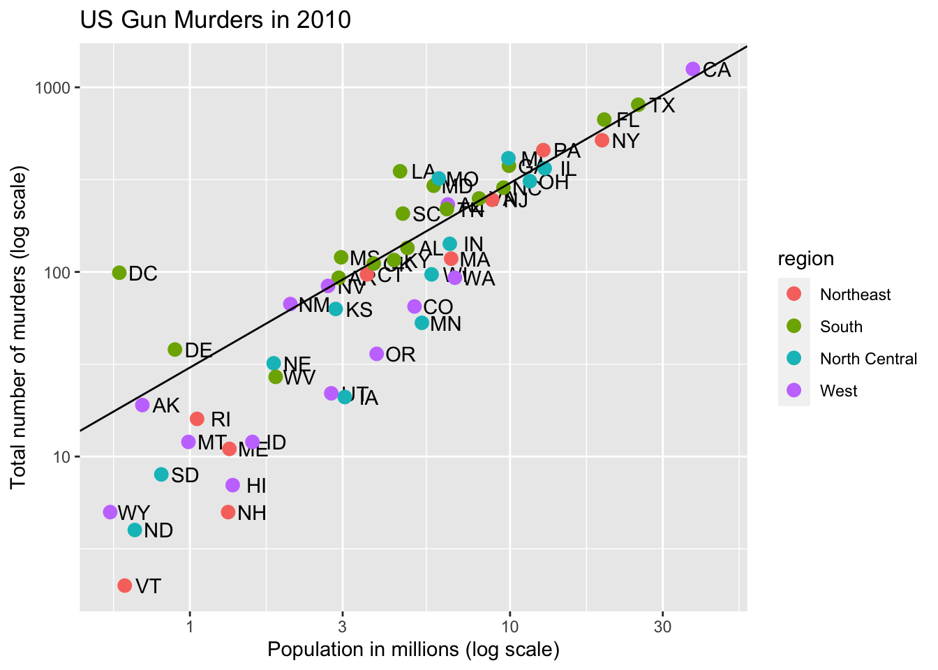
# change line to dashed and dark grey, line under points
p +
    geom_abline(intercept = log10(r), lty = 2, color = "darkgrey") +
    geom_point(aes(col = region), size = 3)
Code: Change legend title
p <- p + scale_color_discrete(name = "Region") # capitalize legend title3.7 Add-on Packages
The textbook for this section is available here and here.
Key points
- The style of a ggplot graph can be changed using the
themefunction. - The ggthemes package adds additional themes.
- The ggrepel package includes a geometry that repels text labels, ensuring they do not overlap with each other:
geom_text_repel.
Code: Adding themes
if(!require(ggthemes)) install.packages("ggthemes")## Loading required package: ggthemes# theme used for graphs in the textbook and course
ds_theme_set()
# themes from ggthemes
library(ggthemes)
p + theme_economist() # style of the Economist magazine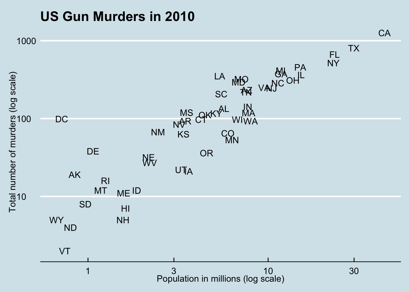
p + theme_fivethirtyeight() # style of the FiveThirtyEight website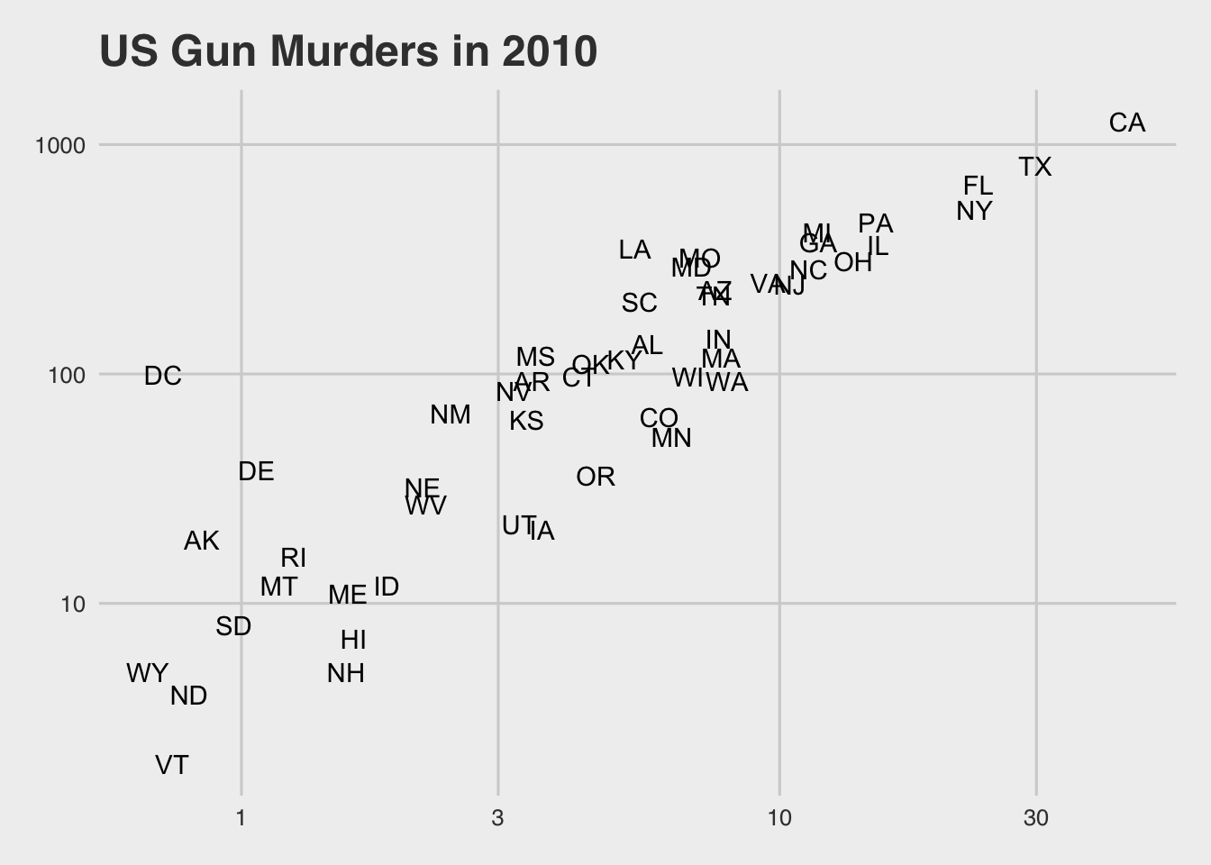
Code: Putting it all together to assemble the plot
if(!require(ggrepel)) install.packages("ggrepel")## Loading required package: ggrepel# load libraries
library(ggrepel)
# define the intercept
r <- murders %>%
summarize(rate = sum(total) / sum(population) * 10^6) %>%
.$rate
# make the plot, combining all elements
murders %>%
ggplot(aes(population/10^6, total, label = abb)) +
geom_abline(intercept = log10(r), lty = 2, color = "darkgrey") +
geom_point(aes(col = region), size = 3) +
geom_text_repel() +
scale_x_log10() +
scale_y_log10() +
xlab("Population in millions (log scale)") +
ylab("Total number of murders (log scale)") +
ggtitle("US Gun Murders in 2010") +
scale_color_discrete(name = "Region") +
theme_economist()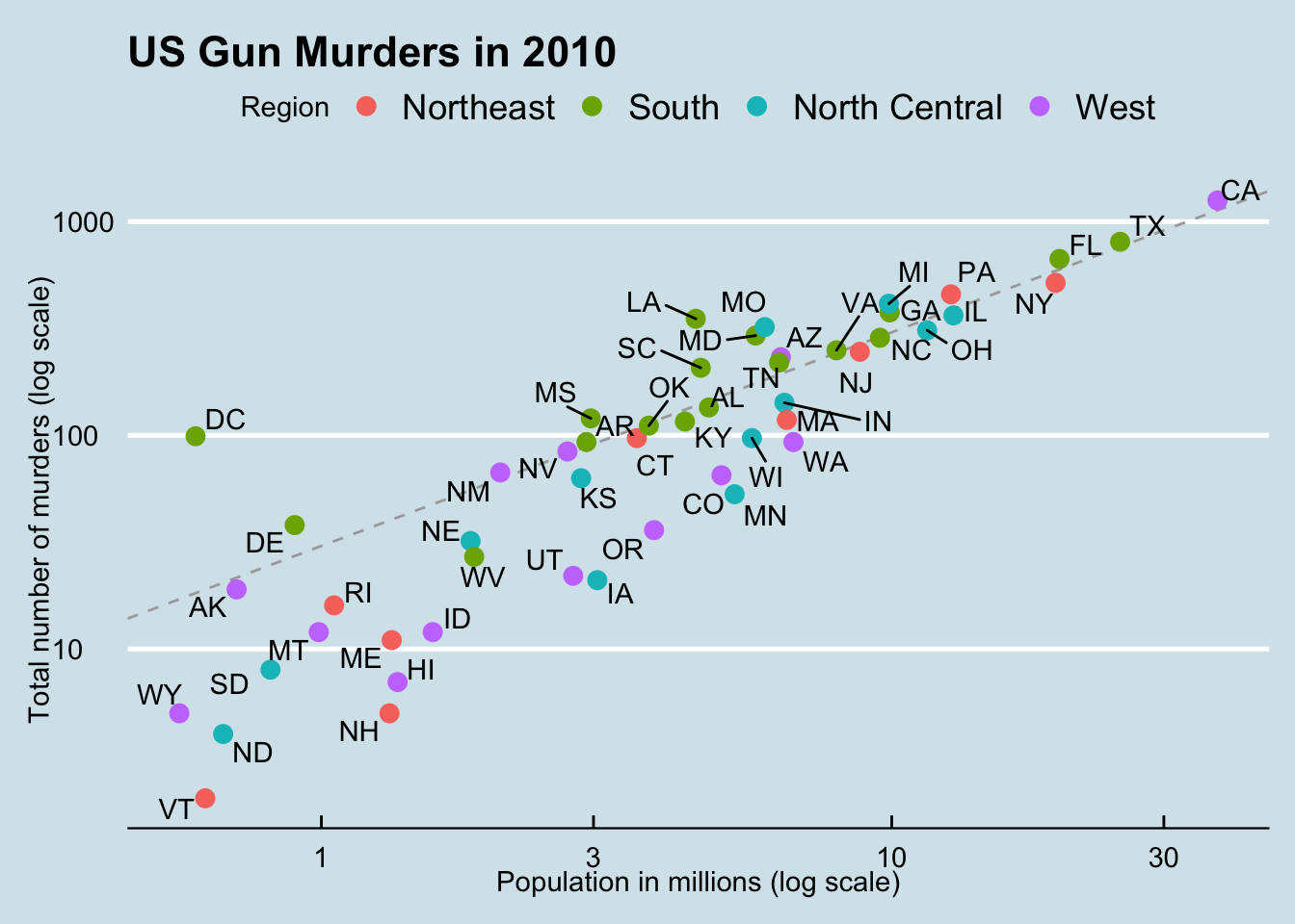
3.8 Other Examples
The textbook for this section is available:
Key points
geom_histogramcreates a histogram. Use thebinwidthargument to change the width of bins, thefillargument to change the bar fill color, and thecolargument to change bar outline color.geom_densitycreates smooth density plots. Change the fill color of the plot with thefillargument.geom_qqcreates a quantile-quantile plot. This geometry requires thesampleargument. By default, the data are compared to a standard normal distribution with a mean of 0 and standard deviation of 1. This can be changed with thedparamsargument, or the sample data can be scaled.- Plots can be arranged adjacent to each other using the
grid.arrangefunction from thegridExtrapackage. First, create the plots and save them to objects (p1, p2, …). Then pass the plot objects togrid.arrange.
Code: Histograms in ggplot2
# define p
p <- heights %>%
    filter(sex == "Male") %>%
    ggplot(aes(x = height))

# basic histograms
p + geom_histogram()
## `stat_bin()` using `bins = 30`. Pick better value with `binwidth`.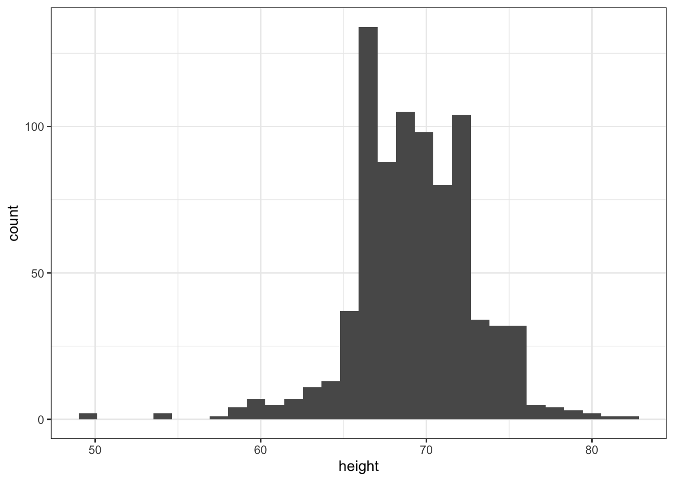
p + geom_histogram(binwidth = 1)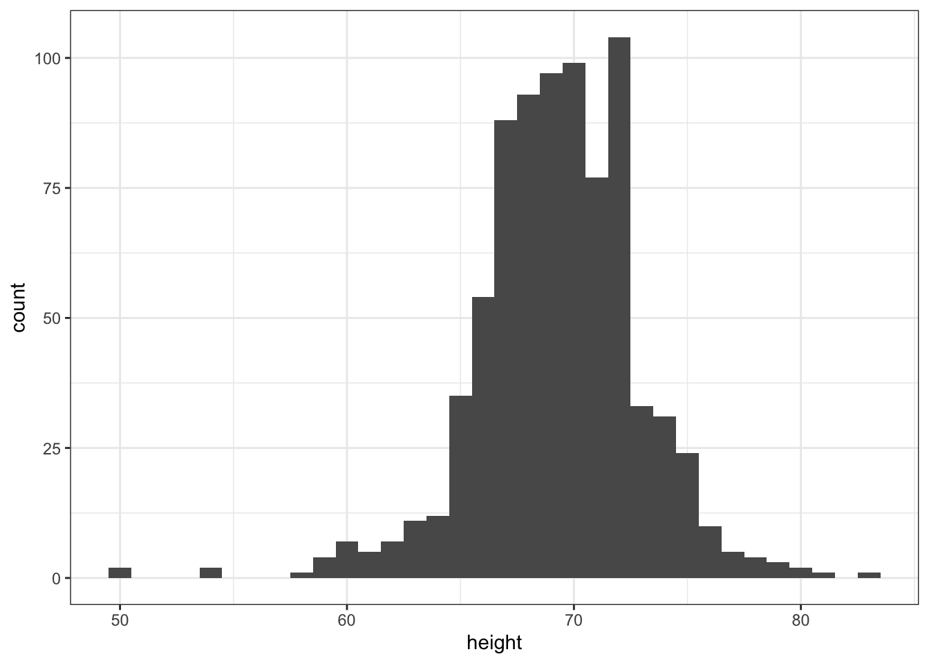
# histogram with blue fill, black outline, labels and title
p + geom_histogram(binwidth = 1, fill = "blue", col = "black") +
    xlab("Male heights in inches") +
    ggtitle("Histogram")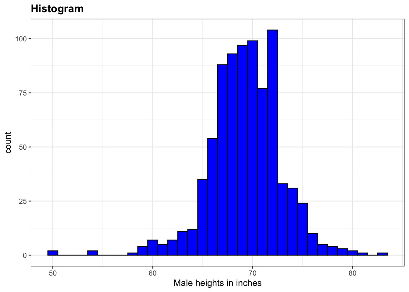
Code: Smooth density plots in ggplot2
p + geom_density()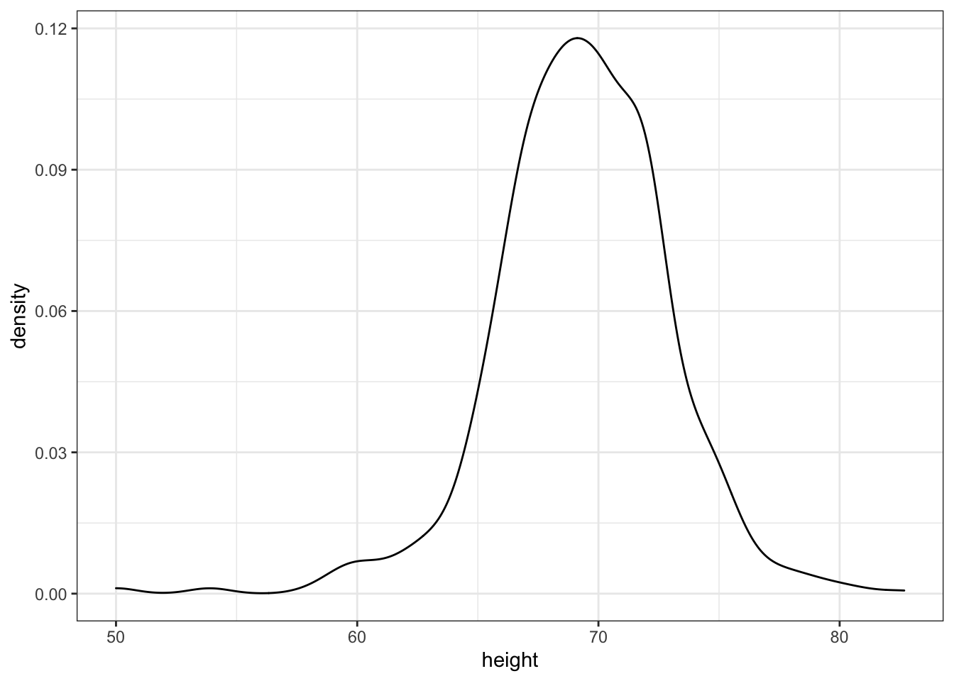
p + geom_density(fill = "blue")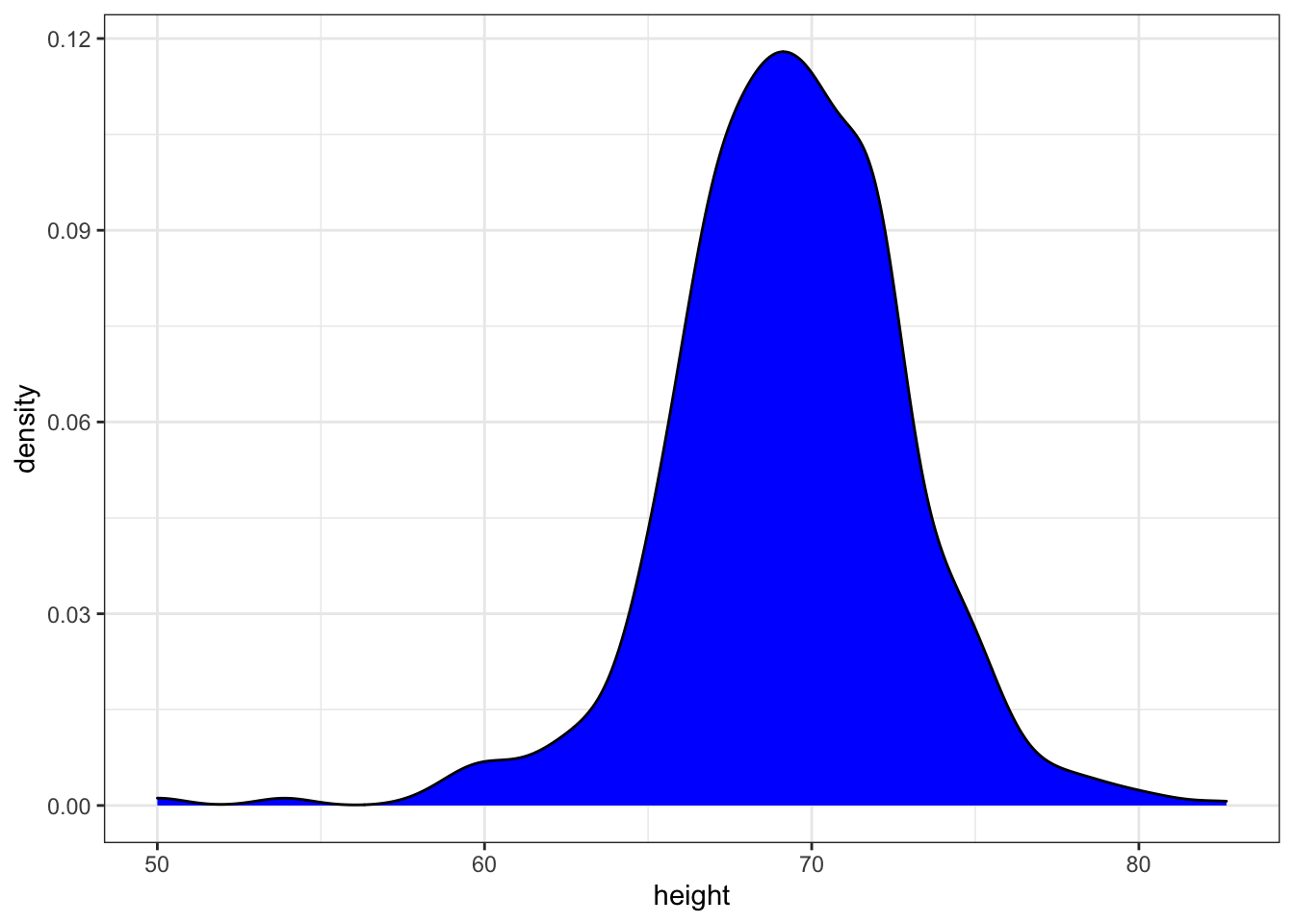
Code: Quantile-quantile plots in ggplot2
# basic QQ-plot
p <- heights %>% filter(sex == "Male") %>%
    ggplot(aes(sample = height))
p + geom_qq()
# QQ-plot against a normal distribution with same mean/sd as data
params <- heights %>%
    filter(sex == "Male") %>%
    summarize(mean = mean(height), sd = sd(height))
p + geom_qq(dparams = params) +
    geom_abline()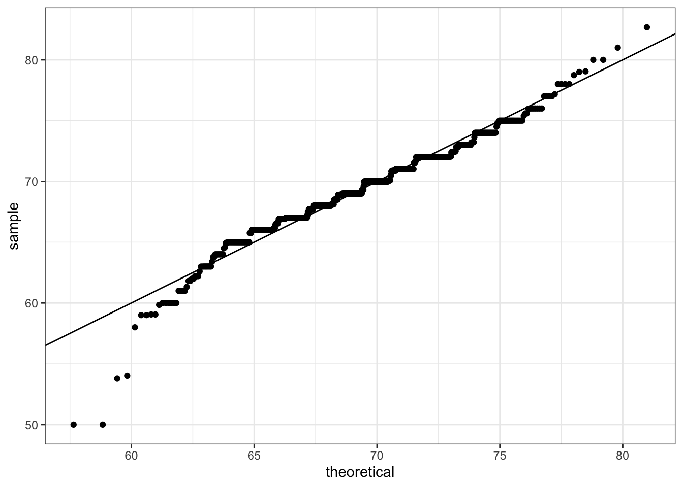
# QQ-plot of scaled data against the standard normal distribution
heights %>%
    ggplot(aes(sample = scale(height))) +
    geom_qq() +
    geom_abline()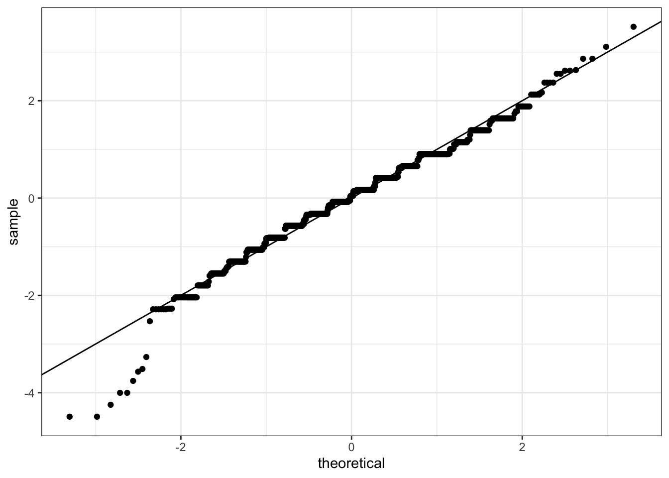
Code: Grids of plots with the grid.extra package
if(!require(gridExtra)) install.packages("gridExtra")## Loading required package: gridExtra##
## Attaching package: 'gridExtra'## The following object is masked from 'package:dplyr':
##
## combine# define plots p1, p2, p3
p <- heights %>% filter(sex == "Male") %>% ggplot(aes(x = height))
p1 <- p + geom_histogram(binwidth = 1, fill = "blue", col = "black")
p2 <- p + geom_histogram(binwidth = 2, fill = "blue", col = "black")
p3 <- p + geom_histogram(binwidth = 3, fill = "blue", col = "black")
# arrange plots next to each other in 1 row, 3 columns
library(gridExtra)
grid.arrange(p1, p2, p3, ncol = 3)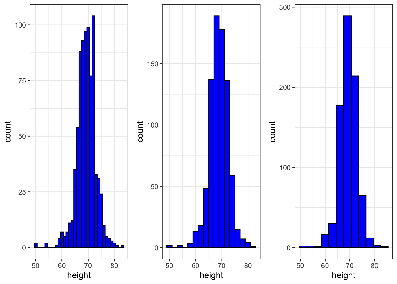
3.9 Assessment - ggplot2
- Start by loading the dplyr and ggplot2 libraries as well as the
murdersdata.
library(dplyr)
library(ggplot2)
library(dslabs)
data(murders)
Note that you can load both dplyr and ggplot2, as well as other packages, by installing and loading the tidyverse package.
With ggplot2 plots can be saved as objects. For example we can associate a dataset with a plot object like this
p <- ggplot(data = murders)Because data is the first argument we don’t need to spell it out. So we can write this instead:
p <- ggplot(murders)or, if we load dplyr, we can use the pipe:
p <- murders %>% ggplot()Remember the pipe sends the object on the left of %>% to be the first argument for the function the right of %>%.
Now let’s get an introduction to ggplot.
if(!require(dplyr)) install.packages("dplyr")

library(dplyr)
p <- ggplot(murders)
class(p)
## [1] "gg" "ggplot"- Remember that to print an object you can use the command
printor simply type the object. For example, instead of
x <- 2
print(x)
you can simply type
x <-2
x
Print the object p defined in exercise one
p <- ggplot(murders)and describe what you see.
- A. Nothing happens.
- B. A blank slate plot.
- C. A scatter plot.
- D. A histogram.
- Now we are going to review the use of pipes by seeing how they can be used with
ggplot.
# define ggplot object called p like in the previous exercise but using a pipe
p <- heights %>% ggplot()
p # a blank slate plot
- Now we are going to add layers and the corresponding aesthetic mappings. For the murders data, we plotted total murders versus population sizes in the videos.
Explore the murders data frame to remind yourself of the names for the two variables (total murders and population size) we want to plot and select the correct answer.
- A. state and abb.
- B. total_murders and population_size.
- C. total and population.
- D. murders and size.
- To create a scatter plot, we add a layer with the function
geom_point.
The aesthetic mappings require us to define the x-axis and y-axis variables respectively. So the code looks like this:
murders %>% ggplot(aes(x = , y = )) +
  geom_point()
except we have to fill in the blanks to define the two variables x and y.
## Fill in the blanks
murders %>% ggplot(aes(x =population , y =total )) +
  geom_point()
- Note that if we don’t use argument names, we can obtain the same plot by making sure we enter the variable names in the desired order.
murders %>% ggplot(aes(population, total)) +
  geom_point()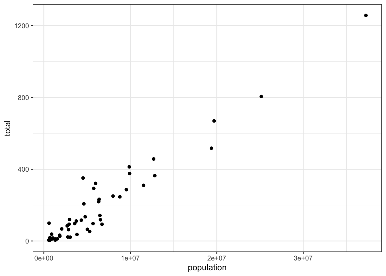
- If instead of points we want to add text, we can use the geom_text() or geom_label() geometries.
However, note that the following code
murders %>% ggplot(aes(population, total)) +
  geom_label()
will give us the error message: Error: geom_label requires the following missing aesthetics: label
Why is this?
- A. We need to map a character to each point through the label argument in aes.
- B. We need to let geom_label know what character to use in the plot.
- C. The geom_label geometry does not require x-axis and y-axis values.
- D. geom_label is not a ggplot2 command.
- You can also add labels to the points on a plot.
## edit the next line to add the label
murders %>% ggplot(aes(population, total, label = abb)) + geom_label()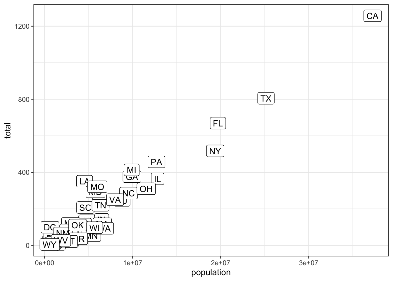
- Now let’s change the color of the labels to blue. How can we do this?
- A. By adding a column called blue to murders
- B. By mapping the colors through aes because each label needs a different color
- C. By using the color argument in ggplot
- D. By using the color argument in geom_label because we want all colors to be blue so we do not need to map colors
- Now let’s go ahead and make the labels blue. We previously wrote this code to add labels to our plot:
murders %>% ggplot(aes(population, total, label= abb)) +
  geom_label()
Now we will edit this code.
murders %>% ggplot(aes(population, total,label= abb)) +
  geom_label(color="blue")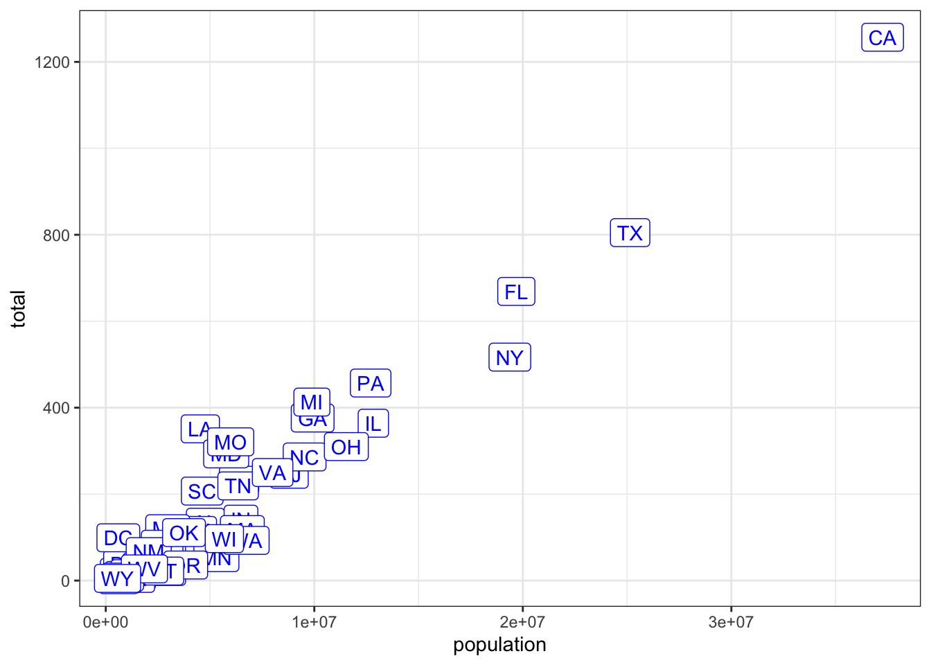
- Now suppose we want to use color to represent the different regions.
So the states from the West will be one color, states from the Northeast another, and so on.
In this case, which of the following is most appropriate:
- A. Adding a column called color to murders with the color we want to use
- B. Mapping the colors through the color argument of aes because each label needs a different color
- C. Using the color argument in ggplot
- D. Using the color argument in geom_label because we want all colors to be blue so we do not need to map colors
- We previously used this code to make a plot using the state abbreviations as labels:
murders %>% ggplot(aes(population, total, label = abb)) +
  geom_label()
We are now going to add color to represent the region.
## edit this code
murders %>% ggplot(aes(population, total, label = abb, color=region)) +
  geom_label()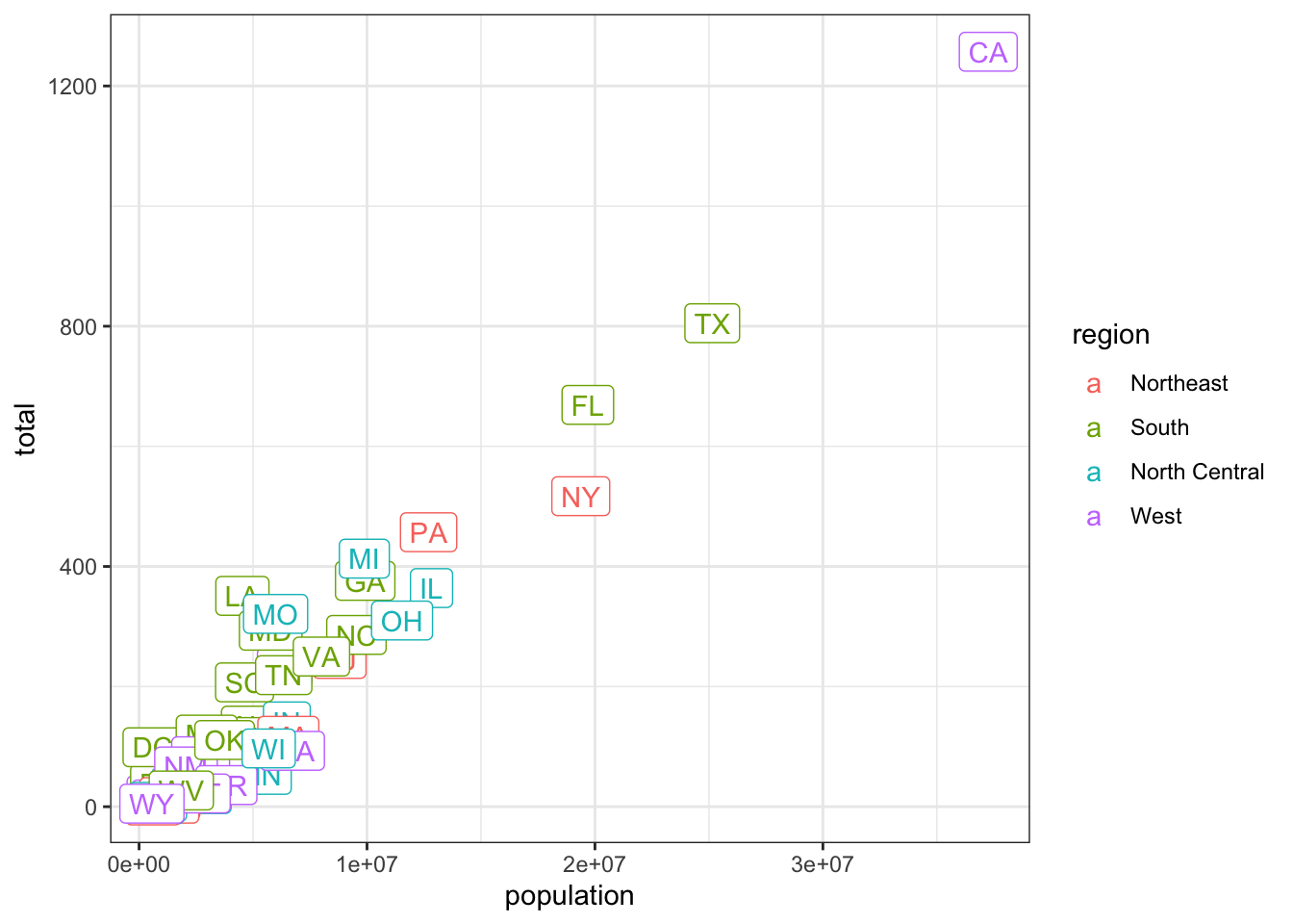
- Now we are going to change the axes to log scales to account for the fact that the population distribution is skewed.
Let’s start by defining an object p that holds the plot we have made up to now:
p <- murders %>% ggplot(aes(population, total, label = abb, color = region)) +
  geom_label()
To change the x-axis to a log scale we learned about the scale_x_log10() function. We can change the axis by adding this layer to the object p to change the scale and render the plot using the following code:
p + scale_x_log10()p <- murders %>% ggplot(aes(population, total, label = abb, color = region)) + geom_label()
## add layers to p here
p + scale_x_log10() + scale_y_log10()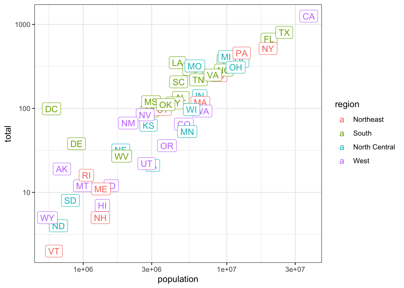
- In the previous exercises we created a plot using the following code:
library(dplyr)
library(ggplot2)
library(dslabs)
data(murders)
p<- murders %>% ggplot(aes(population, total, label = abb, color = region)) +
  geom_label()
p + scale_x_log10() + scale_y_log10()
We are now going to add a title to this plot. We will do this by adding yet another layer, this time with the function ggtitle.
p <- murders %>% ggplot(aes(population, total, label = abb, color = region)) + geom_label()
# add a layer to add title to the next line
p + scale_x_log10() + scale_y_log10() + ggtitle("Gun murder data")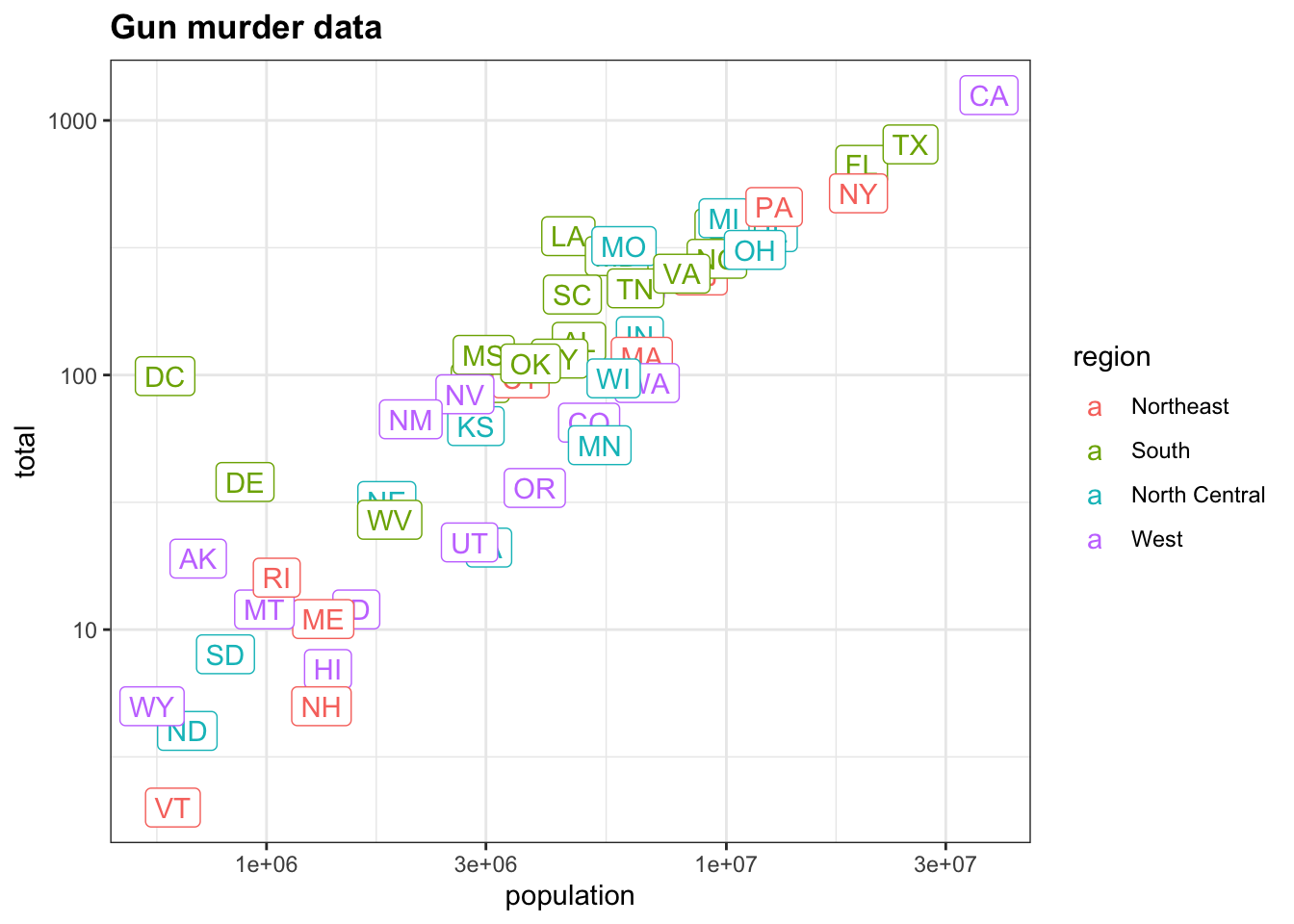
- We are going to shift our focus from the
murdersdataset to explore theheightsdataset.
We use the geom_histogram function to make a histogram of the heights in the heights data frame. When reading the documentation for this function we see that it requires just one mapping, the values to be used for the histogram.
What is the variable containing the heights in inches in the heights data frame?
- A. sex
- B. heights
- C. height
- D. heights$height
- We are now going to make a histogram of the heights so we will load the heights dataset.
The following code has been pre-run for you to load the heights dataset:
library(dplyr)
library(ggplot2)
library(dslabs)
data(heights)
# define p here
p <- heights %>% ggplot(aes(height))- Now we are ready to add a layer to actually make the histogram.
p <- heights %>%
  ggplot(aes(height))
## add a layer to p
p + geom_histogram()
## `stat_bin()` using `bins = 30`. Pick better value with `binwidth`.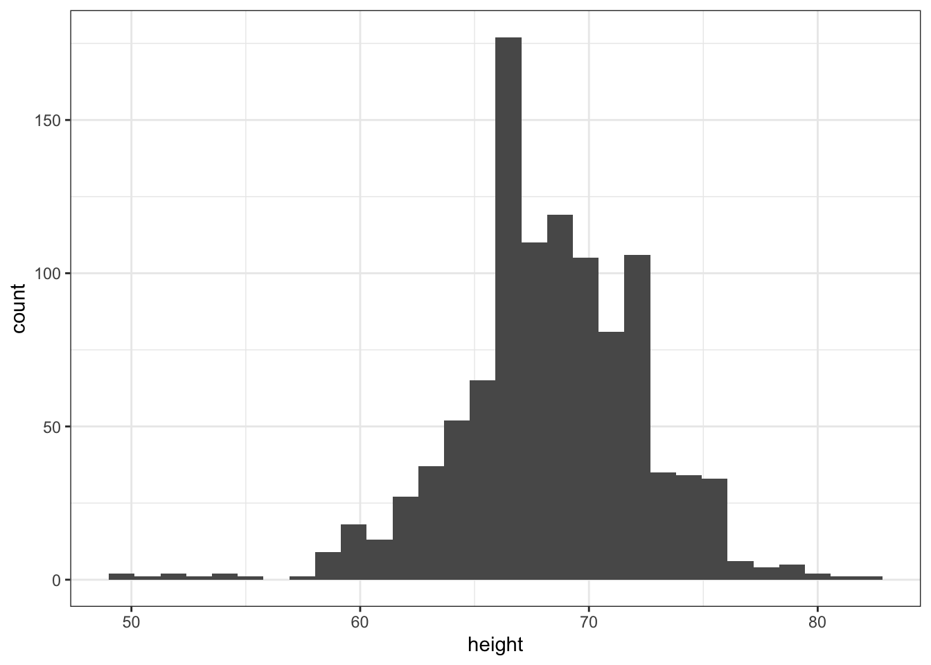
- Note that when we run the code from the previous exercise we get the following warning:
stat_bin() using bins = 30. Pick better value with binwidth.p <- heights %>%
ggplot(aes(height))
## add the geom_histogram layer but with the requested argument
p + geom_histogram(binwidth = 1)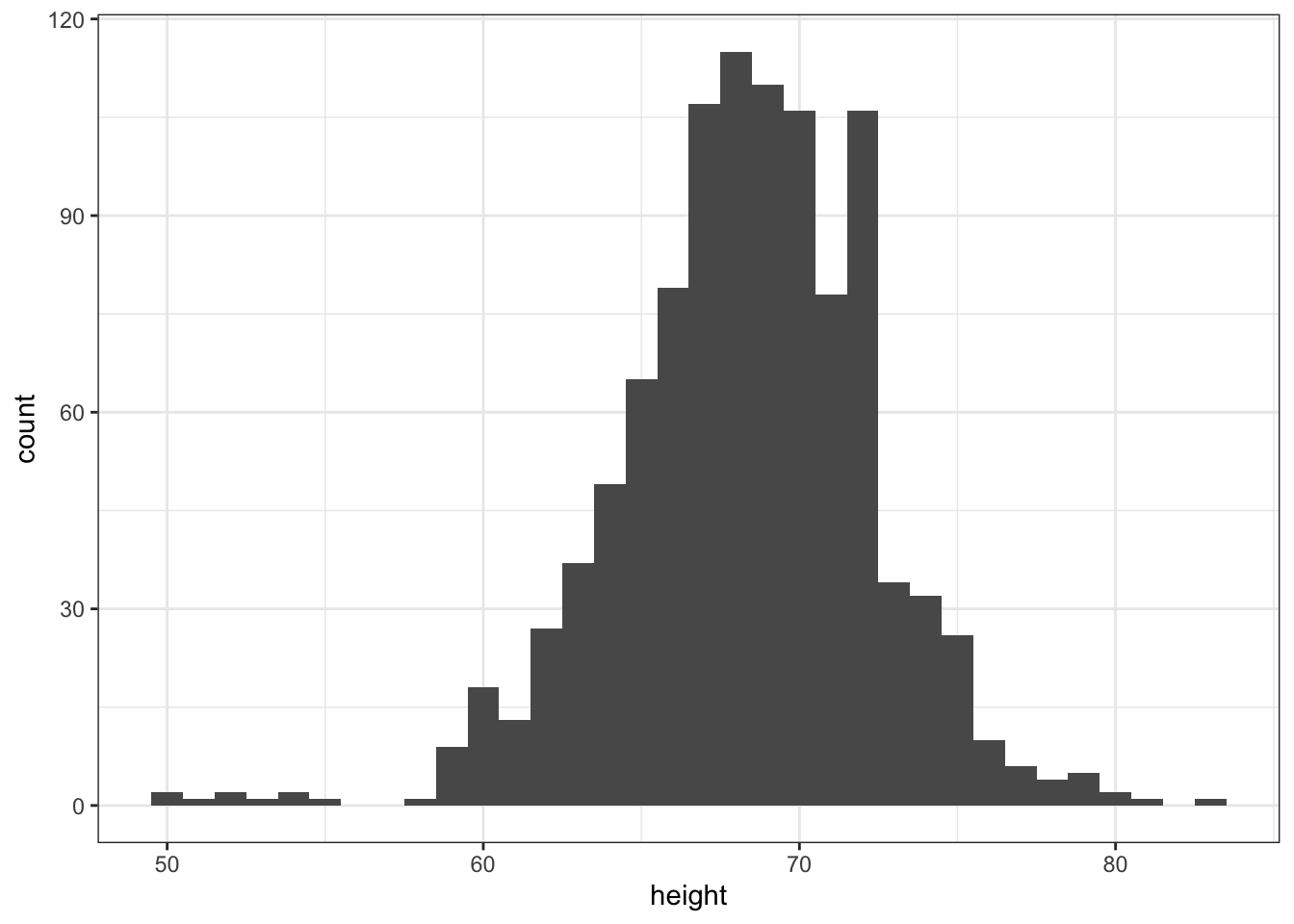
- Now instead of a histogram we are going to make a smooth density plot.
In this case, we will not make an object p. Instead we will render the plot using a single line of code. In the previous exercise, we could have created a histogram using one line of code like this:
heights %>%
  ggplot(aes(height)) +
  geom_histogram()
## add the correct layer using +
heights %>%
ggplot(aes(height)) + geom_density()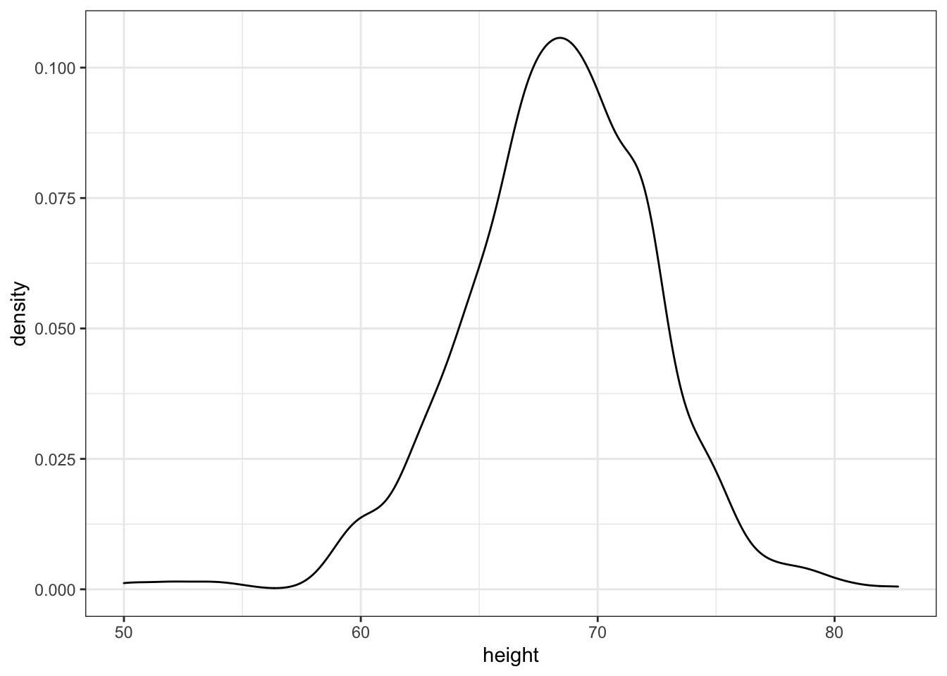
- Now we are going to make density plots for males and females separately.
We can do this using the group argument within the aes mapping. Because each point will be assigned to a different density depending on a variable from the dataset, we need to map within aes.
## add the group argument then a layer with +
heights %>%
  ggplot(aes(height, group = sex)) + geom_density()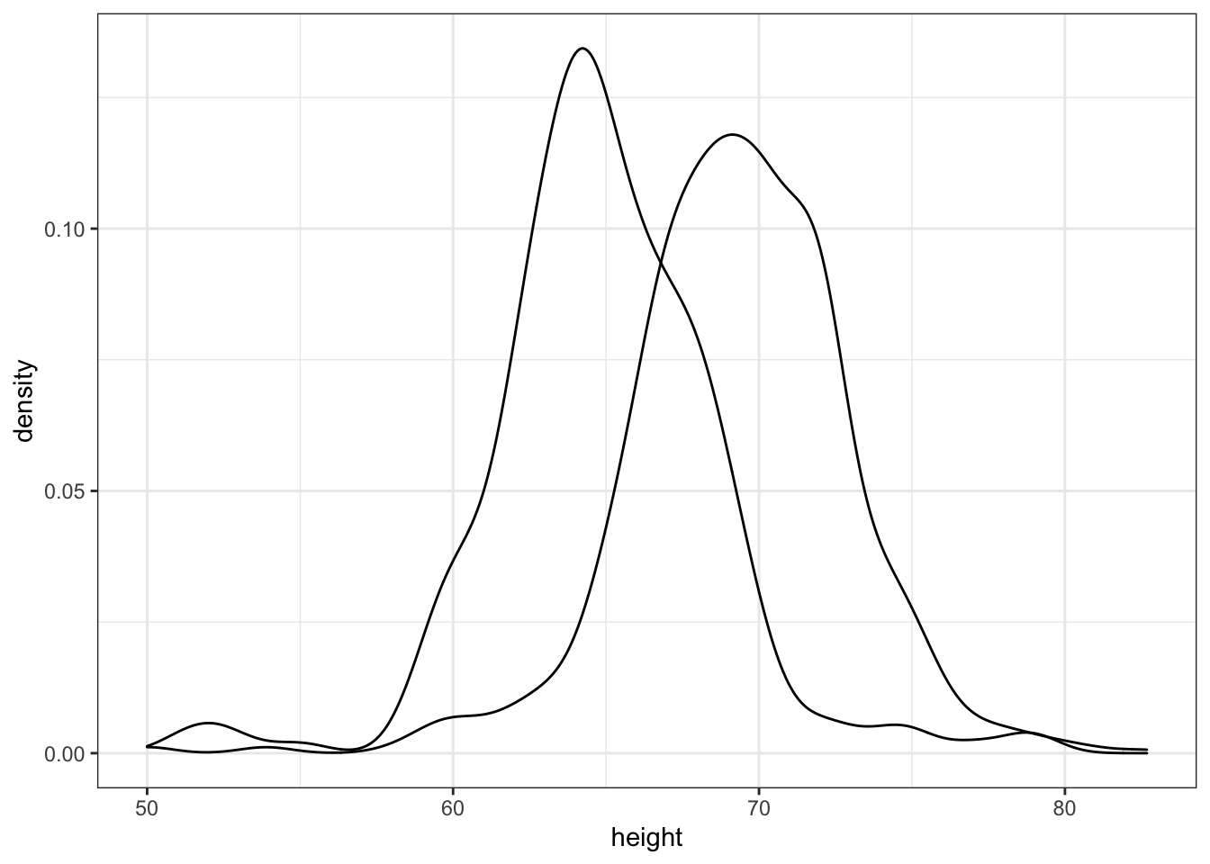
- In the previous exercise we made the two density plots, one for each sex, using:
heights %>%
  ggplot(aes(height, group = sex)) +
  geom_density()
We can also assign groups through the color or fill argument. For example, if you type color = sex ggplot knows you want a different color for each sex. So two densities must be drawn. You can therefore skip the group = sex mapping. Using color has the added benefit that it uses color to distinguish the groups. Change the density plots from the previous exercise to add color.
## edit the next line to use color instead of group then add a density layer
heights %>%
  ggplot(aes(height, color = sex)) + geom_density()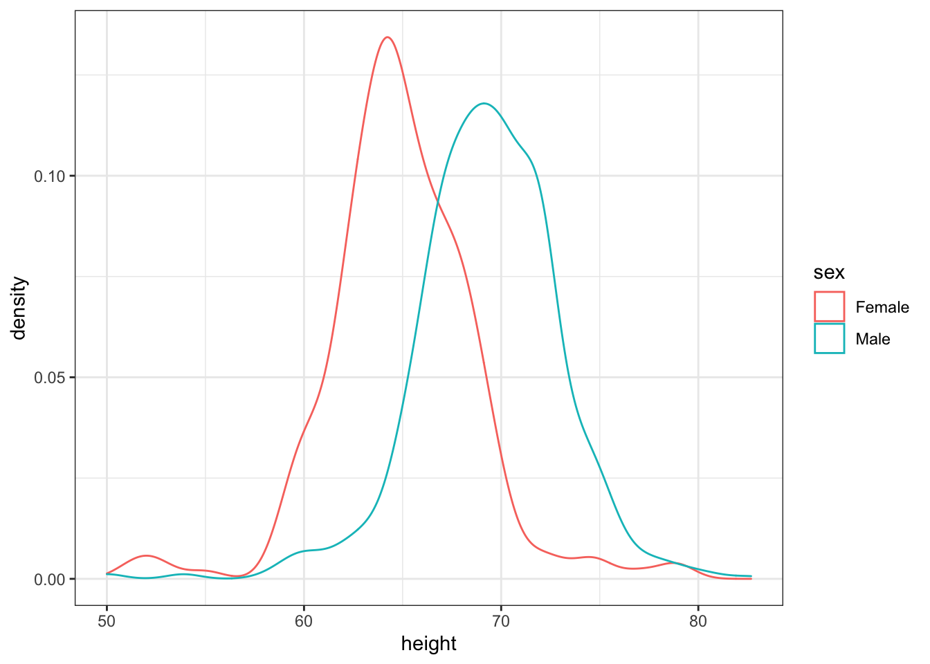
- We can also assign groups using the
fillargument.
When using the geom_density geometry, color creates a colored line for the smooth density plot while fill colors in the area under the curve.
We can see what this looks like by running the following code:
heights %>%
  ggplot(aes(height, fill = sex)) +
  geom_density()
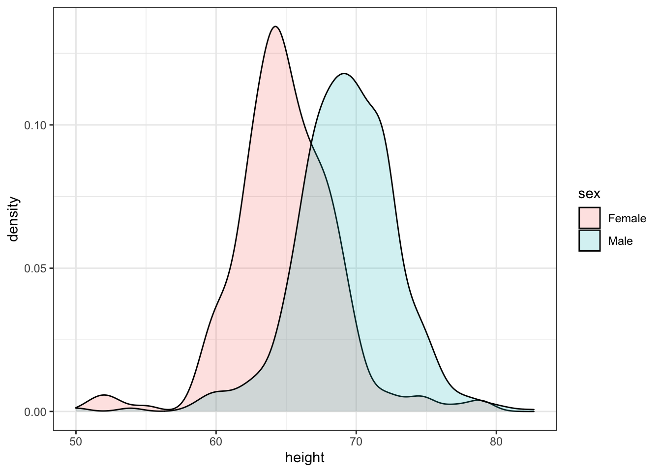
However, here the second density is drawn over the other. We can change this by using something called alpha blending.
heights %>%
  ggplot(aes(height, fill = sex)) +
geom_density(alpha=0.2) 