6 Section 5 Overview
Section 5 covers some general principles that can serve as guides for effective data visualization.
After completing Section 5, you will:
- understand basic principles of effective data visualization.
- understand the importance of keeping your goal in mind when deciding on a visualization approach.
- understand principles for encoding data, including position, aligned lengths, angles, area, brightness, and color hue.
- know when to include the number zero in visualizations.
- be able to use techniques to ease comparisons, such as using common axes, putting visual cues to be compared adjacent to one another, and using color effectively.
6.1 Introduction to Data Visualization Principles
The textbook for this section is available here.
Key points
- We aim to provide some general guidelines for effective data visualization.
- We show examples of plot styles to avoid, discuss how to improve them, and use these examples to explain research-based principles for effective visualization.
- When choosing a visualization approach, keep your goal and audience in mind.
6.2 Encoding Data Using Visual Cues
The textbook for this section is available here.
You can learn more about barplots in the textbook section on barplots.
Key points
- Visual cues for encoding data include position, length, angle, area, brightness and color hue.
- Position and length are the preferred way to display quantities, followed by angles, which are preferred over area. Brightness and color are even harder to quantify but can sometimes be useful.
- Pie charts represent visual cues as both angles and area, while donut charts use only area. Humans are not good at visually quantifying angles and are even worse at quantifying area. Therefore pie and donut charts should be avoided - use a bar plot instead. If you must make a pie chart, include percentages as labels.
- Bar plots represent visual cues as position and length. Humans are good at visually quantifying linear measures, making bar plots a strong alternative to pie or donut charts.
6.3 Know When to Include Zero
The textbook for this section is available here.
Key points
- When using bar plots, always start at 0. It is deceptive not to start at 0 because bar plots imply length is proportional to the quantity displayed. Cutting off the y-axis can make differences look bigger than they actually are.
- When using position rather than length, it is not necessary to include 0 (scatterplot, dot plot, boxplot).
6.4 Do Not Distort Quantities
The textbook for this section is available here.
Key points
- Make sure your visualizations encode the correct quantities.
- For example, if you are using a plot that relies on circle area, make sure the area (rather than the radius) is proportional to the quantity.
6.5 Order by a Meaningful Value
The textbook for this section is available here.
Key points
- It is easiest to visually extract information from a plot when categories are ordered by a meaningful value. The exact value on which to order will depend on your data and the message you wish to convey with your plot.
- The default ordering for categories is alphabetical if the categories are strings or by factor level if factors. However, we rarely want alphabetical order.
6.6 Assessment - Data Visualization Principles, Part 1
1: Pie charts are appropriate:
- A. When we want to display percentages.
- B. When ggplot2 is not available.
- C. When I am in a bakery.
- D. Never. Barplots and tables are always better.
- What is the problem with this plot?
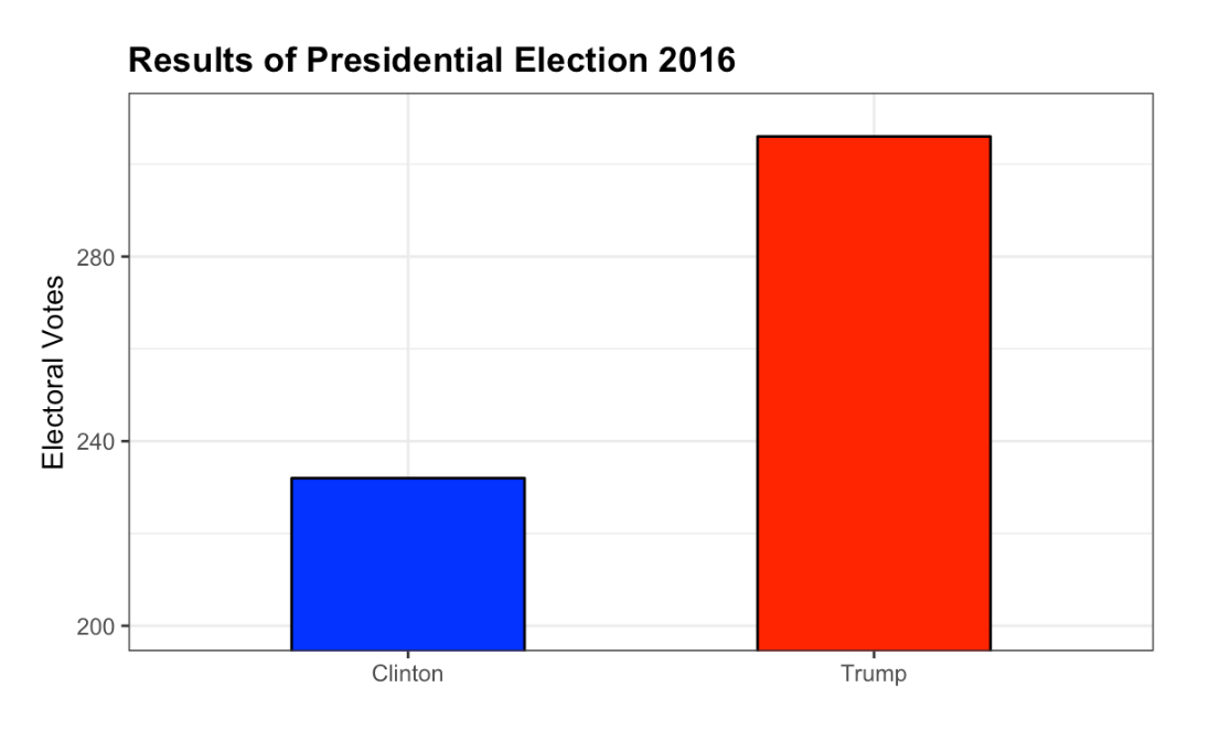
Result of Presidential Election 2016
- A. The values are wrong. The final vote was 306 to 232.
- B. The axis does not start at 0. Judging by the length, it appears Trump received 3 times as many votes when in fact it was about 30% more.
- C. The colors should be the same.
- D. Percentages should be shown as a pie chart.
- Take a look at the following two plots. They show the same information: rates of measles by state in the United States for 1928.
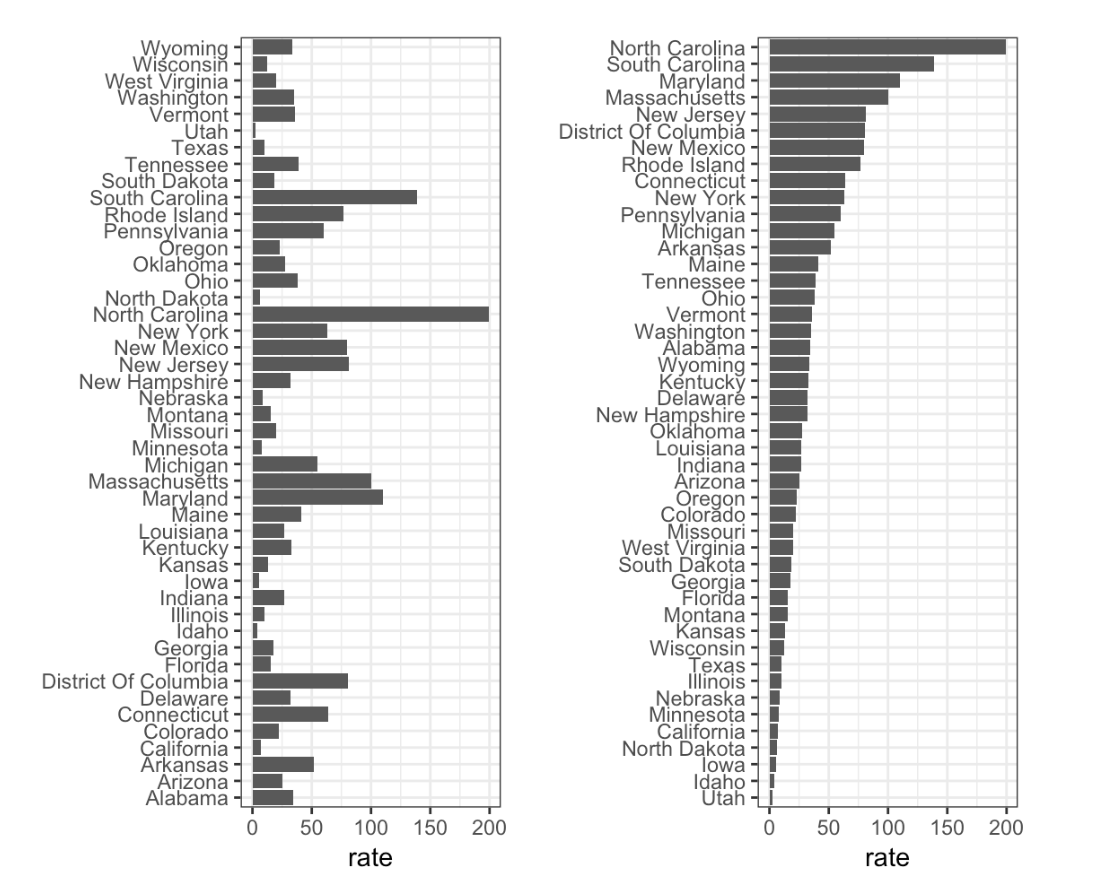
Rates of measles in the US for 1928
- A. Both plots provide the same information, so they are equally good.
- B. The plot on the left is better because it orders the states alphabetically.
- C. The plot on the right is better because it orders the states by disease rate so we can quickly see the states with highest and lowest rates.
- D. Both plots should be pie charts instead.
6.7 Show the Data
The textbook for this section is available here.
Key points
- A dynamite plot - a bar graph of group averages with error bars denoting standard errors - provides almost no information about a distribution.
- By showing the data, you provide viewers extra information about distributions.
Jitter is adding a small random shift to each point in order to minimize the number of overlapping points. To add jitter, use the
geom_jittergeometry instead ofgeom_point. - Alpha blending is making points somewhat transparent, helping visualize the density of overlapping points. Add an
alphaargument to the geometry.
Code
# dot plot showing the data
heights %>% ggplot(aes(sex, height)) + geom_point()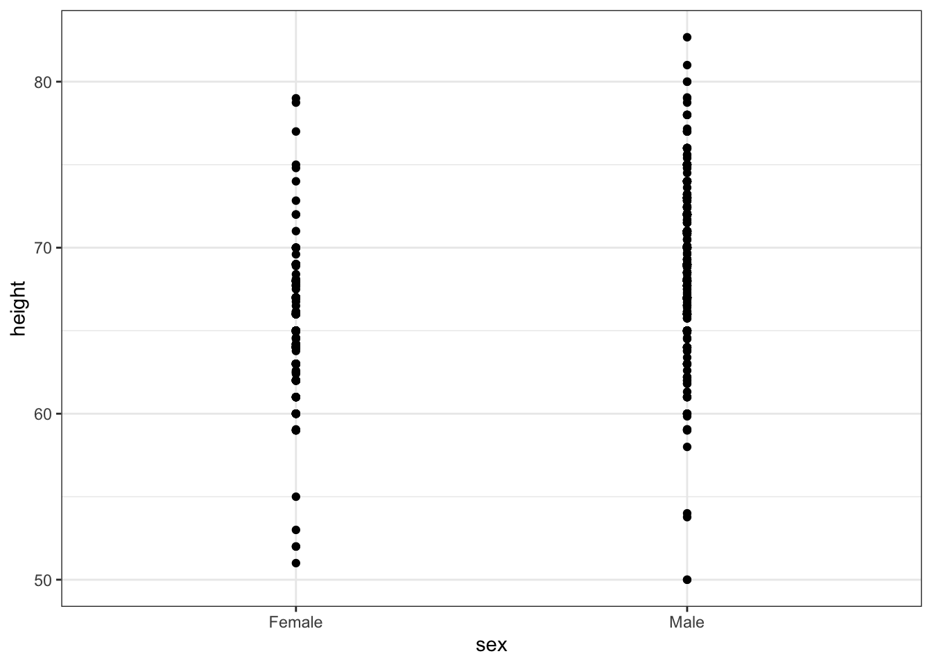
# jittered, alpha blended point plot
heights %>% ggplot(aes(sex, height)) + geom_jitter(width = 0.1, alpha = 0.2)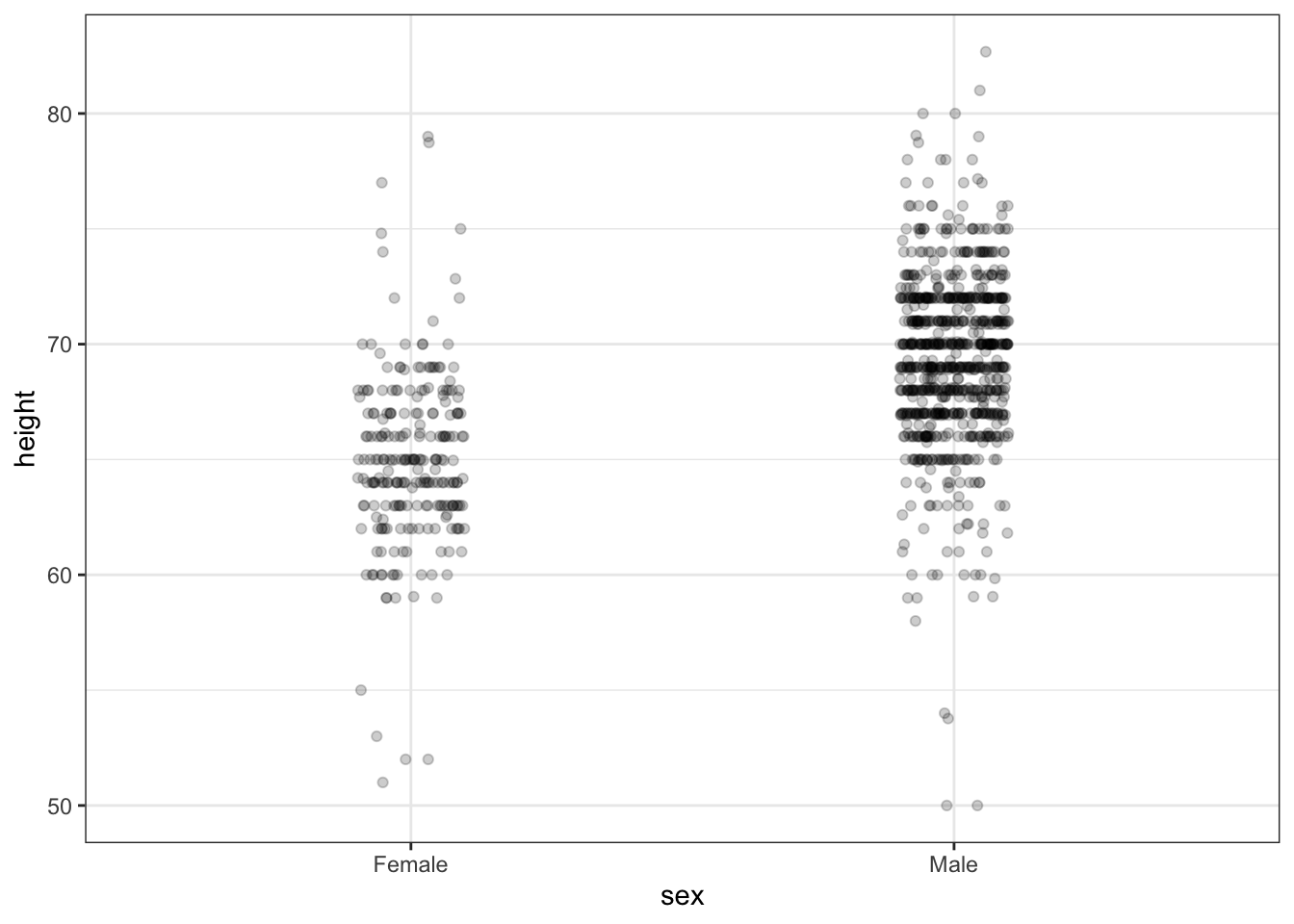
6.8 Ease Comparisons: Use Common Axes
The textbook for this section is available here.
Key points
- Ease comparisons by keeping axes the same when comparing data across multiple plots.
- Align plots vertically to see horizontal changes. Align plots horizontally to see vertical changes.
- Bar plots are useful for showing one number but not useful for showing distributions.
6.9 Consider Transformations
The textbook for this section is available here.
Key points
- Use transformations when warranted to ease visual interpretation.
- The log transformation is useful for data with multiplicative changes. The logistic transformation is useful for fold changes in odds. The square root transformation is useful for count data.
- We learned how to apply transformations earlier in the course.
6.10 Ease Comparisons: Compared Visual Cues Should Be Adjacent
The textbook for this section is available:
Key points
- When two groups are to be compared, it is optimal to place them adjacent in the plot.
- Use color to encode groups to be compared.
- Consider using a color blind friendly palette.
Code
color_blind_friendly_cols <- c("#999999", "#E69F00", "#56B4E9", "#009E73", "#F0E442", "#0072B2", "#D55E00", "#CC79A7")

p1 <- data.frame(x = 1:8, y = 1:8, col = as.character(1:8)) %>%
    ggplot(aes(x, y, color = col)) +
    geom_point(size = 5)
p1 + scale_color_manual(values = color_blind_friendly_cols)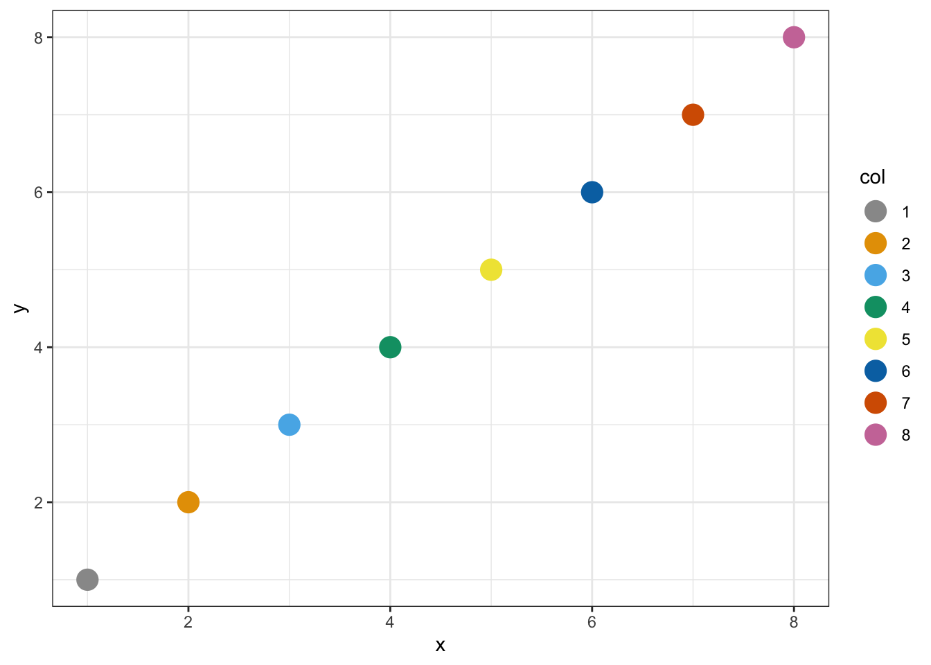
6.11 Assessment - Data Visualization Principles, Part 2
- To make the plot on the right in the exercise from the last set of assessments, we had to reorder the levels of the states’ variables.
dat <- us_contagious_diseases %>%
filter(year == 1967 & disease=="Measles" & !is.na(population)) %>% mutate(rate = count / population * 10000 * 52 / weeks_reporting)
state <- dat$state
rate <- dat$count/(dat$population/10000)*(52/dat$weeks_reporting)
state = reorder(state, rate)
levels(state)
## [1] "Georgia" "District Of Columbia" "Connecticut" "Minnesota" "Louisiana" "New Hampshire" "Maryland"
## [8] "Kansas" "New York" "Pennsylvania" "Rhode Island" "Massachusetts" "Missouri" "New Jersey"
## [15] "South Dakota" "Vermont" "Delaware" "Ohio" "Illinois" "Michigan" "Indiana"
## [22] "North Carolina" "South Carolina" "Hawaii" "Maine" "California" "Florida" "Iowa"
## [29] "Mississippi" "Oklahoma" "Nebraska" "Utah" "Alabama" "Kentucky" "Wisconsin"
## [36] "Montana" "Virginia" "Alaska" "Tennessee" "Idaho" "New Mexico" "Arizona"
## [43] "Nevada" "Arkansas" "Wyoming" "Colorado" "West Virginia" "Oregon" "Texas"
## [50] "North Dakota" "Washington"- Now we are going to customize this plot a little more by creating a rate variable and reordering by that variable instead.
dat <- us_contagious_diseases %>% filter(year == 1967 & disease=="Measles" & count>0 & !is.na(population)) %>%
  mutate(rate = count / population * 10000 * 52 / weeks_reporting)
dat %>% mutate(state = reorder(state, rate)) %>% ggplot(aes(state, rate)) +
  geom_bar(stat="identity") +
  coord_flip()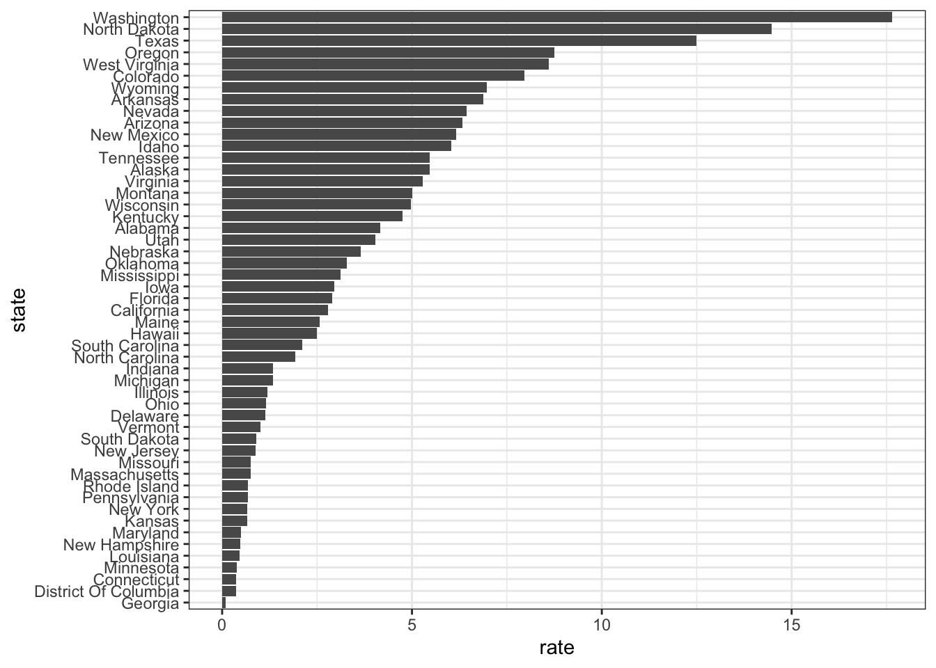
- Say we are interested in comparing gun homicide rates across regions of the US.
We see this plot and decide to move to a state in the western region.
What is the main problem with this interpretation?
library(dplyr)
library(ggplot2)
library(dslabs)
data("murders")
murders %>% mutate(rate = total/population*100000) %>%
  group_by(region) %>%
  summarize(avg = mean(rate)) %>%
  mutate(region = factor(region)) %>%
  ggplot(aes(region, avg)) +
  geom_bar(stat="identity") +
  ylab("Murder Rate Average")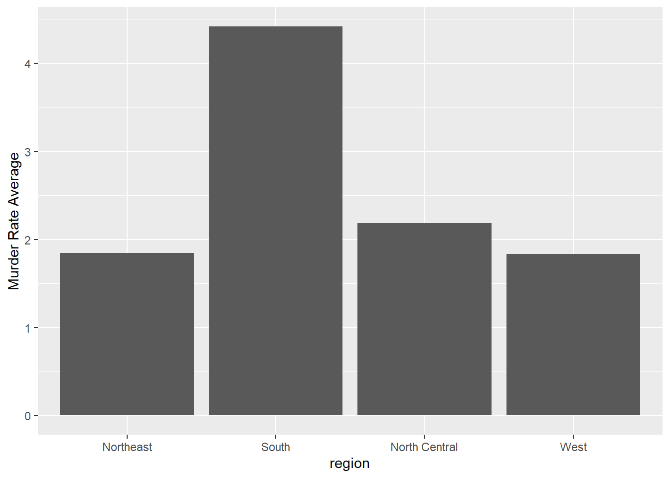
Rates of measles in the US for 1928
- A. The categories are ordered alphabetically.
- B. The graph does not show standard errors.
- C. It does not show all the data. We do not see the variability within a region and it’s possible that the safest states are not in the West.
- D. The Northeast has the lowest average.
- To further investigate whether moving to the western region is a wise decision, let’s make a box plot of murder rates by region, showing all points.
murders %>% mutate(rate = total/population*100000) %>% mutate(region = reorder(region, rate, FUN = median)) %>% ggplot(aes(region, rate)) + geom_boxplot() + geom_point()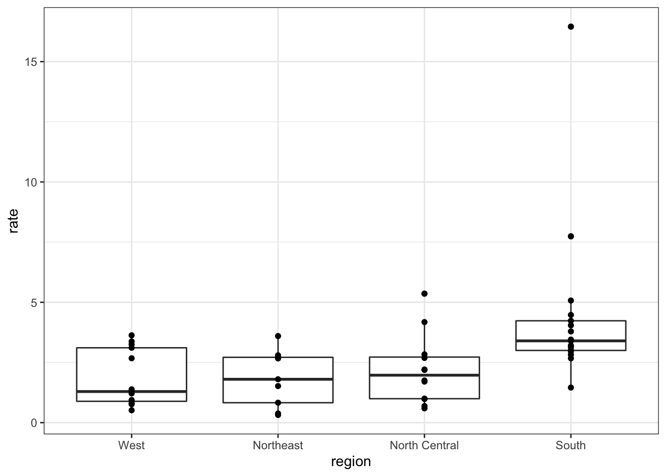
6.12 Slope Charts
The textbook for this section is available here.
Key points
- Consider using a slope chart or Bland-Altman plot when comparing one variable at two different time points, especially for a small number of observations.
- Slope charts use angle to encode change. Use
geom_lineto create slope charts. It is useful when comparing a small number of observations. - The Bland-Altman plot (Tukey mean difference plot, MA plot) graphs the difference between conditions on the y-axis and the mean between conditions on the x-axis. It is more appropriate for large numbers of observations than slope charts.
Code: Slope chart
west <- c("Western Europe", "Northern Europe", "Southern Europe", "Northern America", "Australia and New Zealand")

dat <- gapminder %>%
    filter(year %in% c(2010, 2015) & region %in% west & !is.na(life_expectancy) & population > 10^7)

dat %>%
    mutate(location = ifelse(year == 2010, 1, 2),
                 location = ifelse(year == 2015 & country %in% c("United Kingdom", "Portugal"), location + 0.22, location),
                 hjust = ifelse(year == 2010, 1, 0)) %>%
    mutate(year = as.factor(year)) %>%
    ggplot(aes(year, life_expectancy, group = country)) +
    geom_line(aes(color = country), show.legend = FALSE) +
    geom_text(aes(x = location, label = country, hjust = hjust), show.legend = FALSE) +
    xlab("") +
ylab("Life Expectancy") 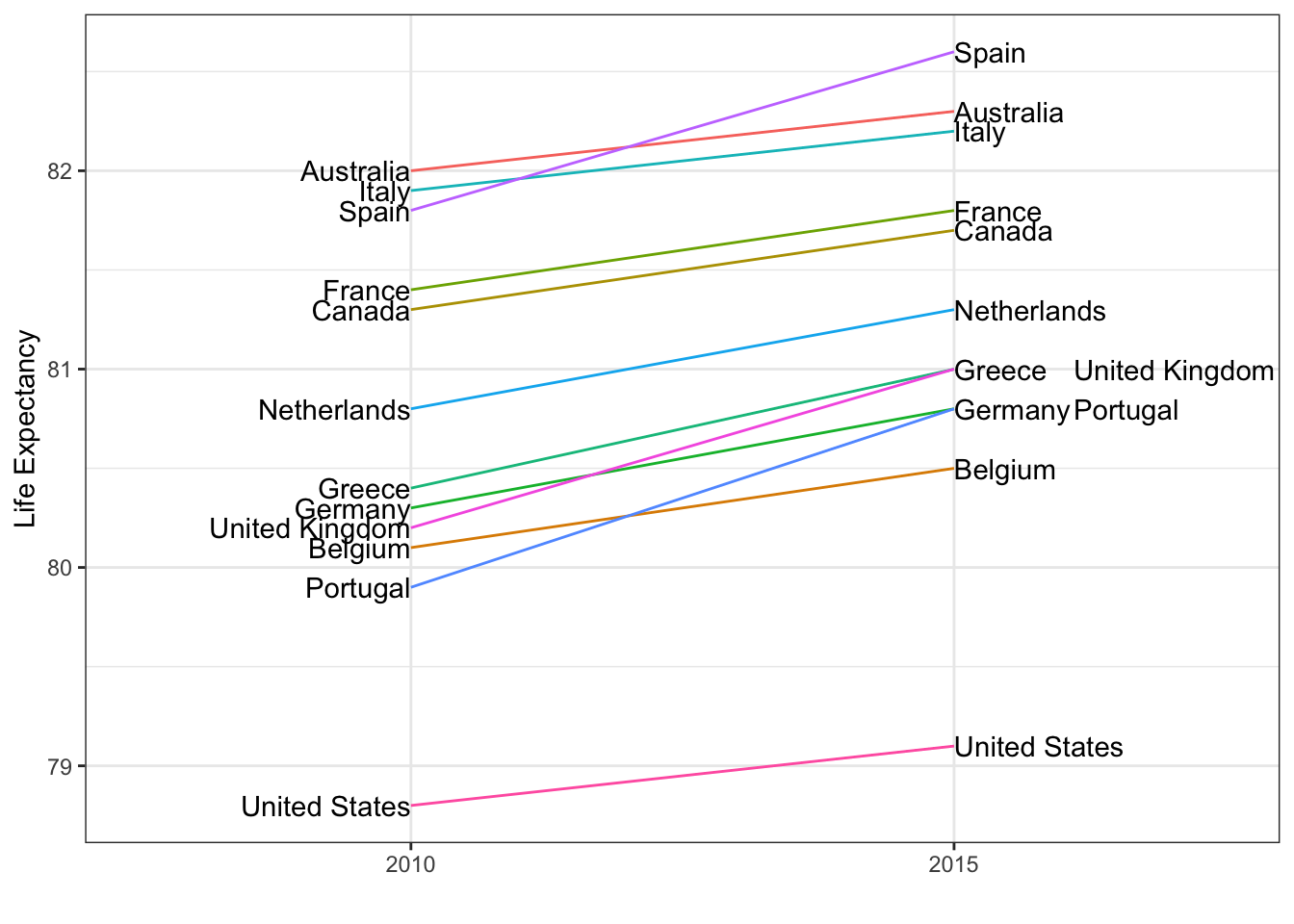
Code: Bland-Altman plot
dat %>%
    mutate(year = paste0("life_expectancy_", year)) %>%
    select(country, year, life_expectancy) %>% spread(year, life_expectancy) %>%
    mutate(average = (life_expectancy_2015 + life_expectancy_2010)/2,
                difference = life_expectancy_2015 - life_expectancy_2010) %>%
    ggplot(aes(average, difference, label = country)) +
    geom_point() +
    geom_text_repel() +
    geom_abline(lty = 2) +
    xlab("Average of 2010 and 2015") +
    ylab("Difference between 2015 and 2010")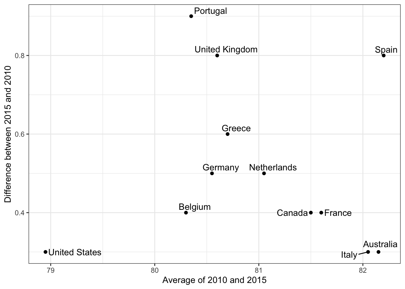
6.13 Encoding a Third Variable
The textbook for this section is available here.
Key points
- Encode a categorical third variable on a scatterplot using color hue or shape. Use the shape argument to control shape.
- Encode a continuous third variable on a using color intensity or size.
6.14 Case Study: Vaccines
The textbook for this section is available here. Information on color palettes can be found in the textbook section on encoding a third variable.
Key points
- Vaccines save millions of lives, but misinformation has led some to question the safety of vaccines. The data support vaccines as safe and effective. We visualize data about measles incidence in order to demonstrate the impact of vaccination programs on disease rate.
- The RColorBrewer package offers several color palettes. Sequential color palettes are best suited for data that span from high to low. Diverging color palettes are best suited for data that are centered and diverge towards high or low values.
- The
geom_tilegeometry creates a grid of colored tiles. - Position and length are stronger cues than color for numeric values, but color can be appropriate sometimes.
Code: Tile plot of measles rate by year and state
# import data and inspect
str(us_contagious_diseases)
## 'data.frame': 16065 obs. of 6 variables:
## $ disease : Factor w/ 7 levels "Hepatitis A",..: 1 1 1 1 1 1 1 1 1 1 ...
## $ state : Factor w/ 51 levels "Alabama","Alaska",..: 1 1 1 1 1 1 1 1 1 1 ...
## $ year : num 1966 1967 1968 1969 1970 ...
## $ weeks_reporting: num 50 49 52 49 51 51 45 45 45 46 ...
## $ count : num 321 291 314 380 413 378 342 467 244 286 ...
## $ population : num 3345787 3364130 3386068 3412450 3444165 ...# assign dat to the per 10,000 rate of measles, removing Alaska and Hawaii and adjusting for weeks reporting
the_disease <- "Measles"
dat <- us_contagious_diseases %>%
filter(!state %in% c("Hawaii", "Alaska") & disease == the_disease) %>%
mutate(rate = count / population * 10000 * 52/weeks_reporting) %>%
mutate(state = reorder(state, rate))
# plot disease rates per year in California
dat %>% filter(state == "California" & !is.na(rate)) %>%
ggplot(aes(year, rate)) +
geom_line() +
ylab("Cases per 10,000") +
geom_vline(xintercept=1963, col = "blue")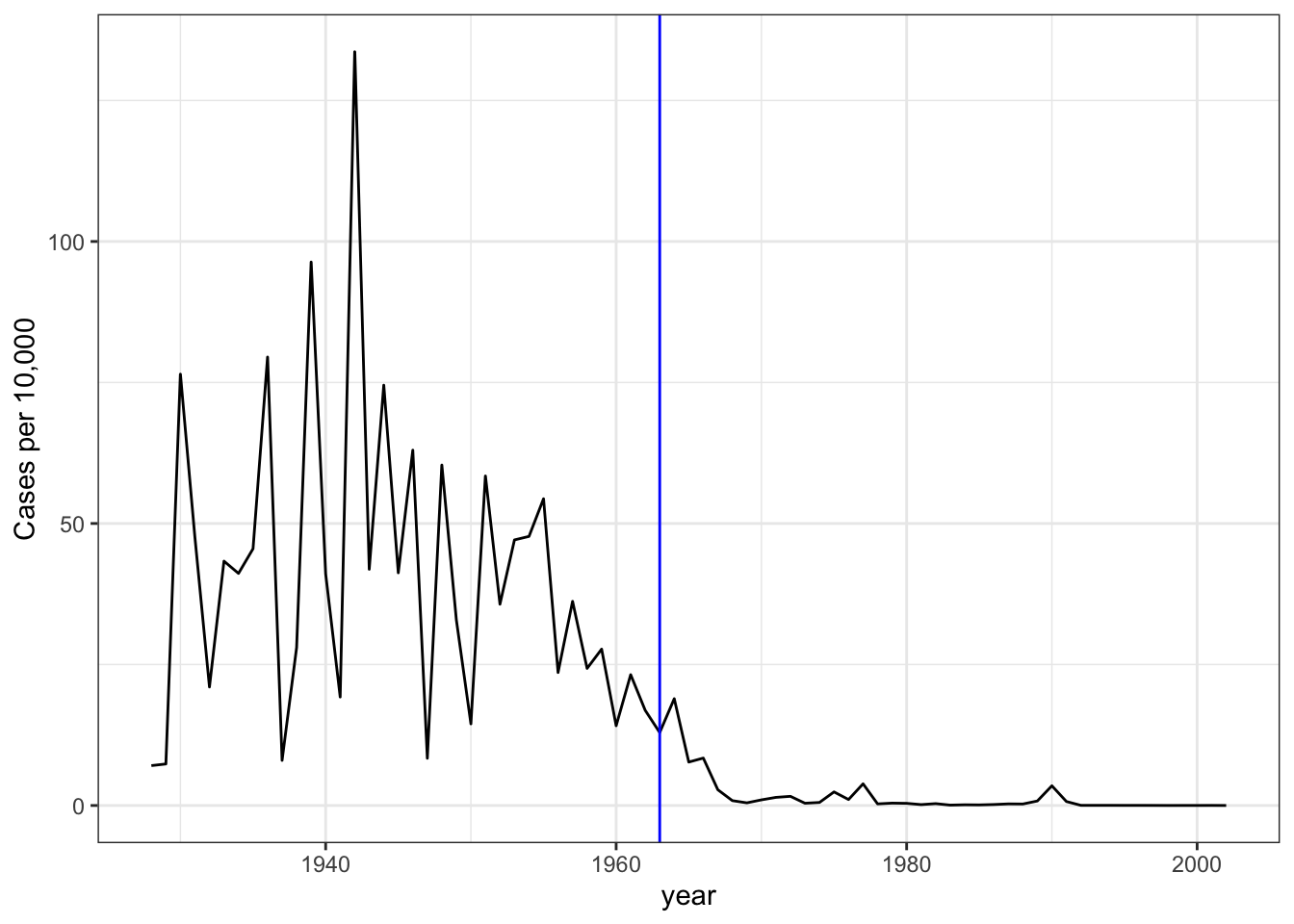
# tile plot of disease rate by state and year
dat %>% ggplot(aes(year, state, fill=rate)) +
    geom_tile(color = "grey50") +
    scale_x_continuous(expand = c(0,0)) +
    scale_fill_gradientn(colors = RColorBrewer::brewer.pal(9, "Reds"), trans = "sqrt") +
    geom_vline(xintercept = 1963, col = "blue") +
    theme_minimal() + theme(panel.grid = element_blank()) +
    ggtitle(the_disease) +
    ylab("") +
    xlab("")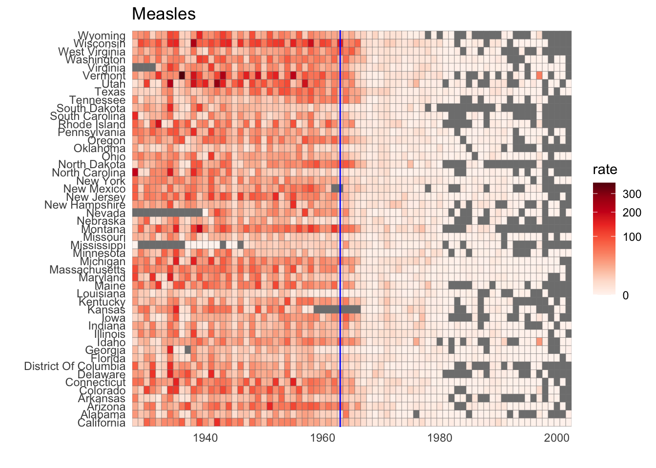
Code: Line plot of measles rate by year and state
# compute US average measles rate by year
avg <- us_contagious_diseases %>%
    filter(disease == the_disease) %>% group_by(year) %>%
    summarize(us_rate = sum(count, na.rm = TRUE)/sum(population, na.rm = TRUE)*10000)
## `summarise()` ungrouping output (override with `.groups` argument)# make line plot of measles rate by year by state
dat %>%
filter(!is.na(rate)) %>%
ggplot() +
geom_line(aes(year, rate, group = state), color = "grey50",
show.legend = FALSE, alpha = 0.2, size = 1) +
geom_line(mapping = aes(year, us_rate), data = avg, size = 1, col = "black") +
scale_y_continuous(trans = "sqrt", breaks = c(5, 25, 125, 300)) +
ggtitle("Cases per 10,000 by state") +
xlab("") +
ylab("") +
geom_text(data = data.frame(x = 1955, y = 50),
mapping = aes(x, y, label = "US average"), color = "black") +
geom_vline(xintercept = 1963, col = "blue")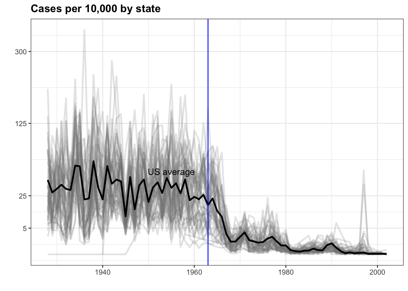
6.15 Avoid Pseudo and Gratuitous 3D Plots
The textbook for this section is available here.
Key point
In general, pseudo-3D plots and gratuitous 3D plots only add confusion. Use regular 2D plots instead.
6.16 Avoid Too Many Significant Digits
The textbook for this section is available here.
Key points
- In tables, avoid using too many significant digits. Too many digits can distract from the meaning of your data.
- Reduce the number of significant digits globally by setting an option. For example,
options(digits = 3)will cause all future computations that session to have 3 significant digits. - Reduce the number of digits locally using
roundorsignif.
6.17 Assessment - Data Visualization Principles, Part 3
- The sample code given creates a tile plot showing the rate of measles cases per population. We are going to modify the tile plot to look at smallpox cases instead.
if(!require(RColorBrewer)) install.packages("RColorBrewer")## Loading required package: RColorBrewerlibrary(RColorBrewer)
the_disease = "Smallpox"
dat <- us_contagious_diseases %>%
filter(!state%in%c("Hawaii","Alaska") & disease == the_disease & weeks_reporting >= 10) %>%
mutate(rate = count / population * 10000) %>%
mutate(state = reorder(state, rate))
dat %>% ggplot(aes(year, state, fill = rate)) +
geom_tile(color = "grey50") +
scale_x_continuous(expand=c(0,0)) +
scale_fill_gradientn(colors = brewer.pal(9, "Reds"), trans = "sqrt") +
theme_minimal() +
theme(panel.grid = element_blank()) +
ggtitle(the_disease) +
ylab("") +
xlab("")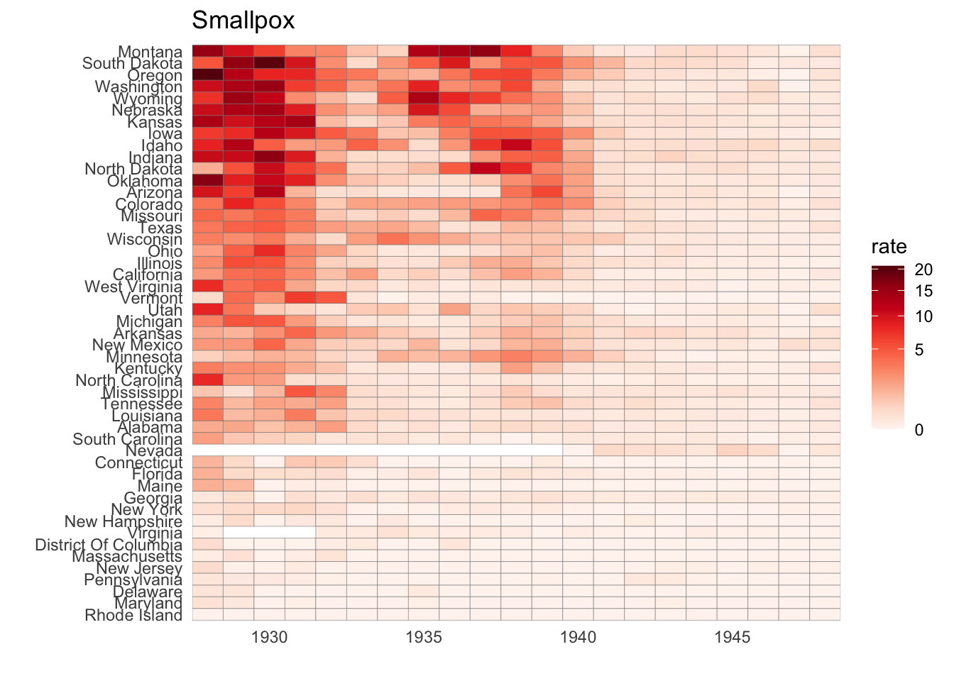
- The sample code given creates a time series plot showing the rate of measles cases per population by state.
We are going to again modify this plot to look at smallpox cases instead.
the_disease = "Smallpox"
dat <- us_contagious_diseases %>%
   filter(!state%in%c("Hawaii","Alaska") & disease == the_disease & weeks_reporting >= 10) %>%
   mutate(rate = count / population * 10000) %>%
   mutate(state = reorder(state, rate))

avg <- us_contagious_diseases %>%
  filter(disease==the_disease) %>% group_by(year) %>%
  summarize(us_rate = sum(count, na.rm=TRUE)/sum(population, na.rm=TRUE)*10000)
## `summarise()` ungrouping output (override with `.groups` argument)dat %>% ggplot() +
geom_line(aes(year, rate, group = state), color = "grey50",
show.legend = FALSE, alpha = 0.2, size = 1) +
geom_line(mapping = aes(year, us_rate), data = avg, size = 1, color = "black") +
scale_y_continuous(trans = "sqrt", breaks = c(5,25,125,300)) +
ggtitle("Cases per 10,000 by state") +
xlab("") +
ylab("") +
geom_text(data = data.frame(x=1955, y=50), mapping = aes(x, y, label="US average"), color="black") +
geom_vline(xintercept=1963, col = "blue")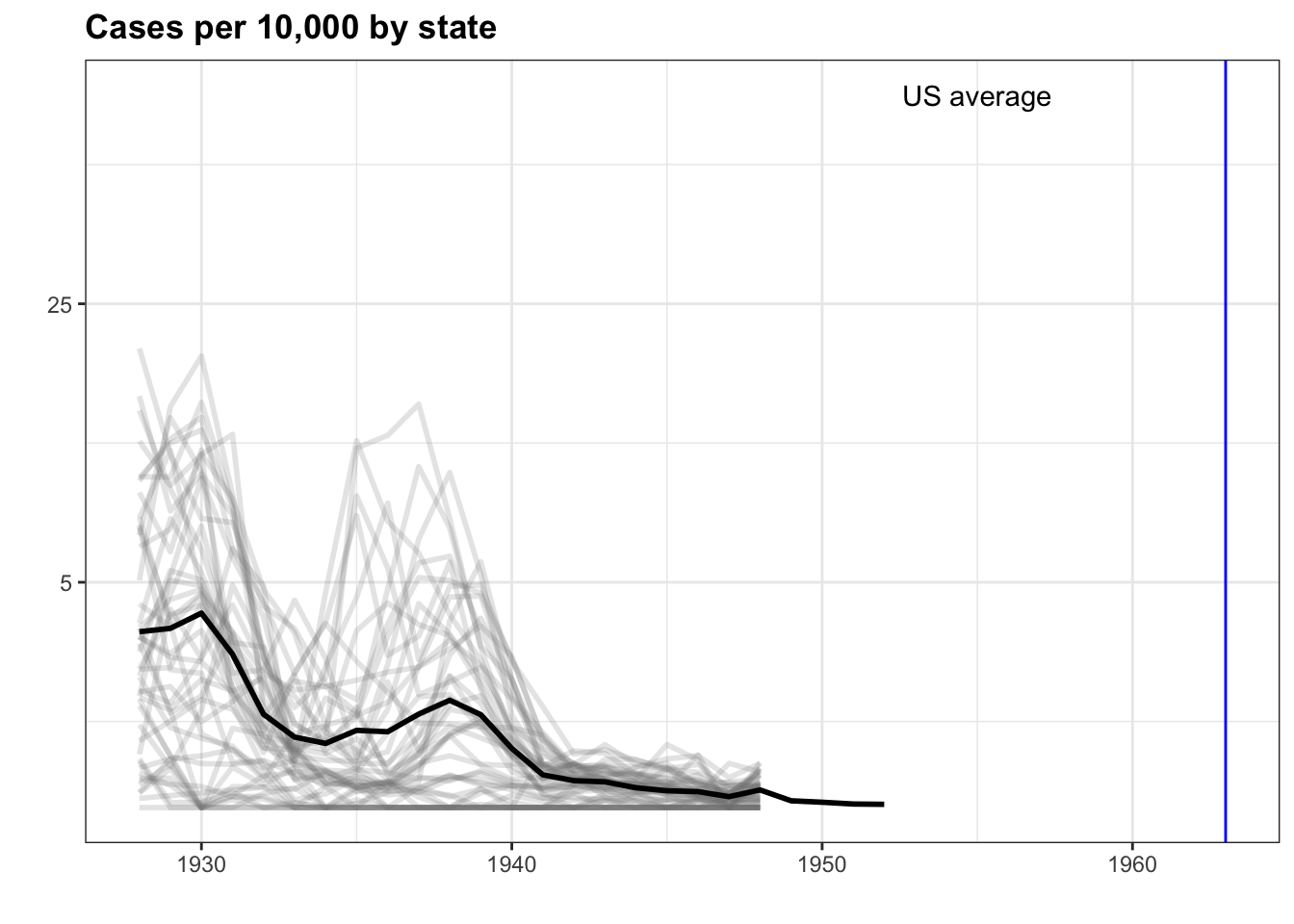
- Now we are going to look at the rates of all diseases in one state.
Again, you will be modifying the sample code to produce the desired plot.
us_contagious_diseases %>% filter(state=="California" & weeks_reporting >= 10) %>%
  group_by(year, disease) %>%
  summarize(rate = sum(count)/sum(population)*10000) %>%
  ggplot(aes(year, rate, color = disease)) +
  geom_line()
## `summarise()` regrouping output by 'year' (override with `.groups` argument)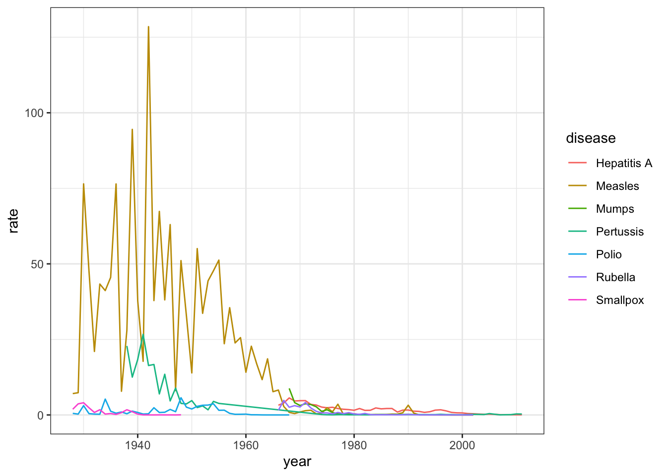
- Now we are going to make a time series plot for the rates of all diseases in the United States.
For this exercise, we have provided less sample code - you can take a look at the previous exercise to get you started.
us_contagious_diseases %>% filter(!is.na(population)) %>%
  group_by(year, disease) %>%
  summarize(rate = sum(count)/sum(population)*10000) %>%
  ggplot(aes(year, rate, color = disease)) +
  geom_line()
## `summarise()` regrouping output by 'year' (override with `.groups` argument)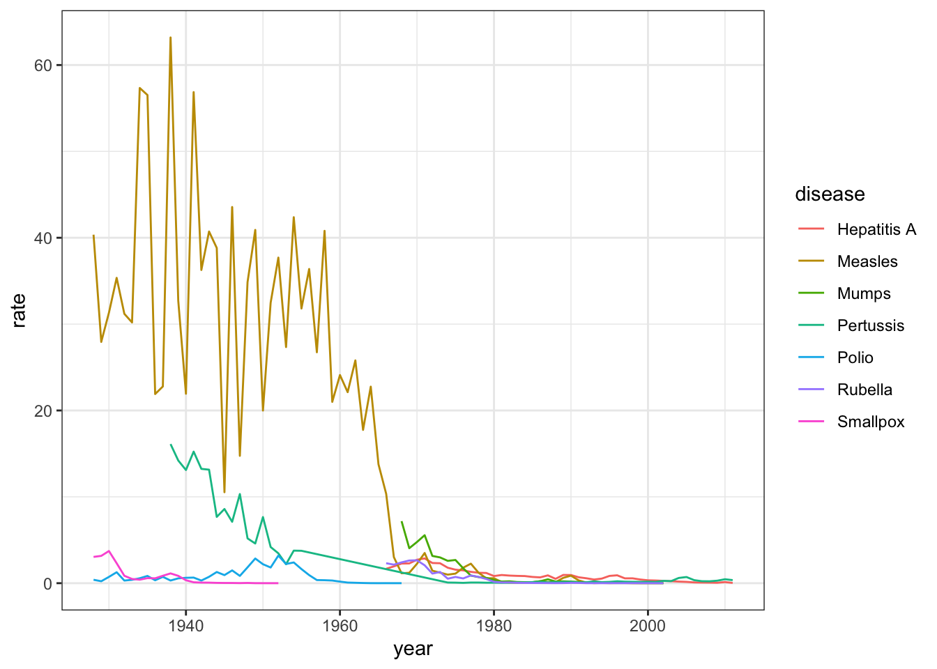
6.18 Titanic Survival Exercises
Put all your new skills together to perform exploratory data analysis on a classic machine learning dataset: Titanic survival!
Background
The Titanic was a British ocean liner that struck an iceberg and sunk on its maiden voyage in 1912 from the United Kingdom to New York. More than 1,500 of the estimated 2,224 passengers and crew died in the accident, making this one of the largest maritime disasters ever outside of war. The ship carried a wide range of passengers of all ages and both genders, from luxury travelers in first-class to immigrants in the lower classes. However, not all passengers were equally likely to survive the accident. We use real data about a selection of 891 passengers to learn who was on the Titanic and which passengers were more likely to survive.
Libraries, Options, and Data
Define the titanic dataset starting from the titanic library with the following code:
if(!require(titanic)) install.packages("titanic")## Loading required package: titanicoptions(digits = 3) # report 3 significant digits
library(tidyverse)
library(titanic)
titanic <- titanic_train %>%
select(Survived, Pclass, Sex, Age, SibSp, Parch, Fare) %>%
mutate(Survived = factor(Survived),
Pclass = factor(Pclass),
Sex = factor(Sex))- Variable Types
Inspect the data and also use ?titanic_train to learn more about the variables in the dataset. Match these variables from the dataset to their variable type. There is at least one variable of each type (ordinal categorical, non-ordinal categorical, continuous, discrete).
Survivednon-ordinal categoricalPclassordinal categoricalSexnon-ordinal categoricalSibSpdiscreteParchdiscrete
Farecontinuous
- Demographics of Titanic Passengers
Make density plots of age grouped by sex. Try experimenting with combinations of faceting, alpha blending, stacking and using variable counts on the y-axis to answer the following questions. Some questions may be easier to answer with different versions of the density plot.
A faceted plot is useful for comparing the distributions of males and females for A. Each sex has the same general shape with two modes at the same locations, though proportions differ slightly across ages and there are more males than females.
titanic %>%
    ggplot(aes(Age, fill = Sex)) +
    geom_density(alpha = 0.2) +
    facet_grid(Sex ~ .)
## Warning: Removed 177 rows containing non-finite values (stat_density).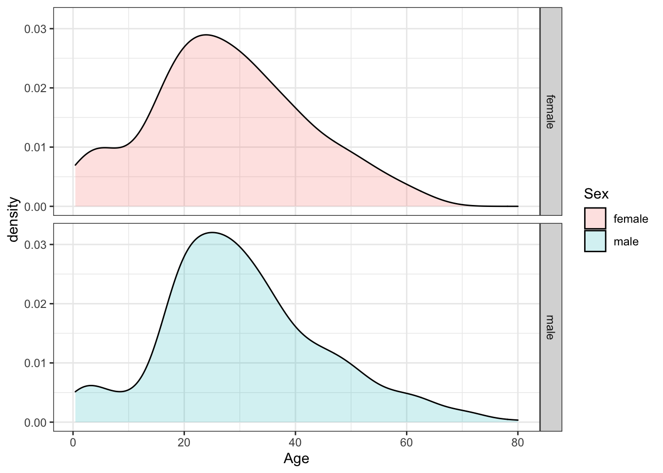
A stacked density plot with count on the y-axis is useful for answering B, C and D. The main mode is around age 25 and a second smaller mode is around age 4-5. There are more males than females as indicated by a higher total area and higher counts at almost all ages. With count on the y-axis, it is clear that more males than females are age 40.
titanic %>%
    ggplot(aes(Age, y = ..count.., fill = Sex)) +
    geom_density(alpha = 0.2, position = "stack")
## Warning: Removed 177 rows containing non-finite values (stat_density).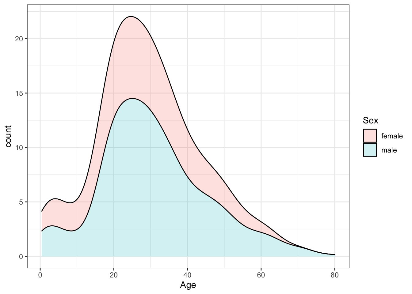
A plot filled by sex with alpha blending helps reveal the answers to E, F and G. There is a higher proportion of females than males below age 17, a higher proportion of males than females for ages 18-35, approximately the same proportion of males and females age 35-55, and a higher proportion of males over age 55. The oldest individuals are male.
titanic %>%
    ggplot(aes(Age, fill = Sex)) +
    geom_density(alpha = 0.2)
## Warning: Removed 177 rows containing non-finite values (stat_density).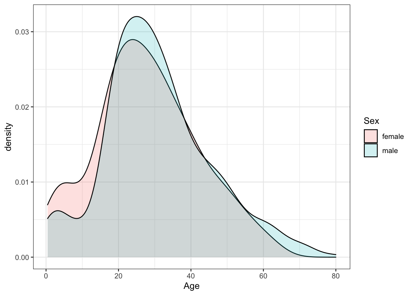
Which of the following are true? Select all correct answers.
- A. Females and males had the same general shape of age distribution.
- B. The age distribution was bimodal, with one mode around 25 years of age and a second smaller mode around 5 years of age.
- C. There were more females than males.
- D. The count of males of age 40 was higher than the count of females of age 40.
- E. The proportion of males age 18-35 was higher than the proportion of females age 18-35.
- F. The proportion of females under age 17 was higher than the proportion of males under age 17.
- G. The oldest passengers were female.
- QQ-plot of Age Distribution
Use geom_qq to make a QQ-plot of passenger age and add an identity line with geom_abline. Filter out any individuals with an age of NA first. Use the following object as the dparams argument in geom_qq:
params <- titanic %>%
    filter(!is.na(Age)) %>%
    summarize(mean = mean(Age), sd = sd(Age))

titanic %>%
    filter(!is.na(Age)) %>%
    ggplot(aes(sample = Age)) +
    geom_qq(dparams = params) +
    geom_abline()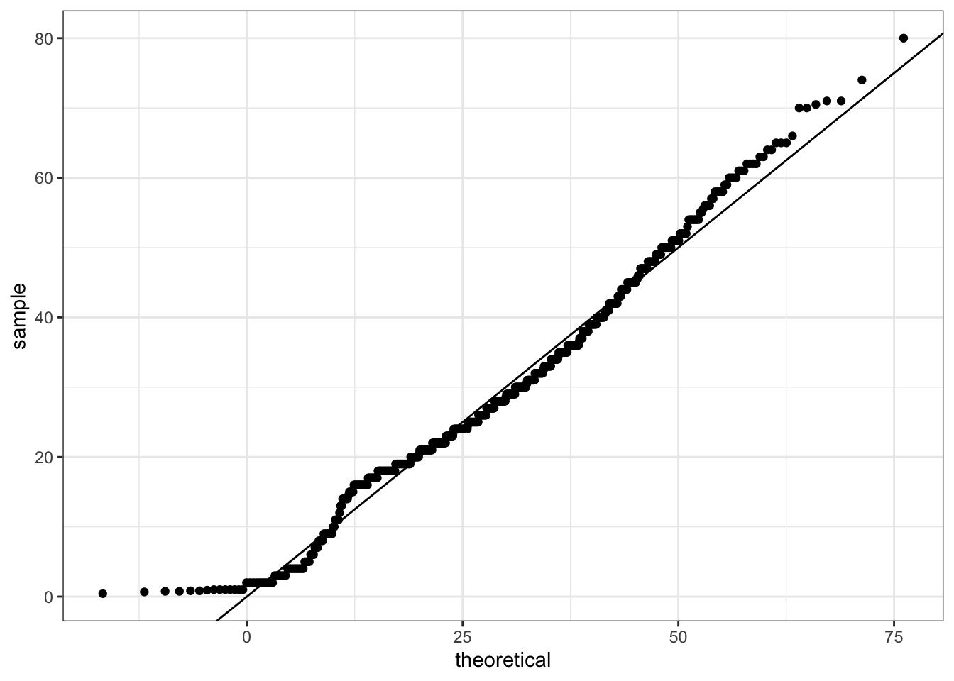
What is the correct plot according to the instructions above? QQ-plot C
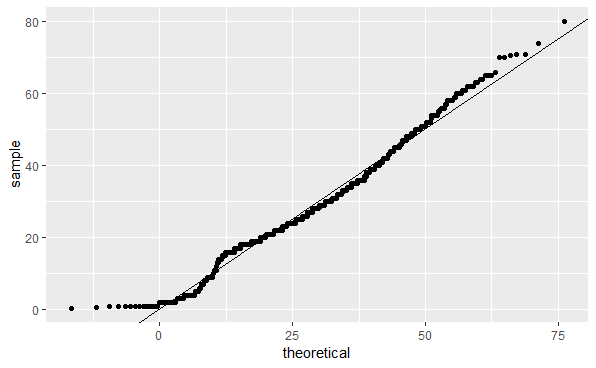
QQ-plot C
- Survival by Sex
To answer the following questions, make barplots of the Survived and Sex variables using geom_bar. Try plotting one variable and filling by the other variable. You may want to try the default plot, then try adding position = position_dodge() to geom_bar to make separate bars for each group.
You can read more about making barplots in the textbook section on ggplot2 geometries.
A and B can be clearly seen in the barplot of survival status filled by sex. The count of survivors is lower than the count of non-survivors. The bar of survivors is more than half filled by females. Alternatively, the bars can be split by sex with position_dodge, showing the “Female, Survived” bar has a greater height than the “Male, survived” bar. C and D are more clearly seen in the barplot of sex filled by survival status, though they can also be determined from the first barplot. Most males did not survive, but most females did survive.
#plot 1 - survival filled by sex
titanic %>%
    ggplot(aes(Survived, fill = Sex)) +
    geom_bar()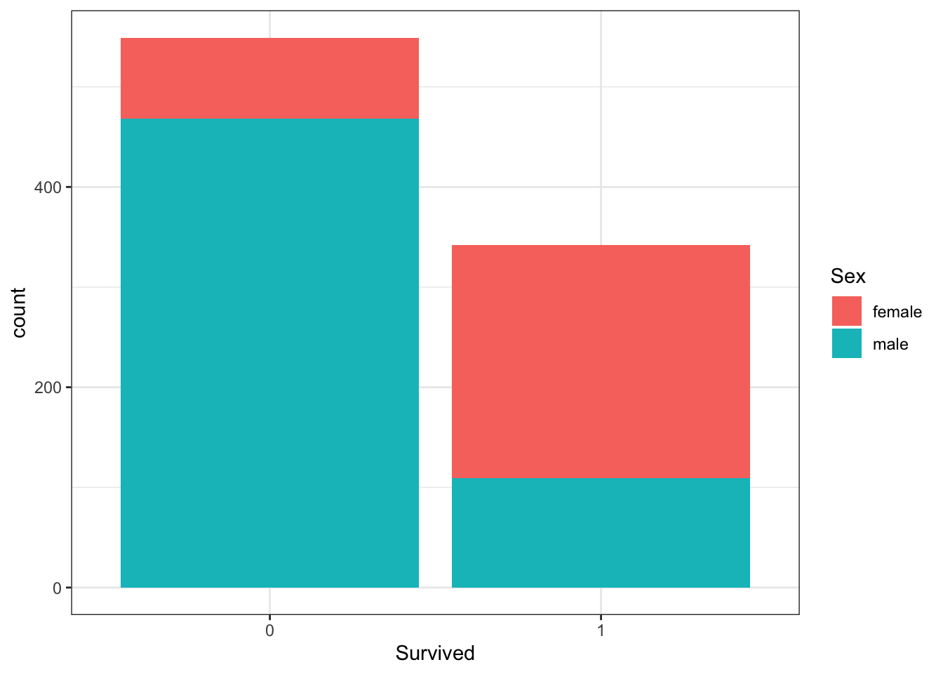
# plot 2 - survival filled by sex with position_dodge
titanic %>%
    ggplot(aes(Survived, fill = Sex)) +
    geom_bar(position = position_dodge())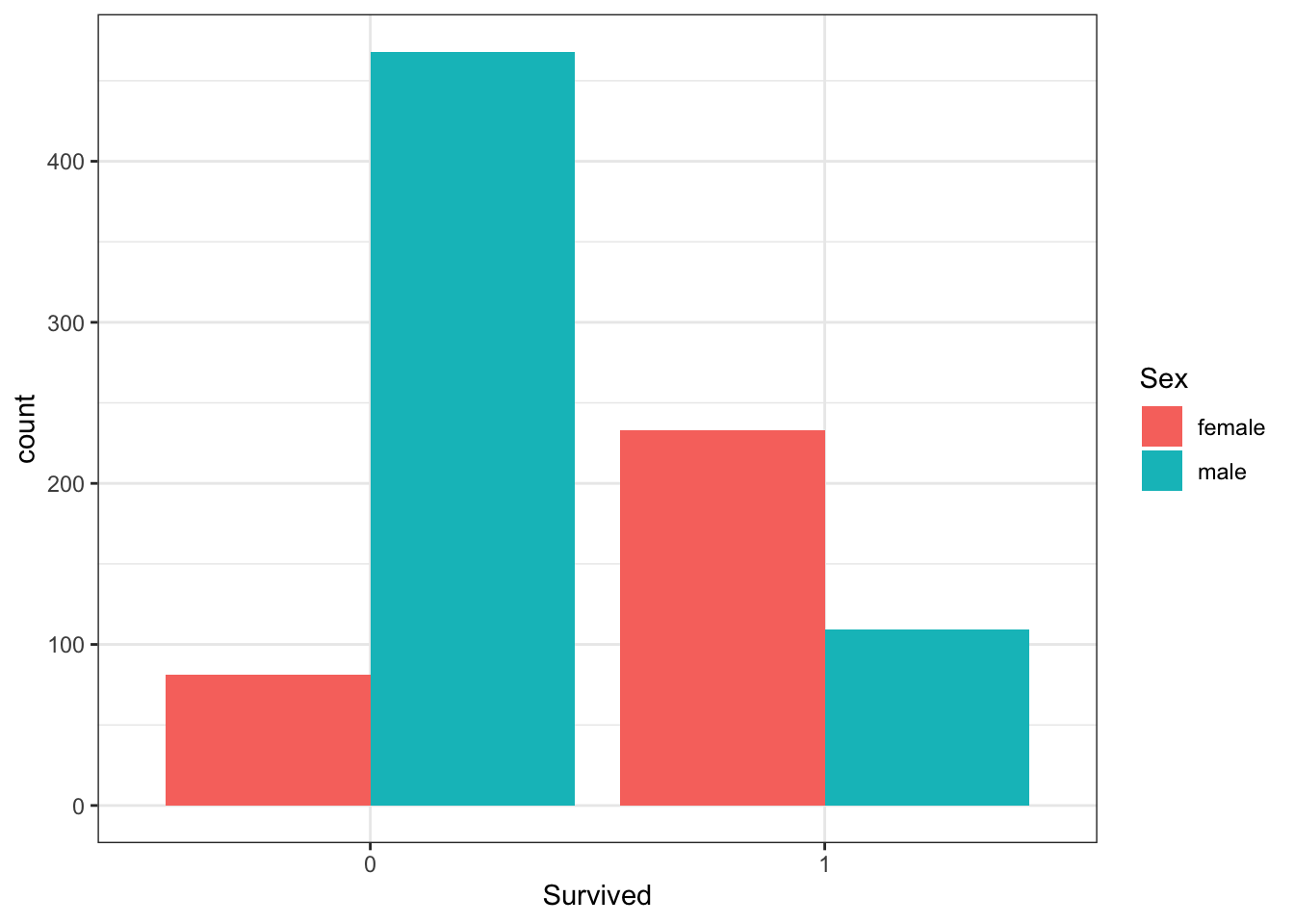
#plot 3 - sex filled by survival
titanic %>%
    ggplot(aes(Sex, fill = Survived)) +
    geom_bar()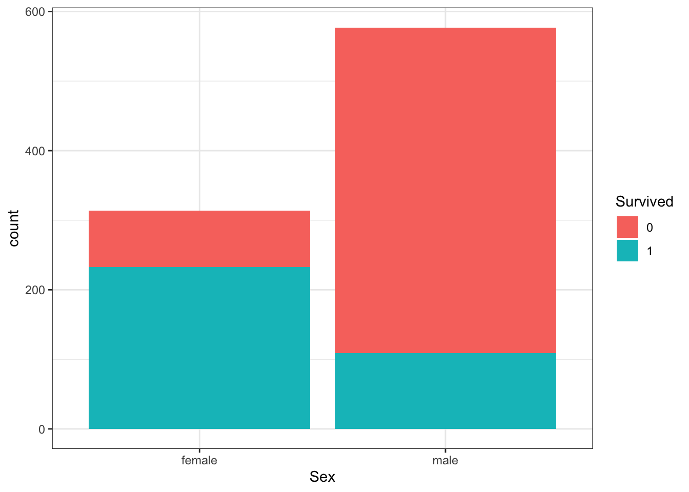
Which of the following are true? Select all correct answers.
- A. Less than half of passengers survived.
- B. Most of the survivors were female.
- C. Most of the males survived.
- D. Most of the females survived.
- Survival by Age
Make a density plot of age filled by survival status. Change the y-axis to count and set alpha = 0.2.
titanic %>%
    ggplot(aes(Age, y = ..count.., fill = Survived)) +
    geom_density(alpha = 0.2)
## Warning: Removed 177 rows containing non-finite values (stat_density).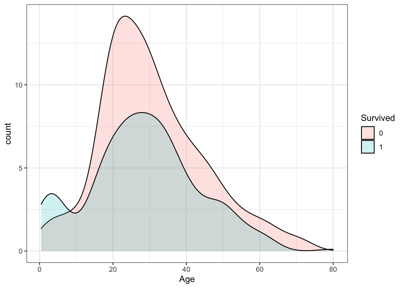
Which age group is the only group more likely to survive than die?
- A. 0-8
- B. 10-18
- C. 18-30
- D. 30-50
- E. 50-70
- F. 70-80
Which age group had the most deaths?
- A. 0-8
- B. 10-18
- C. 18-30
- D. 30-50
- E. 50-70
- F. 70-80
Which age group had the highest proportion of deaths?
- A. 0-8
- B. 10-18
- C. 18-30
- D. 30-50
- E. 50-70
- F. 70-80
- Survival by Fare
Filter the data to remove individuals who paid a fare of 0. Make a boxplot of fare grouped by survival status. Try a log2 transformation of fares. Add the data points with jitter and alpha blending.
titanic %>%
    filter(Fare > 0) %>%
    ggplot(aes(Survived, Fare)) +
    geom_boxplot() +
    scale_y_continuous(trans = "log2") +
    geom_jitter(alpha = 0.2)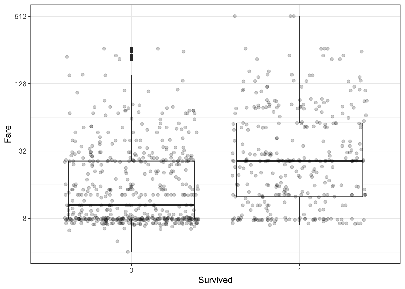
Which of the following are true? Select all correct answers.
- A. Passengers who survived generally payed higher fares than those who did not survive.
- B. The interquartile range for fares was smaller for passengers who survived.
- C. The median fare was lower for passengers who did not survive.
- D. Only one individual paid a fare around $500. That individual survived.
- E. Most individuals who paid a fare around $8 did not survive.
- Survival by Passenger Class
The Pclass variable corresponds to the passenger class. Make three barplots. For the first, make a basic barplot of passenger class filled by survival. For the second, make the same barplot but use the argument position = position_fill() to show relative proportions in each group instead of counts. For the third, make a barplot of survival filled by passenger class using position = position_fill().
# barplot of passenger class filled by survival
titanic %>%
    ggplot(aes(Pclass, fill = Survived)) +
    geom_bar() +
    ylab("Proportion")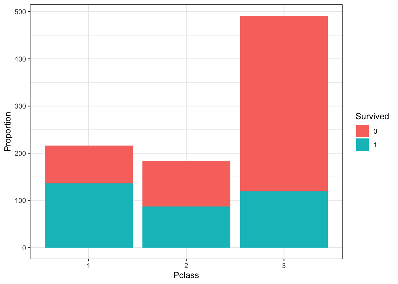
# barplot of passenger class filled by survival with position_fill
titanic %>%
    ggplot(aes(Pclass, fill = Survived)) +
    geom_bar(position = position_fill()) +
    ylab("Proportion")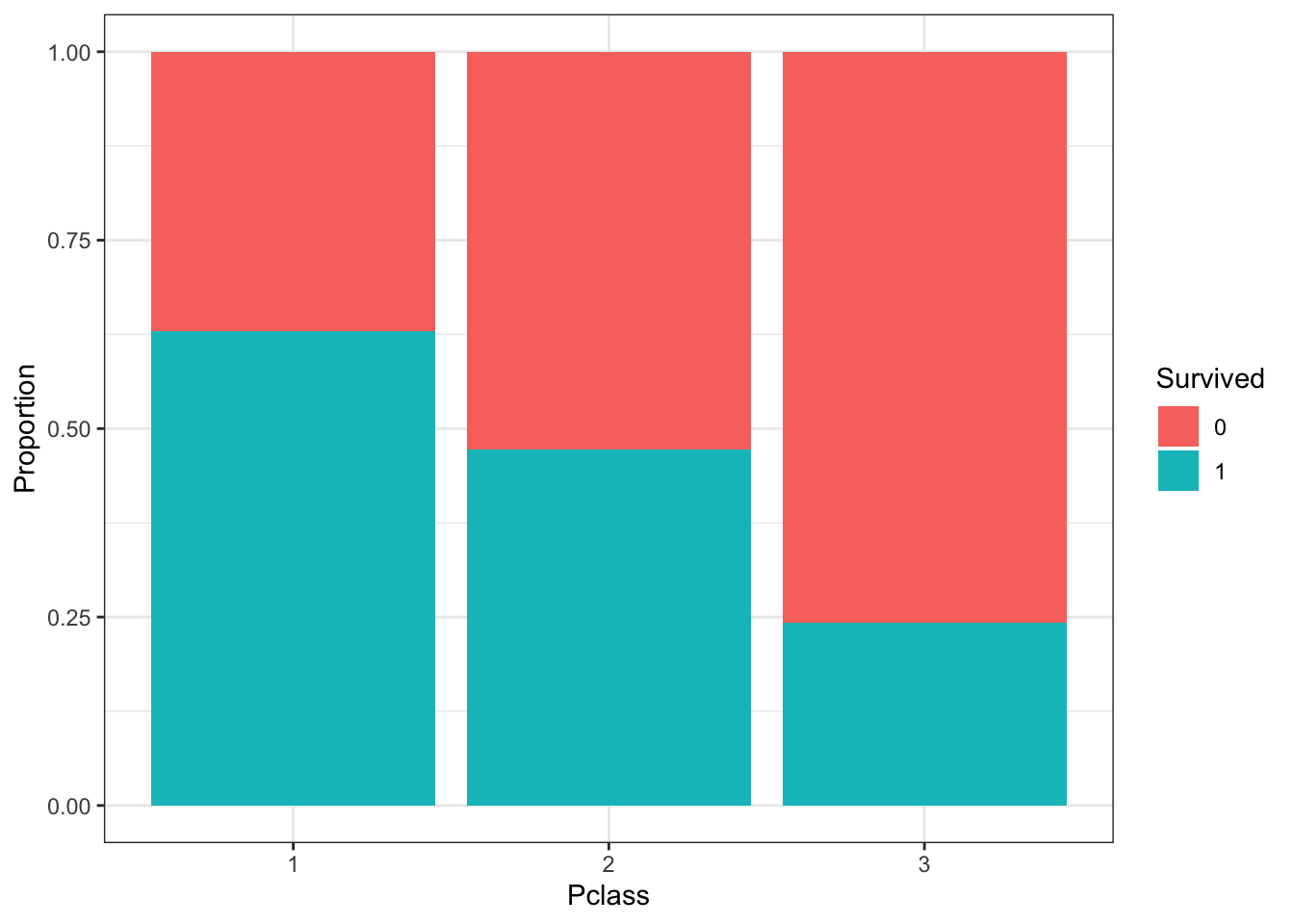
# barplot of survival filled by passenger class with position_fill
titanic %>%
    ggplot(aes(Survived, fill = Pclass)) +
    geom_bar(position = position_fill()) +
    ylab("Proportion")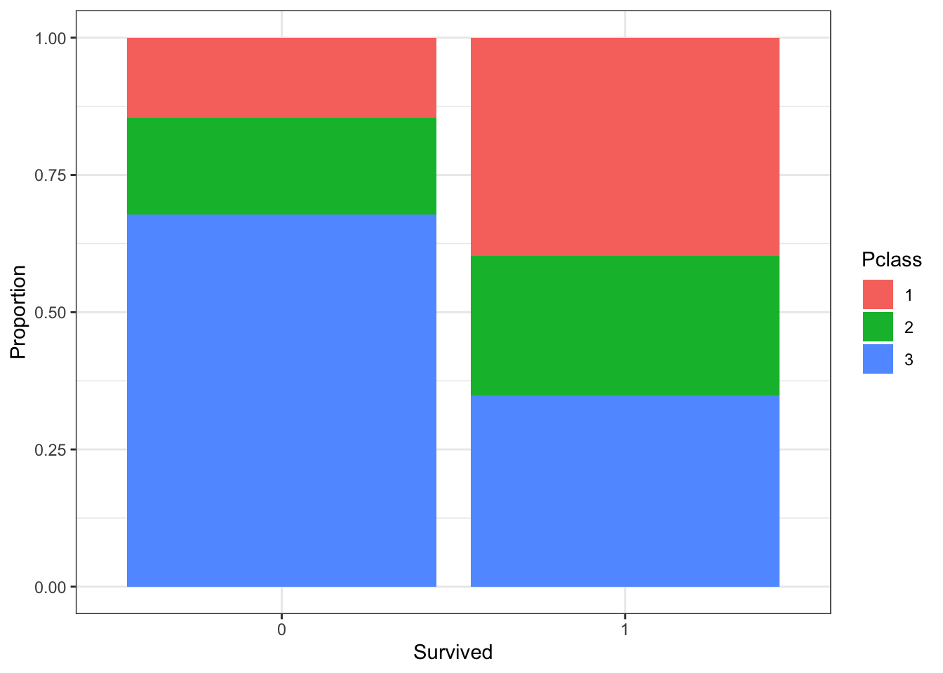
Which of the following are true? Select all correct answers.
- A. There were more third class passengers than passengers in the first two classes combined.
- B. There were the fewest passengers in first class, second-most passengers in second class, and most passengers in third class.
- C. Survival proportion was highest for first class passengers, followed by second class. Third-class had the lowest survival proportion.
- D. Most passengers in first class survived. Most passengers in other classes did not survive.
- E. The majority of survivors were from first class. (Majority means over 50%.)
- F. The majority of those who did not survive were from third class.
- Survival by Age, Sex and Passenger Class
Create a grid of density plots for age, filled by survival status, with count on the y-axis, faceted by sex and passenger class.
titanic %>%
    ggplot(aes(Age, y = ..count.., fill = Survived)) +
    geom_density(position = "stack") +
    facet_grid(Sex ~ Pclass)
## Warning: Removed 177 rows containing non-finite values (stat_density).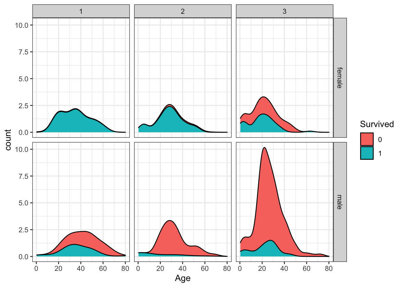
Which of the following are true? Select all correct answers.
- A. The largest group of passengers was third-class males.
- B. The age distribution is the same across passenger classes.
- C. The gender distribution is the same across passenger classes.
- D. Most first-class and second-class females survived.
- E. Almost all second-class males did not survive, with the exception of children.
6.19 Properties of Stars Exercises
Background
Astronomy is one of the oldest data-driven sciences. In the late 1800s, the director of the Harvard College Observatory hired women to analyze astronomical data, which at the time was done using photographic glass plates. These women became known as the Harvard Computers. They computed the position and luminosity of various astronomical objects such as stars and galaxies. (If you are interested, you can learn more about the Harvard Computers). Today, astronomy is even more of a data-driven science, with an inordinate amount of data being produced by modern instruments every day.
In the following exercises we will analyze some actual astronomical data to inspect properties of stars, their absolute magnitude (which relates to a star’s luminosity, or brightness), temperature and type (spectral class).
Libraries and Options
data(stars)
options(digits = 3) # report 3 significant digitsIMPORTANT: These exercises use dslabs datasets that were added in a July 2019 update. Make sure your package is up to date with the command update.packages("dslabs"). You can also update all packages on your system by running update.packages() with no arguments, and you should consider doing this routinely.
- Load the
starsdata frame from dslabs. This contains the name, absolute magnitude, temperature in degrees Kelvin, and spectral class of selected stars. Absolute magnitude (shortened in these problems to simply “magnitude”) is a function of star luminosity, where negative values of magnitude have higher luminosity.
What is the mean magnitude?
mean(stars$magnitude)## [1] 4.26What is the standard deviation of magnitude?
sd(stars$magnitude)## [1] 7.35- Make a density plot of the magnitude.
stars %>%
  ggplot(aes(magnitude)) +
  geom_density()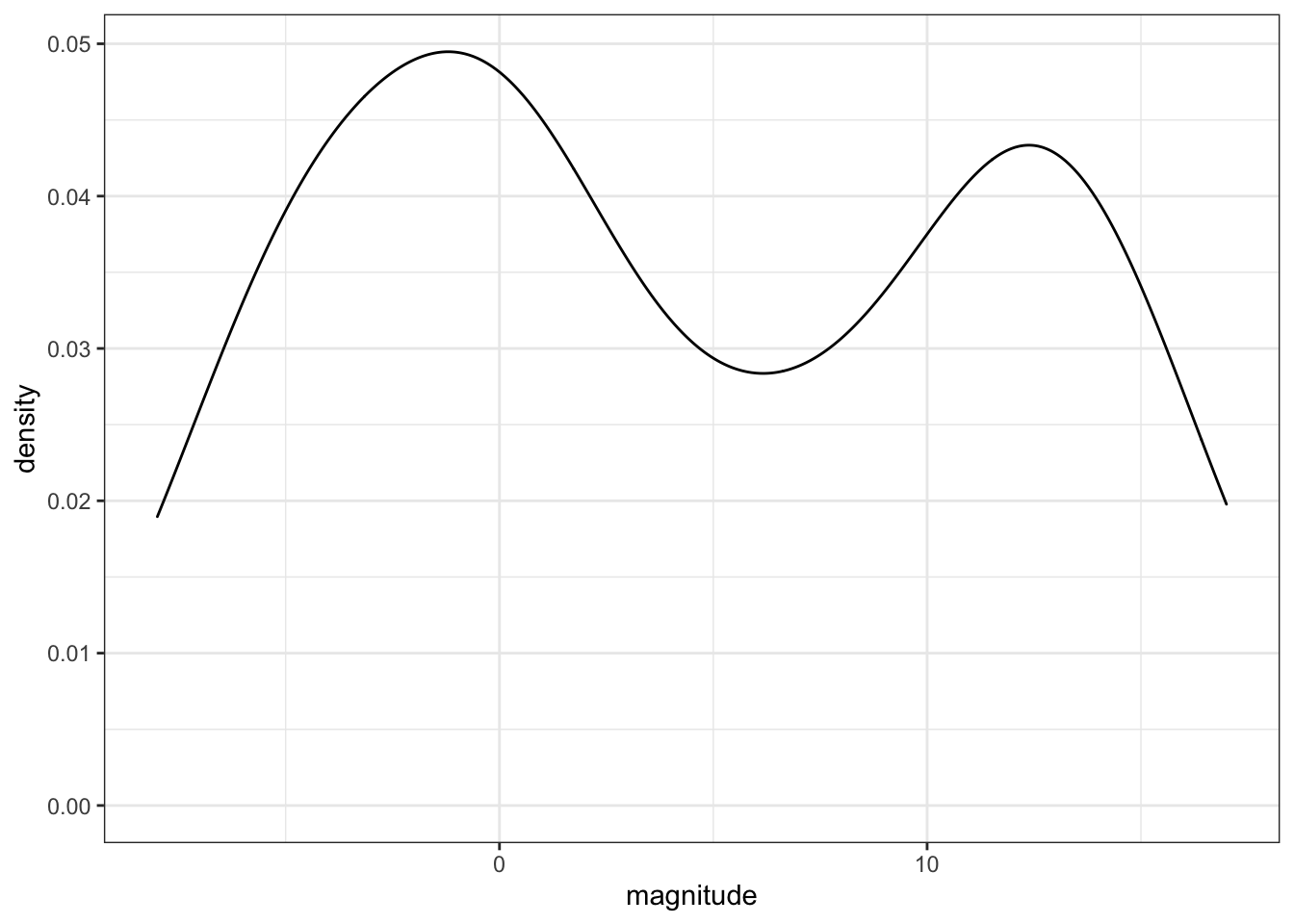
How many peaks are there in the data?
- A. 1
- B. 2
- C. 3
- D. 4
- Examine the distribution of star temperature.
stars %>%
  ggplot(aes(temp)) +
  geom_density()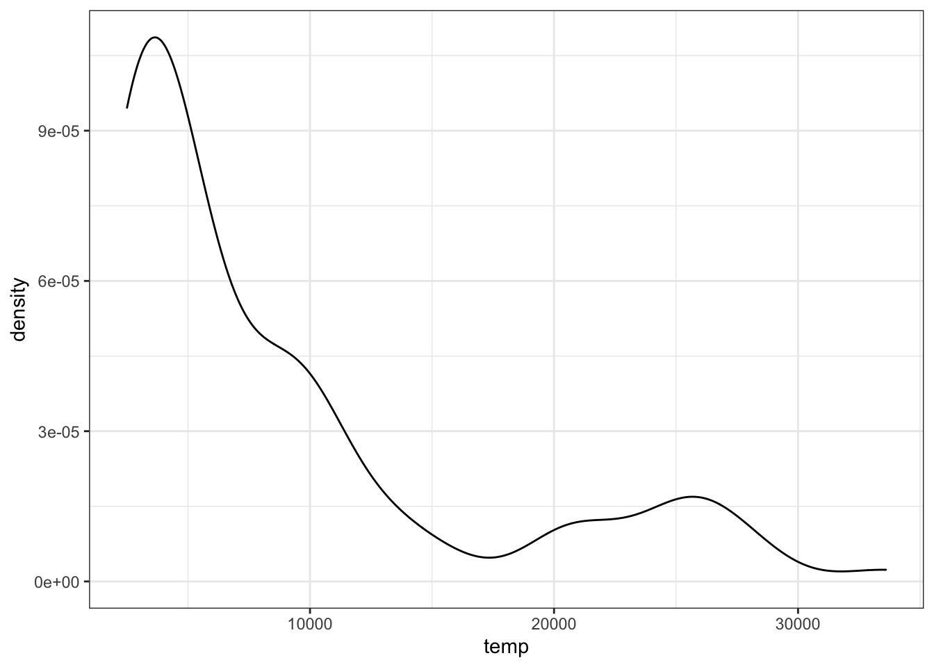
Which of these statements best characterizes the temperature distribution?
- A. The majority of stars have a high temperature.
- B. The majority of stars have a low temperature.
- C. The temperature distribution is normal.
- D. There are equal numbers of stars across the temperature range.
- Make a scatter plot of the data with temperature on the x-axis and magnitude on the y-axis and examine the relationship between the variables. Recall that lower magnitude means a more luminous (brighter) star.
Most stars follow a _______________ trend. These are called main sequence stars.
stars %>%
  ggplot(aes(temp, magnitude)) +
  geom_point()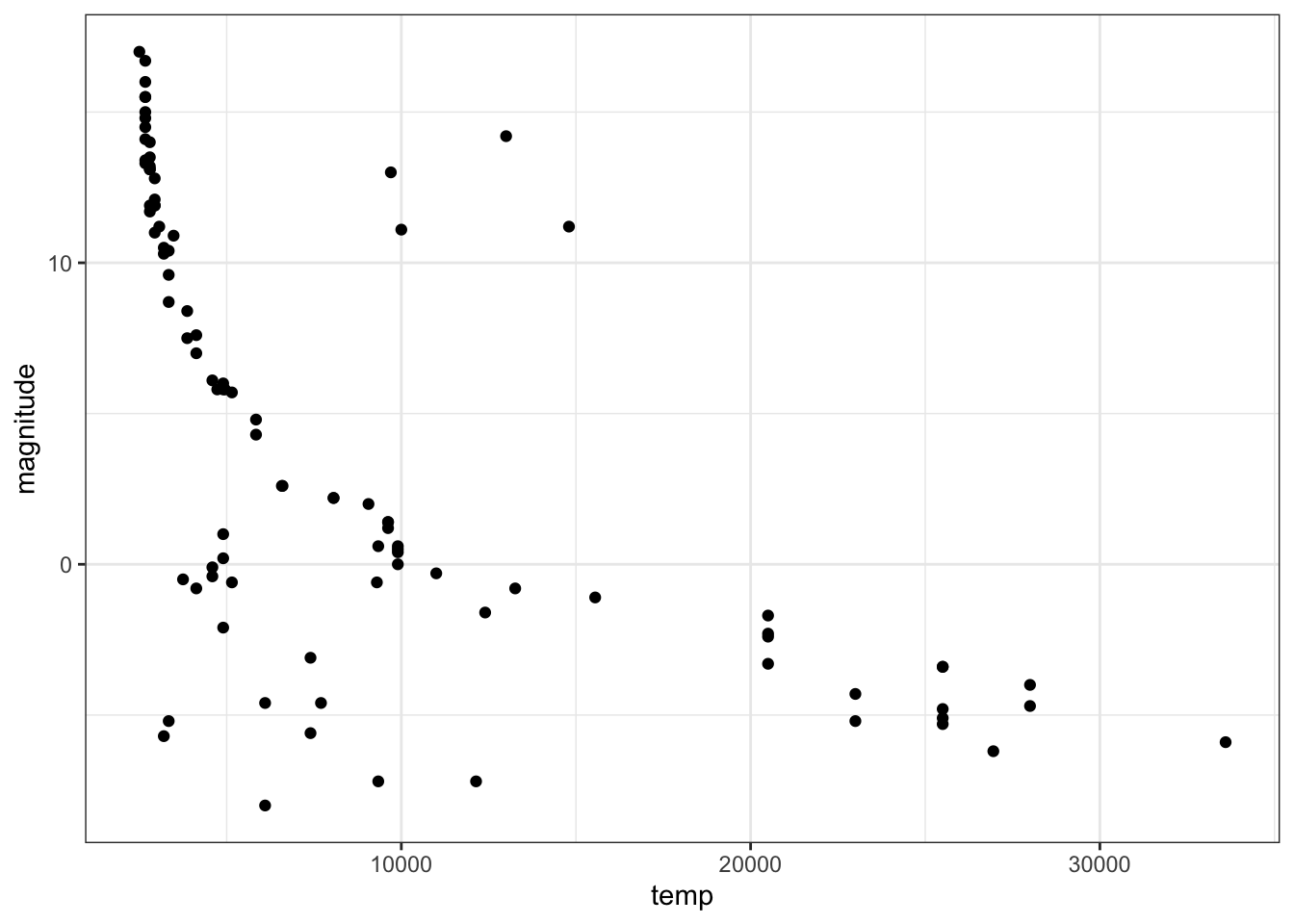
Fill in the blank:
- A. decreasing linear
- B. increasing linear
- C. decreasing exponential
- D. increasing exponential
- For various reasons, scientists do not always follow straight conventions when making plots, and astronomers usually transform values of star luminosity and temperature before plotting. Flip the y-axis so that lower values of magnitude are at the top of the axis (recall that more luminous stars have lower magnitude) using
scale_y_reverse. Take the log base 10 of temperature and then also flip the x-axis.
stars %>%
  ggplot(aes(x=log10(temp), magnitude)) +
  scale_x_reverse() +
  scale_y_reverse() +
  geom_point()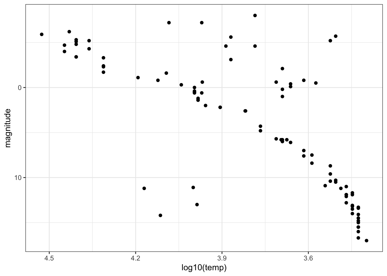
Fill in the blanks in the statements below to describe the resulting plot.
The brighest, highest temperature stars are in the ______________ corner of the plot.
- A. lower left
- B. lower right
- C. upper left
- D. upper right
For main sequence stars, hotter stars have ____________ luminosity.
- A. higher
- B. lower
- The trends you see allow scientists to learn about the evolution and lifetime of stars. The primary group of stars to which most stars belong we will call the main sequence stars (discussed in question 4). Most stars belong to this main sequence, however some of the more rare stars are classified as “old” and “evolved” stars. These stars tend to be hotter stars, but also have low luminosity, and are known as white dwarfs.
How many white dwarfs are there in our sample?
These stars are in the lower left of the plot from question 5. There are 4 stars in this region.
- Consider stars which are not part of the Main Group but are not old/evolved (white dwarf) stars. These stars must also be unique in certain ways and are known as giants. Use the plot from Question 5 to estimate the average temperature of a giant.
Giants are in the upper right corner of the plot and generally have temperatures below 6000K.
Which of these temperatures is closest to the average temperature of a giant?:
- A. 5000K
- B. 10000K
- C. 15000K
- D. 20000K
- We can now identify whether specific stars are main sequence stars, red giants or white dwarfs. Add text labels to the plot to answer these questions. You may wish to plot only a selection of the labels, repel the labels, or zoom in on the plot in RStudio so you can locate specific stars.
stars %>%
    ggplot(aes(log10(temp), magnitude)) +
    geom_point() +
    geom_text(aes(label = star)) +
    scale_x_reverse() +
    scale_y_reverse()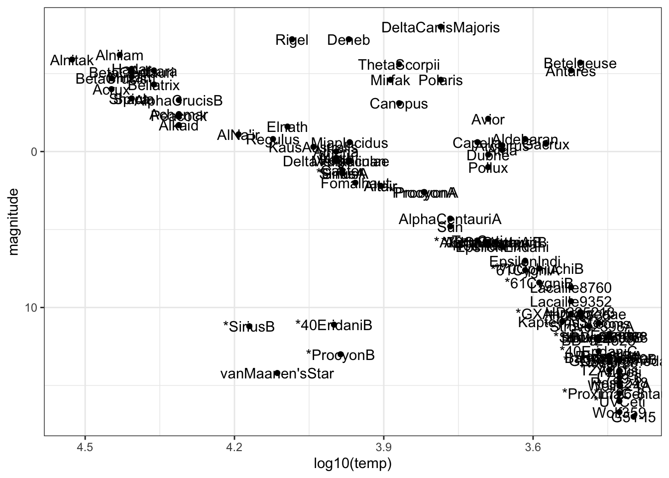
Fill in the blanks in the statements below:
The least lumninous star in the sample with a surface temperature over 5000K is _________.
- A. Antares
- B. Castor
- C. Mirfak
- D. Polaris
- E. van Maanen’s Star
The two stars with lowest temperature and highest luminosity are known as supergiants. The two supergiants in this dataset are ____________.
- A. Rigel and Deneb
- B. *SiriusB and van Maanen’s Star
- C. Alnitak and Alnitam
- D. Betelgeuse and Antares
- E. Wolf359 and G51-I5
The Sun is a ______________.
- A. main sequence star
- B. giant
- C. white dwarf
- Remove the text labels and color the points by star type. This classification describes the properties of the star’s spectrum, the amount of light produced at various wavelengths.
stars %>%
    ggplot(aes(log10(temp), magnitude, col = type)) +
    geom_point() +
    scale_x_reverse() +
    scale_y_reverse()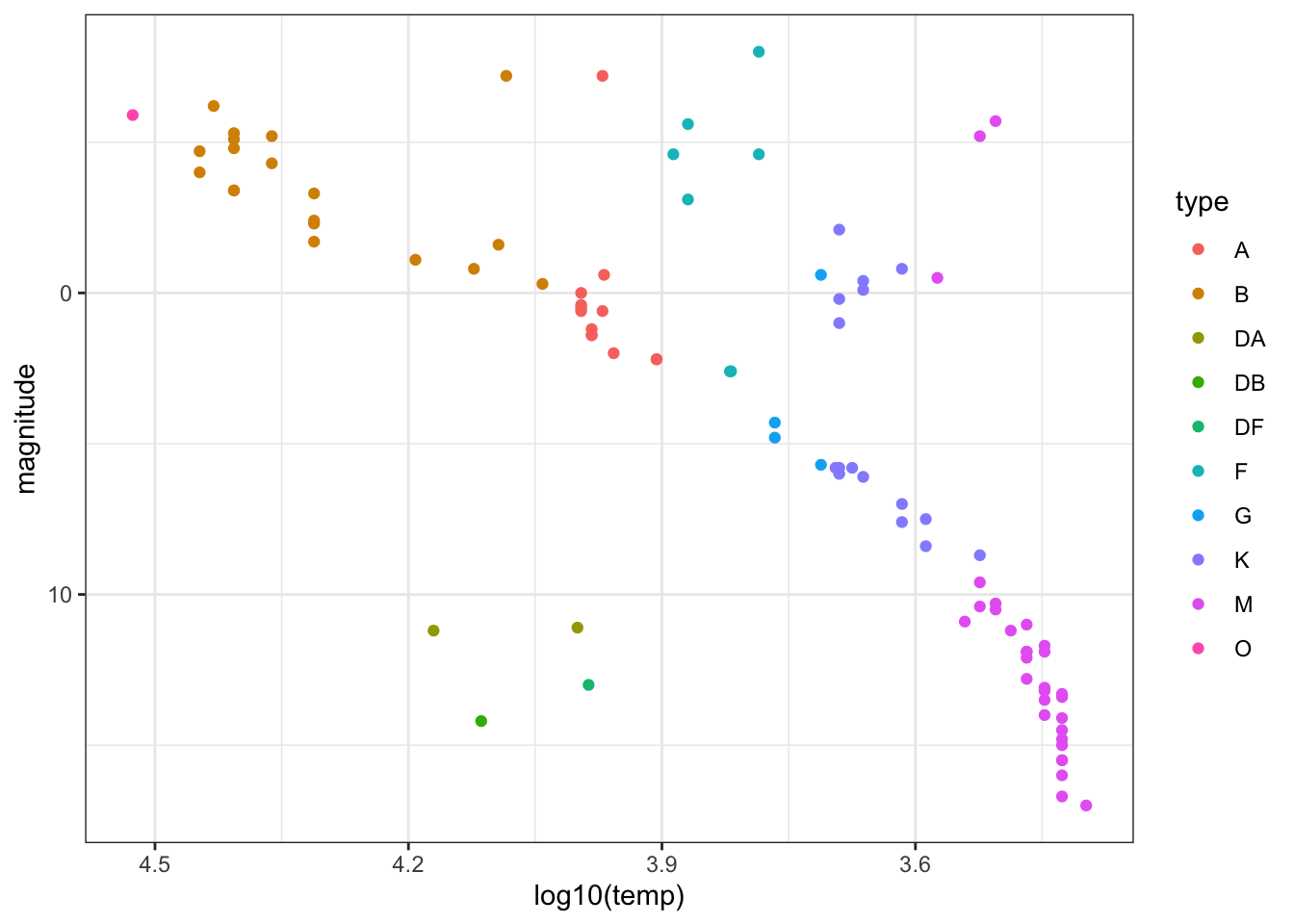
Which star type has the lowest temperature? M
Which star type has the highest temperature? O
The Sun is classified as a G-type star. Is the most luminous G-type star in this dataset also the hottest? No
6.20 Climate Change Exercises
Background
The planet’s surface temperature is increasing due to human greenhouse gas emissions, and this global warming and carbon cycle disruption is wreaking havoc on natural systems. Living systems that depend on current temperature, weather, currents and carbon balance are jeopardized, and human society will be forced to contend with widespread economic, social, political and environmental damage as the temperature continues to rise. Although most countries recognize that global warming is a crisis and that humans must act to limit its effects, little action has been taken to limit or reverse human impact on the climate.
One limitation is the spread of misinformation related to climate change and its causes, especially the extent to which humans have contributed to global warming. In these exercises, we examine the relationship between global temperature changes, greenhouse gases and human carbon emissions using time series of actual atmospheric and ice core measurements from the National Oceanic and Atmospheric Administration (NOAA) and Carbon Dioxide Information Analysis Center (CDIAC).
Libraries and Options
data(temp_carbon)
data(greenhouse_gases)
data(historic_co2)IMPORTANT: These exercises use dslabs datasets that were added in a July 2019 update. Make sure your package is up to date with the command update.packages("dslabs"). You can also update all packages on your system by running update.packages() with no arguments, and you should consider doing this routinely.
- Load the
temp_carbondataset from dslabs, which contains annual global temperature anomalies (difference from 20th century mean temperature in degrees Celsius), temperature anomalies over the land and ocean, and global carbon emissions (in metric tons). Note that the date ranges differ for temperature and carbon emissions.
Which of these code blocks return the latest year for which carbon emissions are reported?
- A.
temp_carbon %>%
    .$year %>%
max()- B.
temp_carbon %>%
    filter(!is.na(carbon_emissions)) %>%
    pull(year) %>%
    max()
## [1] 2014- C.
temp_carbon %>%
    filter(!is.na(carbon_emissions)) %>%
max(year)- D.
temp_carbon %>%
    filter(!is.na(carbon_emissions)) %>%
    .$year %>%
    max()
## [1] 2014- E.
temp_carbon %>%
    filter(!is.na(carbon_emissions)) %>%
    select(year) %>%
    max()
## [1] 2014- F.
temp_carbon %>%
    filter(!is.na(carbon_emissions)) %>%
max(.$year)- Inspect the difference in carbon emissions in
temp_carbonfrom the first available year to the last available year.
What is the first year for which carbon emissions (carbon_emissions) data are available?
temp_carbon %>%
    filter(!is.na(carbon_emissions)) %>%
    .$year %>%
    min()
## [1] 1751What is the last year for which carbon emissions data are available?
temp_carbon %>%
    filter(!is.na(carbon_emissions)) %>%
    .$year %>%
    max()
## [1] 2014How many times larger were carbon emissions in the last year relative to the first year?
carbon1 <- temp_carbon %>%
    filter(year == 1751) %>%
    .$carbon_emissions

carbon2 <- temp_carbon %>%
    filter(year == 2014) %>%
    .$carbon_emissions

carbon2/carbon1
## [1] 3285- Inspect the difference in temperature in
temp_carbonfrom the first available year to the last available year.
What is the first year for which global temperature anomaly (temp_anomaly) data are available?
temp_carbon %>%
    filter(!is.na(temp_anomaly)) %>%
    .$year %>%
    min()
## [1] 1880What is the last year for which global temperature anomaly data are available?
temp_carbon %>%
    filter(!is.na(temp_anomaly)) %>%
    .$year %>%
    max()
## [1] 2018How many degrees Celsius has temperature increased over the date range? Compare the temperatures in the most recent year versus the oldest year.
temp1 <- temp_carbon %>%
    filter(year == "1880") %>%
    .$temp_anomaly

temp2 <- temp_carbon %>%
    filter(year == "2018") %>%
    .$temp_anomaly

temp2 - temp1
## [1] 0.93- Create a time series line plot of the temperature anomaly. Only include years where temperatures are reported. Save this plot to the object
p.
Which command adds a blue horizontal line indicating the 20th century mean temperature?
- A.
p <- p + geom_vline(aes(xintercept = 0), col = "blue")- B.
p <- p + geom_hline(aes(y = 0), col = "blue")- C.
p <- p + geom_hline(aes(yintercept = 0, col = blue))- D.
p <- temp_carbon %>%
    filter(!is.na(temp_anomaly)) %>%
    ggplot(aes(year, temp_anomaly)) +
    geom_line()

p <- p + geom_hline(aes(yintercept = 0), col = "blue")
p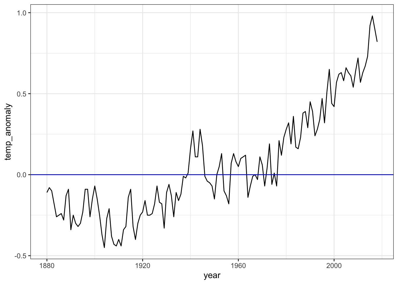
- Continue working with
p, the plot created in the previous question.
Change the y-axis label to be “Temperature anomaly (degrees C)”. Add a title, “Temperature anomaly relative to 20th century mean, 1880-2018”. Also add a text layer to the plot: the x-coordinate should be 2000, the y-coordinate should be 0.05, the text should be “20th century mean”, and the text color should be blue.
- A.
p + ylab("Temperature anomaly (degrees C)") +
    title("Temperature anomaly relative to 20th century mean, 1880-2018") +
geom_text(aes(x = 2000, y = 0.05, label = "20th century mean", col = "blue"))- B.
p + ylim("Temperature anomaly (degrees C)") +
    ggtitle("Temperature anomaly relative to 20th century mean, 1880-2018") +
geom_text(aes(x = 2000, y = 0.05, label = "20th century mean"), col = "blue")- C.
p + ylab("Temperature anomaly (degrees C)") +
    ggtitle("Temperature anomaly relative to 20th century mean, 1880-2018") +
geom_text(aes(x = 2000, y = 0.05, label = "20th century mean", col = "blue"))- D.
p <- temp_carbon %>%
  filter(!is.na(temp_anomaly)) %>%
  ggplot(aes(year, temp_anomaly)) +
  geom_line() +
  geom_hline(aes(yintercept=0), col='blue') +
  ylab("Temperature anomaly (degrees C)") +
  ggtitle("Temperature anomaly relative to 20th century mean, 1880-2018") +
  geom_text(aes(x = 2000, y = 0.05, label="20th century mean"), col='blue')
p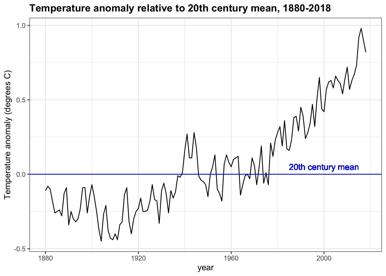
- E.
p + ylab("Temperature anomaly (degrees C)") +
    title("Temperature anomaly relative to 20th century mean, 1880-2018") +
geom_text(aes(x = 2000, y = 0.05, label = "20th century mean"), col = "blue")- Use the plot created in the last two exercises to answer the following questions.
Answers within 5 years of the correct answer will be accepted.
temp_carbon %>%
    filter(!is.na(temp_anomaly)) %>%
    ggplot(aes(year, temp_anomaly)) +
    geom_line() +
    geom_hline(aes(yintercept = 0), col = "blue") +
    ylab("Temperature anomaly (degrees C)") +
    geom_text(aes(x = 2000, y = 0.05, label = "20th century mean"), col = "blue") +
    xlim(c(1880, 2018)) +
    ggtitle("Temperature anomaly relative to 20th century mean, 1880-2018")
When was the earliest year with a temperature above the 20th century mean? 1940
When was the last year with an average temperature below the 20th century mean? 1976
In what year did the temperature anomaly exceed 0.5 degrees Celsius for the first time? 1997
- Add layers to the previous plot to include line graphs of the temperature anomaly in the ocean (
ocean_anomaly) and on land (land_anomaly).
Assign different colors to the lines. Compare the global temperature anomaly to the land temperature anomaly and ocean temperature anomaly.
temp_carbon %>%
    filter(!is.na(temp_anomaly)) %>%
    ggplot(aes(year, temp_anomaly)) +
    geom_line() +
    geom_line(aes(year, land_anomaly), col = "red") +
    geom_line(aes(year, ocean_anomaly), col = "blue") +
    ylab("Temperature anomaly (degrees C)") +
    xlim(c(1880, 2018)) +
    ggtitle("Temperature anomaly on land and ocean")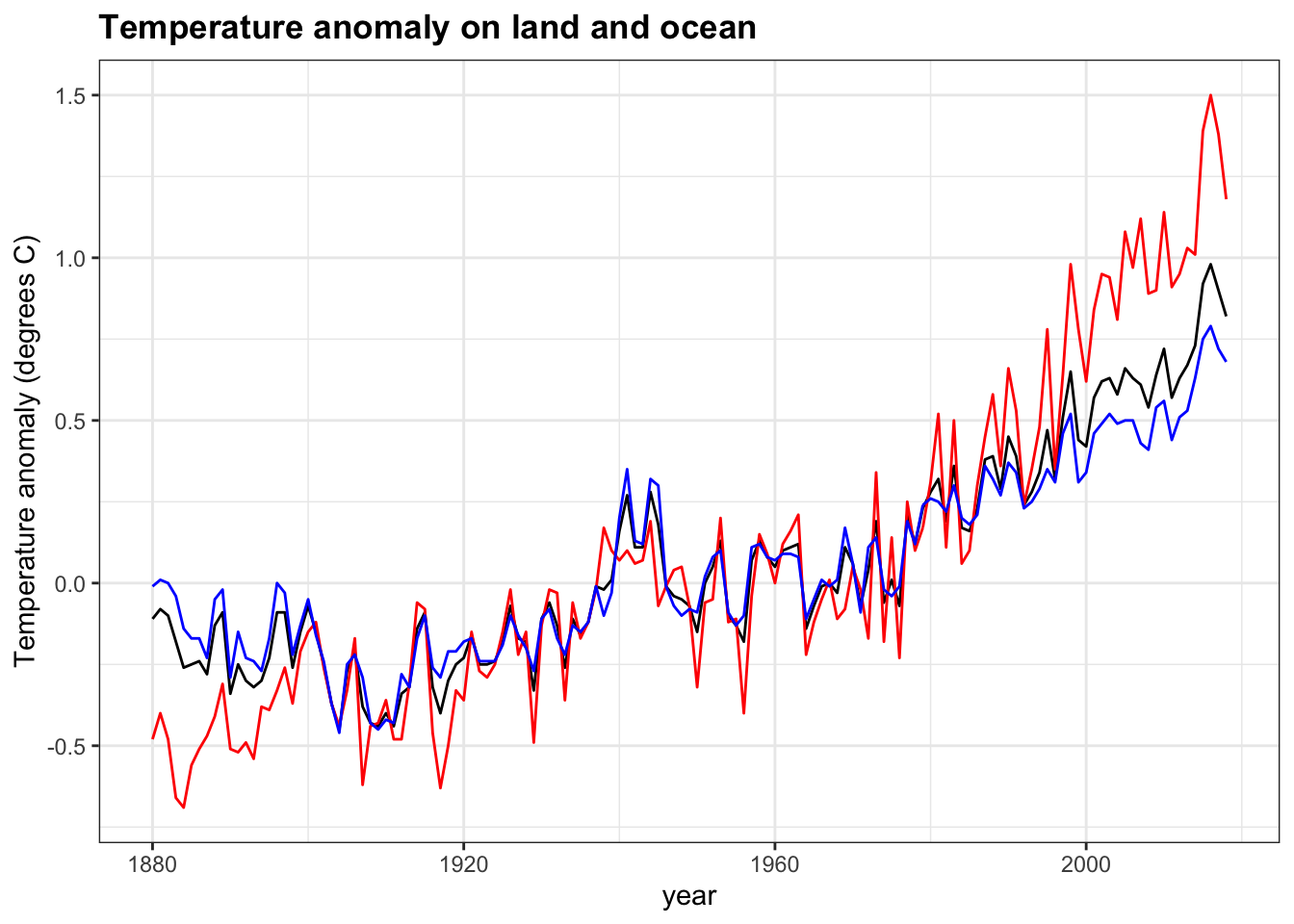
Which region has the largest 2018 temperature anomaly relative to the 20th century mean? Land
Which region has the largest change in temperature since 1880? Land
Which region has a temperature anomaly pattern that more closely matches the global pattern? Ocean
- A major determinant of Earth’s temperature is the greenhouse effect. Many gases trap heat and reflect it towards the surface, preventing heat from escaping the atmosphere. The greenhouse effect is vital in keeping Earth at a warm enough temperature to sustain liquid water and life; however, changes in greenhouse gas levels can alter the temperature balance of the planet.
The greenhouse_gases data frame from dslabs contains concentrations of the three most significant greenhouse gases: carbon dioxide (\(CO_2\), abbreviated in the data as co2), methane (\(CH_4\), ch4 in the data), and nitrous oxide (\(N_2 O\), n2o in the data). Measurements are provided every 20 years for the past 2000 years.
Complete the code outline below to make a line plot of concentration on the y-axis by year on the x-axis. Facet by gas, aligning the plots vertically so as to ease comparisons along the year axis. Add a vertical line with an x-intercept at the year 1850, noting the unofficial start of the industrial revolution and widespread fossil fuel consumption. Note that the units for ch4 and n2o are ppb while the units for co2 are ppm.
greenhouse_gases %>%
    ggplot(aes(year, concentration)) +
    geom_line() +
    facet_grid(gas ~ ., scales = "free") +
    geom_vline(xintercept = 1850, col='red') +
    ylab("Concentration (ch4/n2o ppb, co2 ppm)") +
    ggtitle("Atmospheric greenhouse gas concentration by year, 0-2000")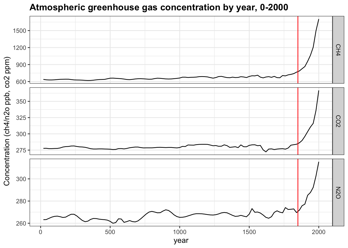
What code fills the first blank? year, concentration
What code fills the second blank? Make sure to align plots vertically. gas ~ .
What code fills the third blank? geom_vline(xintercept = 1850)
- Interpret the plot of greenhouse gases over time from the previous question. You will use each answer exactly once
ch4,co2,n2o, all, none).
Which gas was stable at approximately 275 ppm/ppb until around 1850? co2
Which gas more than doubled in concentration since 1850? ch4
Which gas decreased in concentration since 1850? none
Which gas had the smallest magnitude change since 1850? n2o
Which gas increased exponentially in concentration after 1850? all
- While many aspects of climate are independent of human influence, and
co2levels can change without human intervention, climate models cannot reconstruct current conditions without incorporating the effect of manmade carbon emissions. These emissions consist of greenhouse gases and are mainly the result of burning fossil fuels such as oil, coal and natural gas.
Make a time series line plot of carbon emissions (carbon_emissions) from the temp_carbon dataset. The y-axis is metric tons of carbon emitted per year.
temp_carbon %>%
    filter(!is.na(carbon_emissions)) %>%
    ggplot(aes(year, carbon_emissions)) +
    geom_line() +
    ylab("Carbon emissions (metric tons)") +
    ggtitle("Annual global carbon emissions, 1751-2014")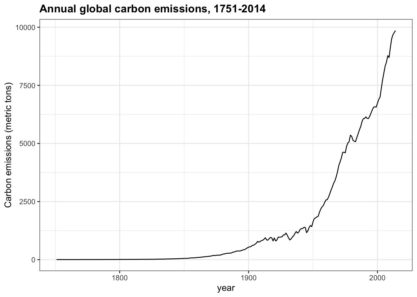
Which of the following are true about the trend of carbon emissions? Check all correct answers.
- A. Carbon emissions were essentially zero before 1850 and have increased exponentially since then.
- B. Carbon emissions are reaching a stable level.
- C. Carbon emissions have increased every year on record.
- D. Carbon emissions in 2014 were about 4 times as large as 1960 emissions.
- E. Carbon emissions have doubled since the late 1970s.
-
F. Carbon emissions change with the same trend as atmospheric greenhouse gas levels (
co2,ch4,n2o)
- We saw how greenhouse gases have changed over the course of human history, but how has \(CO_2\) (
co2in the data) varied over a longer time scale? Thehistoric_co2data frame in dslabs contains direct measurements of atmosphericco2from Mauna Loa since 1959 as well as indirect measurements of atmosphericco2from ice cores dating back 800,000 years.
Make a line plot of co2 concentration over time (year), coloring by the measurement source (source). Save this plot as co2_time for later use.
co2_time <- historic_co2 %>%
  filter(!is.na(co2)) %>%
  ggplot(aes(year, co2, col=source)) +
  geom_line() +
  ggtitle("Atmospheric CO2 concentration, -800,000 BC to today") +
  ylab("co2 (ppmv)")
co2_time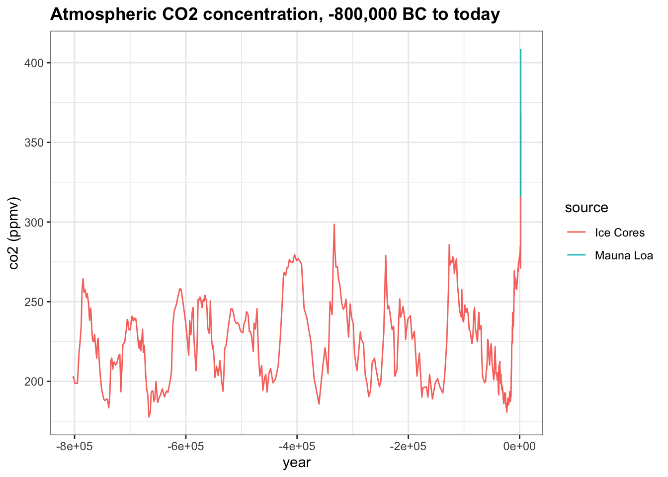
Which of the following are true about co2_time, the time series of co2 over the last 800,000 years? Check all correct answers.
- A. Modern co2 levels are higher than at any point in the last 800,000 years.
- B. There are natural cycles of co2 increase and decrease lasting 50,000-100,000 years per cycle.
- C. In most cases, it appears to take longer for co2 levels to decrease than to increase.
- D. co2 concentration has been at least 200 ppm for the last 800,000 years.
- One way to differentiate natural
co2oscillations from today’s manmadeco2spike is by examining the rate of change ofco2. The planet is affected not only by the absolute concentration ofco2but also by its rate of change. When the rate of change is slow, living and nonliving systems have time to adapt to new temperature and gas levels, but when the rate of change is fast, abrupt differences can overwhelm natural systems. How does the pace of naturalco2change differ from the current rate of change?
Use the co2_time plot saved above. Change the limits as directed to investigate the rate of change in co2 over various periods with spikes in co2 concentration.
Change the x-axis limits to -800,000 and -775,000. About how many years did it take for co2 to rise from 200 ppmv to its peak near 275 ppmv?
co2_time <- historic_co2 %>%
    ggplot(aes(year, co2, col = source)) +
    geom_line() +
    ggtitle("Atmospheric CO2 concentration, -800,000 BC to today") +
    ylab("co2 (ppmv)")
co2_time + xlim(-800000, -775000)
## Warning: Removed 683 row(s) containing missing values (geom_path).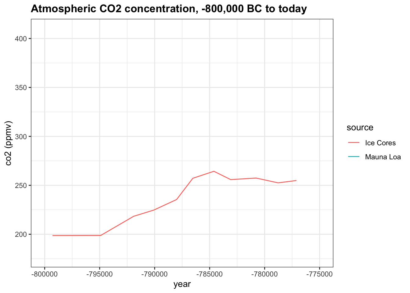
- A. 100
- B. 3,000
- C. 6,000
- D. 10,000
Change the x-axis limits to -375,000 and -330,000. About how many years did it take for co2 to rise from the minimum of 180 ppm to its peak of 300 ppmv?
co2_time <- historic_co2 %>%
    ggplot(aes(year, co2, col = source)) +
    geom_line() +
    ggtitle("Atmospheric CO2 concentration, -800,000 BC to today") +
    ylab("co2 (ppmv)")
co2_time + xlim(-375000, -330000)
## Warning: Removed 683 row(s) containing missing values (geom_path).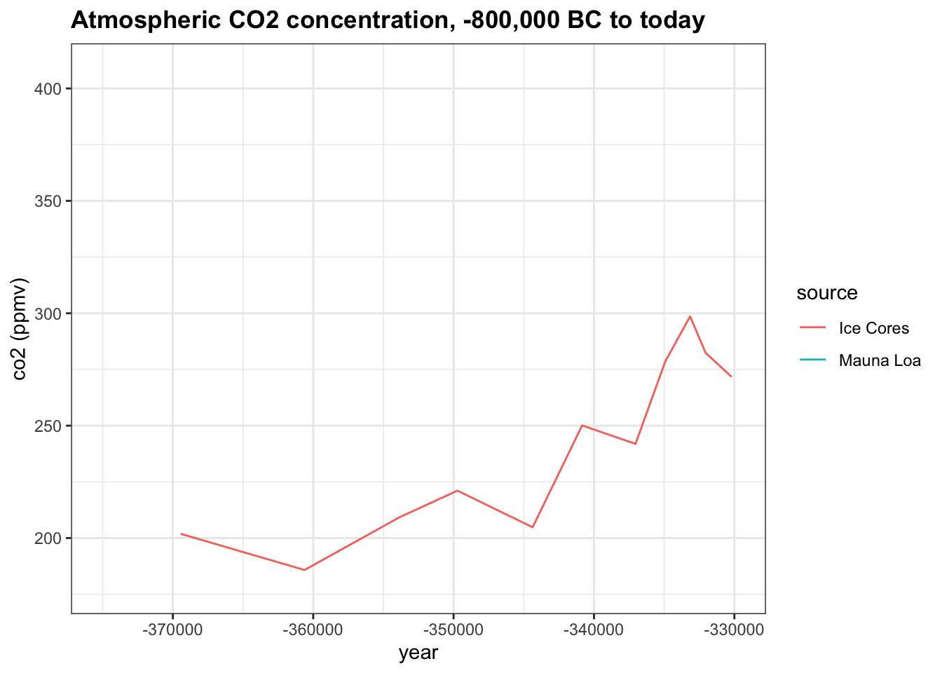
- A. 3,000
- B. 6,000
- C. 12,000
- D. 25,000
Change the x-axis limits to -140,000 and -120,000. About how many years did it take for co2 to rise from 200 ppmv to its peak near 280 ppmv?
co2_time <- historic_co2 %>%
    ggplot(aes(year, co2, col = source)) +
    geom_line() +
    ggtitle("Atmospheric CO2 concentration, -800,000 BC to today") +
    ylab("co2 (ppmv)")
co2_time + xlim(-140000, -120000)
## Warning: Removed 683 row(s) containing missing values (geom_path).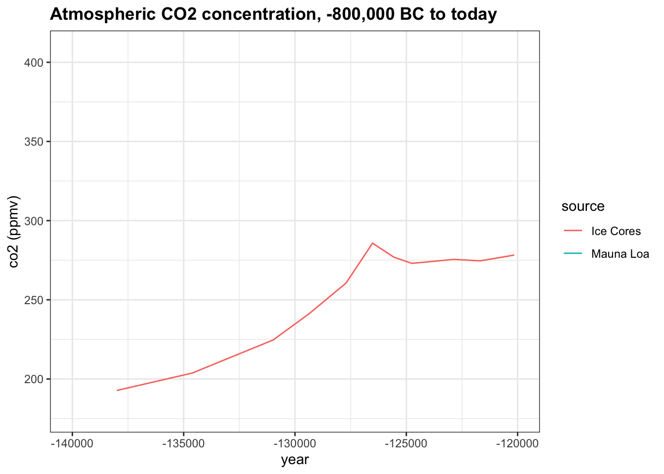
- A. 3200
- B. 1,500
- C. 5,000
- D. 9,000
Change the x-axis limits to -3000 and 2018 to investigate modern changes in co2. About how many years did it take for co2 to rise from its stable level around 275 ppmv to the current level of over 400 ppmv?
co2_time <- historic_co2 %>%
    ggplot(aes(year, co2, col = source)) +
    geom_line() +
    ggtitle("Atmospheric CO2 concentration, -800,000 BC to today") +
    ylab("co2 (ppmv)")
co2_time + xlim(-3000, 2018)
## Warning: Removed 539 row(s) containing missing values (geom_path).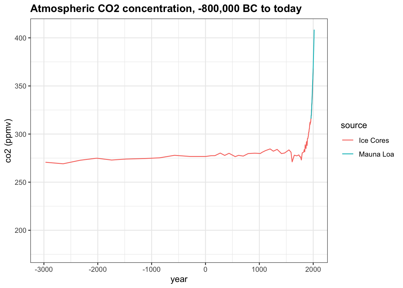
- A. 250
- B. 1,000
- C. 2,000
- D. 5,000